
Responsive design is no longer optional in modern frontend development. Users access applications from smartphones, tablets, laptops, and ultra-wide monitors, so your React app must adapt seamlessly across all screen sizes.
In this tutorial, we will build a responsive React dashboard layout using CSS Grid and media queries with a mobile-first approach.
By the end of this tutorial, you will learn how to:
- build mobile-first layouts
- use CSS Grid for responsive UI
- create adaptive sidebars and cards
- apply media queries effectively
- use
auto-fitandminmax() - improve typography responsiveness
- test across screen sizes
Modern best practice strongly recommends fluid grids using fr, minmax(), and content-based breakpoints instead of fixed device-specific widths.
Prerequisites
Before starting, make sure you have:
- Node.js latest LTS installed
- npm or yarn
- basic React knowledge
- basic CSS knowledge
- VS Code or your preferred editor
We will use:
- React (Vite)
- CSS Grid
- CSS media queries
Step 1: Create a New React App
Open Terminal and run:
npm create vite@latest react-responsive-design
cd react-responsive-design
npm install
npm run dev
Choose:
React
JavaScript
After installation, open it in your editor:
code .
Step 2: Clean Up the Starter Files
Open src/App.jsx and replace everything with this code:
import './App.css';

function App() {
  return (
    <div className="dashboard">
      <header className="header">
        <h1>React Responsive Dashboard</h1>
      </header>

      <aside className="sidebar">
        <nav>
          <p>Dashboard</p>
          <p>Users</p>
          <p>Reports</p>
          <p>Settings</p>
        </nav>
      </aside>

      <main className="content">
        <div className="card">Card 1</div>
        <div className="card">Card 2</div>
        <div className="card">Card 3</div>
        <div className="card">Card 4</div>
      </main>

      <footer className="footer">
        Copyright © 2026 Djamware
      </footer>
    </div>
  );
}

export default App;
This creates the main layout structure:
- header
- sidebar
- content
- footer
Step 3: Create the Mobile-First Layout with CSS Grid
Now open src/App.css and replace everything with:
body {
margin: 0;
font-family: Arial, sans-serif;
}
.dashboard {
display: grid;
min-height: 100vh;
grid-template-columns: 1fr;
grid-template-areas:
"header"
"content"
"footer";
}
.header {
grid-area: header;
background: #1f2937;
color: white;
padding: 20px;
}
.sidebar {
display: none;
}
.content {
grid-area: content;
display: grid;
grid-template-columns: 1fr;
gap: 20px;
padding: 20px;
}
.card {
background: #f3f4f6;
padding: 30px;
border-radius: 8px;
}
.footer {
grid-area: footer;
background: #e5e7eb;
padding: 20px;
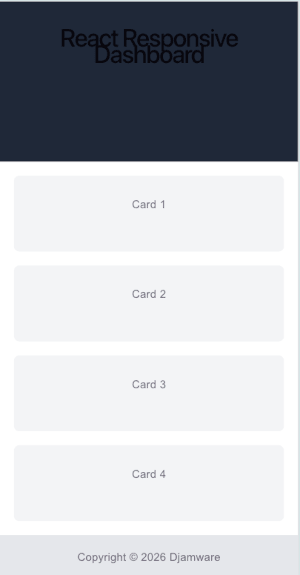
}This is our mobile-first base layout, which is the recommended approach for responsive design in 2026.
On mobile screens, everything stacks vertically.
Expected Mobile Layout
Step 4: Add Tablet Media Query
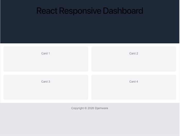
Now let’s make the cards display in two columns on tablet screens.
Add this below your CSS:
@media (min-width: 768px) {
  .content {
    grid-template-columns: repeat(2, 1fr);
  }
}
This breakpoint activates when screen width is 768px or larger.
This is ideal for:
- tablets
- landscape phones
- small laptops
Using min-width media queries supports the progressive enhancement mobile-first strategy.
Expected Desktop Layout
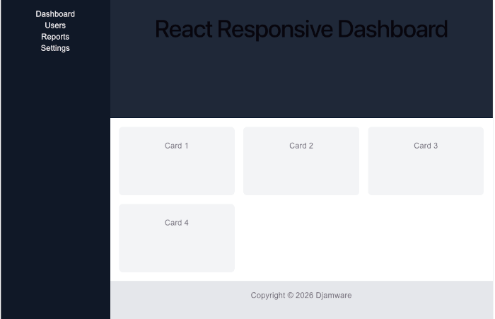
Step 5: Add Desktop Sidebar Layout
Now let’s create the desktop version.
Add this below the tablet media query:
@media (min-width: 1024px) {
  .dashboard {
    grid-template-columns: 250px 1fr;
    grid-template-areas:
      "sidebar header"
      "sidebar content"
      "sidebar footer";
  }

  .sidebar {
    display: block;
    grid-area: sidebar;
    background: #111827;
    color: white;
    padding: 20px;
  }

  .content {
    grid-template-columns: repeat(3, 1fr);
  }
}
Now the layout becomes:
- left sidebar
- header on top
- 3-column cards
- footer below
This is a common admin dashboard pattern.
Expected Desktop Layout
Step 6: Use Modern auto-fit and minmax()
This is one of the most useful CSS Grid techniques.
Replace:
grid-template-columns: repeat(3, 1fr);with:
grid-template-columns: repeat(auto-fit, minmax(250px, 1fr));So the desktop .content becomes:
.content {
  grid-template-columns: repeat(auto-fit, minmax(250px, 1fr));
}
This automatically adjusts columns based on available space.
For example:
- 1 column on small screens
- 2 columns on medium screens
- 3–4 columns on large screens
This is considered a modern best practice because it reduces the need for multiple breakpoints.
Step 7: Add Fluid Typography
Responsive text is equally important.
Update the header:
.header h1 {
  font-size: clamp(1.2rem, 2vw, 2rem);
}
This makes font size scale smoothly.
Example:
- small screens → 1.2rem
- medium → fluid scaling
- large → 2rem max
Fluid typography with clamp() is widely recommended for modern responsive UI.
Step 8: Test the Responsive Layout
Run:
npm run devOpen browser DevTools and test:
- mobile
- tablet
- desktop
- ultra-wide
Suggested breakpoints:
- 375px
- 768px
- 1024px
- 1440px
Use content-based breakpoints, not device model names.
Conclusion
In this tutorial, you learned how to build a responsive React layout using CSS Grid and media queries.
We covered:
- mobile-first layout
- CSS Grid areas
- tablet and desktop breakpoints
- responsive sidebar
auto-fit+minmax()- fluid typography
These techniques are essential for modern React applications and help improve:
- user experience
- accessibility
- SEO
- Core Web Vitals
You can find the full source code on our GitHub.
We know that building beautifully designed Mobile and Web Apps from scratch can be frustrating and very time-consuming. Check Envato unlimited downloads and save development and design time.
That's just the basics. If you need more deep learning about React, you can take the following cheap course:
- React - The Complete Guide 2025 (incl. Next.js, Redux)
- The Ultimate React Course 2025: React, Next.js, Redux & More
- Modern React From The Beginning
- Complete React, Next.js & TypeScript Projects Course 2025
- 100 Hours Web Development Bootcamp - Build 23 React Projects
- React JS Masterclass: Zero To Job Ready With 10 Projects
- Big React JS Course With AI (Redux / Router / Tailwind CSS)
- React JS + ChatGPT Crash Course: Build Dynamic React Apps
- Advanced React: Design System, Design Patterns, Performance
- Microfrontends with React: A Complete Developer's Guide
Thanks!