Creating a great mobile app isn't just about functionality—it also depends on delivering an intuitive, visually appealing, and responsive user interface. Users expect applications to look polished, feel fast, and adapt seamlessly across different devices and platforms. Building such interfaces from scratch can be time-consuming, but the Ionic Framework simplifies the process with its extensive library of pre-built UI components.
Ionic provides a comprehensive collection of Ion Components, reusable Web Components that follow modern design principles while automatically adapting to both iOS and Android design languages. Whether you're building a simple to-do app, an e-commerce platform, or a business dashboard, these components help you create professional-looking interfaces with minimal custom CSS.
One of Ionic's greatest strengths is its responsive design system. Components such as grids, cards, lists, buttons, navigation menus, and forms are designed to work across smartphones, tablets, and desktop browsers, allowing you to build a single application that delivers a consistent user experience on multiple platforms.
In this tutorial, you'll learn how to design attractive and responsive user interfaces using Ionic 8 and Angular. We'll explore the most commonly used Ion Components, customize their appearance with Ionic's theming system, build responsive layouts, and implement best practices for creating clean, accessible, and user-friendly mobile applications.
By the end of this tutorial, you'll be able to:
- Understand the purpose and benefits of Ionic's UI component library.
- Build responsive layouts using Ionic's Grid system.
- Create beautiful interfaces with cards, lists, buttons, and forms.
- Customize colors, typography, and themes using CSS variables.
- Implement dark mode and responsive utility classes.
- Apply UI design best practices to create professional mobile applications.
Rather than focusing solely on individual components, this guide demonstrates how they work together to create a cohesive user experience. You'll build practical UI examples that can serve as a solid foundation for your own Ionic projects.
What You'll Build
Throughout this tutorial, you'll create a modern demo application featuring:
- A clean header and responsive navigation.
- Beautiful cards for displaying content.
- Interactive lists and forms.
- A responsive dashboard layout using Ionic Grid.
- Custom color themes and dark mode support.
- Mobile-friendly spacing and typography.
No prior UI design experience is required. If you're familiar with Angular fundamentals and have basic knowledge of Ionic, you'll be able to follow along and build an attractive, production-ready interface step by step.
Prerequisites
Before you begin building beautiful and responsive interfaces with Ionic, make sure your development environment is set up with the required tools. This tutorial uses Ionic 8 with Angular 21, providing access to the latest features, performance improvements, and UI enhancements.
Prerequisites
You should have the following installed on your system:
- Node.js 22 LTS (or later)
- npm (included with Node.js)
- Angular CLI 21
- Ionic CLI
- A modern code editor such as Visual Studio Code
You can verify your Node.js and npm installations by running:
node -v
npm -v
The output should display the installed versions, for example:
v24.18.0
11.16.0
Install Angular CLI
If you don't already have the Angular CLI installed globally, run:
npm install -g @angular/cliVerify the installation:
ng versionInstall Ionic CLI
Next, install the Ionic CLI globally:
npm install -g @ionic/cliVerify that it was installed successfully:
ionic --versionCreate a New Ionic Project
Generate a new blank Ionic application using the Angular framework:
ionic start ionic-ui-demo blank --type=angularWhen prompted, you can choose whether to integrate additional services such as Git or Capacitor. For this tutorial, the default options are sufficient.
After the project is created, navigate to the project directory:
cd ionic-ui-demoExplore the Project Structure
Open the project in Visual Studio Code:
code .The generated project includes a clean and organized structure similar to the following:
ionic-ui-demo/
├── src/
│   ├── app/
│   ├── assets/
│   ├── environments/
│   ├── global.scss
│   ├── index.html
│   ├── main.ts
│   └── theme/
├── ionic.config.json
├── angular.json
├── package.json
└── ...
Some important files and folders include:
- src/app/ – Contains your Angular components, pages, and routing configuration.
- src/assets/ – Stores static assets such as images, fonts, and icons.
- src/global.scss – Defines global styles that apply across the application.
- src/theme/ – Contains theme-related configuration, including CSS variables for customizing Ionic's appearance.
- package.json – Lists project dependencies and npm scripts.
Run the Application
Start the development server by running:
ionic serveThe Ionic CLI will compile the application and automatically open it in your default web browser.
If it doesn't open automatically, navigate to:
http://localhost:8100You should see the default Ionic starter application running.
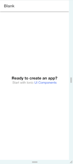
One of the advantages of ionic serve is live reload. Whenever you modify your source code and save the file, the browser automatically refreshes to display the latest changes, making UI development faster and more efficient.
Preview on Different Screen Sizes
Responsive design is a key focus of this tutorial. To preview your application on various devices:
- Open your browser's Developer Tools (
F12orCtrl+Shift+I). - Click the Toggle Device Toolbar (or press
Ctrl+Shift+Min Chromium-based browsers). - Select a device profile such as:
- iPhone 16 Pro
- Pixel 9
- iPad Air
- Galaxy S25
- Resize the viewport to observe how Ionic's responsive components automatically adapt to different screen sizes.
Throughout this tutorial, we'll frequently use the device emulator to ensure our layouts look great on both mobile and tablet displays.
With the development environment ready, it's time to explore the building blocks of every Ionic application: Ion Components. In the next section, you'll learn about the core layout components and how they work together to create a clean, responsive application structure.
Understanding Ion Components
At the heart of every Ionic application is a collection of reusable UI elements called Ion Components. These components are built as Web Components, making them framework-agnostic while integrating seamlessly with Angular, React, Vue, and even vanilla JavaScript.
Instead of writing complex HTML structures and CSS styles from scratch, you can compose your application's interface using Ion Components. They provide a consistent look and feel across platforms while automatically adapting to the design language of iOS and Android.
Some of the most commonly used components include:
ion-header– Displays the application's top navigation area.ion-toolbar– Contains titles, buttons, and navigation controls.ion-title– Displays the page title.ion-content– Holds the main content and provides scrolling behavior.ion-footer– Displays content at the bottom of the page.ion-button– Creates interactive buttons.ion-card– Displays content inside a visually appealing container.ion-listandion-item– Build menus, settings pages, and data lists.
These components are designed to work together, allowing you to build complex interfaces with minimal effort.
The Basic Page Structure
Almost every Ionic page follows a similar layout consisting of three main sections:
- Header – Displays navigation and page titles.
- Content – Contains the primary content.
- Footer (optional) – Shows actions or persistent information.
The following example demonstrates a simple page layout.
src/app/home/home.page.html
<ion-header>
  <ion-toolbar color="primary">
    <ion-title>Ionic UI Demo</ion-title>
  </ion-toolbar>
</ion-header>

<ion-content class="ion-padding">
  <h2>Welcome!</h2>

  <p>
    Build beautiful mobile interfaces with Ionic.
  </p>
</ion-content>

<ion-footer>
  <ion-toolbar>
    <ion-title size="small">
      © 2026 Djamware
    </ion-title>
  </ion-toolbar>
</ion-footer>
Update src/app/home/home.page.ts
import { Component } from '@angular/core';
import { IonHeader, IonToolbar, IonTitle, IonContent, IonFooter } from '@ionic/angular/standalone';

@Component({
  selector: 'app-home',
  templateUrl: 'home.page.html',
  styleUrls: ['home.page.scss'],
  imports: [IonHeader, IonToolbar, IonTitle, IonContent, IonFooter],
})
export class HomePage {
  constructor() { }
}
When you run the application, you'll see:
- A colored toolbar at the top.
- A scrollable content area with padding.
- A footer fixed to the bottom of the page.
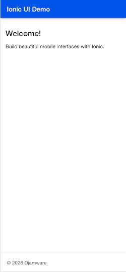
This structure serves as the foundation for nearly every Ionic application.
Exploring the Layout Components
Let's take a closer look at each component.
ion-header
The ion-header component defines the top section of the page. It typically contains one or more toolbars for navigation, titles, and action buttons.
<ion-header>
  <ion-toolbar>
    <ion-title>Dashboard</ion-title>
  </ion-toolbar>
</ion-header>
You can also stack multiple toolbars to create more advanced layouts.
<ion-header>

  <ion-toolbar color="primary">
    <ion-title>Dashboard</ion-title>
  </ion-toolbar>

  <ion-toolbar>
    <ion-searchbar></ion-searchbar>
  </ion-toolbar>

</ion-header>
This layout is useful for applications that include search functionality or filtering controls beneath the main navigation bar.
ion-toolbar
The toolbar is one of the most versatile components in Ionic. It can contain:
- Titles
- Buttons
- Menus
- Search bars
- Segments
- Icons
For example, adding a settings button:
<ion-toolbar color="primary">

  <ion-title>
    Dashboard
  </ion-title>

  <ion-buttons slot="end">
    <ion-button>
      <ion-icon name="settings-outline"></ion-icon>
    </ion-button>
  </ion-buttons>

</ion-toolbar>
The slot="end" attribute positions the button on the right side of the toolbar.
ion-title
The ion-title component displays the page title.
<ion-title>
  My Profile
</ion-title>
On iOS, Ionic automatically centers the title by default, while on Android it follows the Material Design convention, aligning the title to the left. This platform-aware behavior helps your application feel native without requiring additional code.
ion-content
The ion-content component is where the main content of your page lives. Unlike a regular HTML <div>, it automatically handles scrolling and provides built-in support for Ionic's utility classes.
<ion-content>

  <p>
    Scrollable content goes here.
  </p>

</ion-content>
A common pattern is to use the ion-padding utility class to add consistent spacing.
<ion-content class="ion-padding">

  <h2>Hello Ionic!</h2>

  <p>
    This page uses Ionic's built-in spacing utilities.
  </p>

</ion-content>
Using these utility classes helps maintain consistent spacing across your application without writing custom CSS.
ion-footer
The footer appears at the bottom of the page and is often used for navigation, action buttons, or status information.
<ion-footer>

  <ion-toolbar>

    <ion-title size="small">
      Footer Area
    </ion-title>

  </ion-toolbar>

</ion-footer>
A common use case is displaying primary actions that should remain easily accessible.
<ion-footer>

  <ion-toolbar>

    <ion-button expand="block">
      Save Changes
    </ion-button>

  </ion-toolbar>

</ion-footer>
Understanding Slots
Many Ionic components use slots to control the placement of child elements. For example, buttons inside a toolbar can be positioned at the start or end.
<ion-toolbar>

  <ion-buttons slot="start">
    <ion-button>
      Back
    </ion-button>
  </ion-buttons>

  <ion-title>
    Profile
  </ion-title>

  <ion-buttons slot="end">
    <ion-button>
      Edit
    </ion-button>
  </ion-buttons>

</ion-toolbar>
The result is a toolbar with:
- A Back button on the left.
- A centered (or platform-specific) title.
- An Edit button on the right.
Slots are used throughout Ionic, making it easy to arrange icons, labels, buttons, and other components in a predictable way.
Putting It All Together
Let's combine everything into a clean, modern page layout.
src/app/home/home.page.html
<ion-header>

  <ion-toolbar color="primary">

    <ion-title>
      My Dashboard
    </ion-title>

    <ion-buttons slot="end">
      <ion-button>
        <ion-icon name="person-circle-outline"></ion-icon>
      </ion-button>
    </ion-buttons>

  </ion-toolbar>

</ion-header>

<ion-content class="ion-padding">

  <h2>Welcome Back!</h2>

  <p>
    This page demonstrates the basic structure of an Ionic application using
    Ion Components.
  </p>

</ion-content>

<ion-footer>

  <ion-toolbar>

    <ion-title size="small">
      Built with Ionic 8 & Angular 21
    </ion-title>

  </ion-toolbar>

</ion-footer>
src/app/home/home.page.ts
import { Component } from '@angular/core';
import { IonHeader, IonToolbar, IonTitle, IonContent, IonFooter, IonButtons, IonButton, IonIcon } from '@ionic/angular/standalone';

@Component({
  selector: 'app-home',
  templateUrl: 'home.page.html',
  styleUrls: ['home.page.scss'],
  imports: [IonHeader, IonToolbar, IonTitle, IonContent, IonFooter, IonButtons, IonButton, IonIcon],
})
export class HomePage {
  constructor() { }
}
This example illustrates how a handful of Ion Components can produce a polished, responsive page structure with very little code. As your application grows, you'll continue building on this foundation by incorporating cards, lists, forms, navigation, and other components.
Creating Beautiful Buttons with ion-button
Buttons are one of the most important elements in any application. They allow users to perform actions such as submitting forms, saving data, navigating between pages, opening dialogs, or triggering application logic.
Ionic provides the ion-button component with a wide range of built-in options for controlling colors, sizes, shapes, borders, icons, and layout. Because these styles are already optimized for touch interfaces, you can create attractive and accessible buttons without writing extensive CSS.
Basic Ionic Button
The simplest button can be created with ion-button:
<ion-button>
  Click Me
</ion-button>
You can use the button inside ion-content:
<ion-content class="ion-padding">

  <ion-button>
    Get Started
  </ion-button>

</ion-content>
Ionic automatically applies appropriate padding, typography, border radius, and touch behavior.
Using Button Colors
Ionic provides several predefined color names that can be used to communicate the purpose of an action.
<ion-button color="primary">
  Primary
</ion-button>

<ion-button color="secondary">
  Secondary
</ion-button>

<ion-button color="success">
  Success
</ion-button>

<ion-button color="warning">
  Warning
</ion-button>

<ion-button color="danger">
  Delete
</ion-button>
For example, a danger button is appropriate for destructive actions such as deleting an account or removing an item:
<ion-button color="danger">
  Delete Account
</ion-button>
Using consistent semantic colors makes your interface easier to understand. Users should be able to recognize important actions without reading every label carefully.
Filled and Outline Buttons
The fill property controls how the button's background is displayed.
A standard filled button:
<ion-button>
  Save Changes
</ion-button>
An outlined button:
<ion-button fill="outline">
  Cancel
</ion-button>
A clear button removes the background and border:
<ion-button fill="clear">
  Learn More
</ion-button>
You can combine different button styles to establish a visual hierarchy.
<ion-button expand="block">
  Continue
</ion-button>

<ion-button expand="block" fill="outline">
  Cancel
</ion-button>
The primary action is visually stronger, while the secondary action is less prominent.
Full-Width Buttons
For mobile forms and login screens, full-width buttons are often more convenient because they provide a larger touch target.
Use the expand property:
<ion-button expand="block">
  Sign In
</ion-button>
You can also combine it with a color:
<ion-button
  expand="block"
  color="primary">
  Create Account
</ion-button>
This is particularly useful for actions at the bottom of forms.
Button Shapes
You can change the shape of a button using the shape property.
For a rounded button:
<ion-button shape="round">
  Get Started
</ion-button>
The rounded style works particularly well for modern mobile interfaces.
For example:
<ion-button
  expand="block"
  shape="round">
  Continue
</ion-button>
However, avoid using too many different button styles on the same screen. A consistent visual language usually produces a more professional interface.
Button Sizes
Ionic also provides predefined button sizes:
<ion-button size="small">
  Small
</ion-button>

<ion-button>
  Default
</ion-button>

<ion-button size="large">
  Large
</ion-button>
Use larger buttons for important primary actions and smaller buttons for secondary actions where appropriate.
Adding Icons
Icons can make buttons easier to recognize and can reduce the amount of text required.
Ionic uses Ionicons for its icon library. You can place an icon inside a button like this:
<ion-button>
  <ion-icon name="download-outline"></ion-icon>
  Download
</ion-button>
For an icon-only button, use the aria-label attribute to maintain accessibility:
<ion-button
  fill="clear"
  aria-label="Settings">
  <ion-icon name="settings-outline"></ion-icon>
</ion-button>
Icons can also be positioned using Ionic's slot system:
<ion-button>
  Continue
  <ion-icon slot="end" name="arrow-forward-outline"></ion-icon>
</ion-button>
For an icon on the left:
<ion-button>
  <ion-icon slot="start" name="add-outline"></ion-icon>
  Add Item
</ion-button>
This is especially useful for navigation and action buttons.
Buttons Inside a Toolbar
Buttons are frequently used inside ion-toolbar for navigation and page actions.
<ion-header>
  <ion-toolbar>

    <ion-buttons slot="start">
      <ion-button>
        <ion-icon
          slot="icon-only"
          name="arrow-back-outline">
        </ion-icon>
      </ion-button>
    </ion-buttons>

    <ion-title>
      Product Details
    </ion-title>

    <ion-buttons slot="end">
      <ion-button>
        <ion-icon
          slot="icon-only"
          name="heart-outline">
        </ion-icon>
      </ion-button>
    </ion-buttons>

  </ion-toolbar>
</ion-header>
The icon-only slot tells Ionic that the button contains only an icon. This is a common pattern for compact toolbar actions.
Disabled Buttons
Buttons can be disabled when an action isn't currently available.
<ion-button disabled>
  Submit
</ion-button>
In an Angular application, the disabled state can be controlled dynamically:
<ion-button [disabled]="isSubmitting">
  Submit
</ion-button>
For example, you can disable the button while an HTTP request is being processed to prevent users from accidentally submitting the same form multiple times.
A Practical Action Section
Let's combine several techniques into a small action area:
<ion-content class="ion-padding">

  <h2>Complete Your Profile</h2>

  <p>
    Add your information to finish setting up your account.
  </p>

  <ion-button
    expand="block"
    shape="round">
    Save Profile
  </ion-button>

  <ion-button
    expand="block"
    fill="outline"
    shape="round">
    Skip for Now
  </ion-button>

</ion-content>
This creates a clear visual hierarchy: the primary action is prominent, while the secondary action remains available without competing for attention.
Button Design Best Practices
When designing buttons for mobile applications, keep the following principles in mind:
- Use one clear primary action per screen whenever possible.
- Use semantic colors such as
dangerfor destructive actions. - Make important actions large enough to tap comfortably.
- Use icons when they improve recognition, not simply for decoration.
- Keep button labels short and action-oriented.
- Maintain consistent button styles throughout the application.
- Provide a disabled state when an action cannot currently be performed.
- Don't rely on color alone to communicate meaning.
With ion-button, you can create most common button patterns without writing custom CSS. Ionic's built-in properties also make it easy to maintain a consistent visual language throughout your application.
Creating Content Cards with ion-card
Cards are useful for grouping related information into visually distinct sections. They are commonly used in mobile applications to display products, articles, user profiles, statistics, notifications, and dashboard widgets.
Ionic provides the ion-card component together with several supporting components, allowing you to create structured cards without having to build the entire layout from scratch.
A basic card consists of a container, a header, and a content area.
Basic Card
The simplest example looks like this:
<ion-card>
  <ion-card-header>
    <ion-card-title>
      Welcome to Ionic
    </ion-card-title>
  </ion-card-header>

  <ion-card-content>
    Build beautiful and responsive mobile applications
    using Ionic and Angular.
  </ion-card-content>
</ion-card>
The ion-card-header groups the heading-related content, while ion-card-content contains the main information.
You can also add a subtitle:
<ion-card>
  <ion-card-header>
    <ion-card-subtitle>
      Getting Started
    </ion-card-subtitle>

    <ion-card-title>
      Learn Ionic UI Design
    </ion-card-title>
  </ion-card-header>

  <ion-card-content>
    Learn how to build modern interfaces using
    Ionic components.
  </ion-card-content>
</ion-card>
This structure is particularly useful for articles, tutorials, and informational sections.
Adding Images
Images can be placed at the top of a card using a regular <img> element.
<ion-card>
  <img
    src="assets/images/ionic-ui.jpg"
    alt="Ionic UI design"
  />

  <ion-card-header>
    <ion-card-title>
      Modern Mobile UI
    </ion-card-title>
  </ion-card-header>

  <ion-card-content>
    Create responsive interfaces that work
    across mobile, tablet, and desktop devices.
  </ion-card-content>
</ion-card>
Always provide a meaningful alt attribute for images. This improves accessibility and provides useful information when an image cannot be displayed.
For a production application, you should also optimize your images appropriately. Large, unoptimized images can significantly increase loading times, particularly on mobile networks.
Adding Actions
Cards can contain buttons for actions such as viewing details, editing information, or purchasing a product.
<ion-card>
  <ion-card-header>
    <ion-card-title>
      Premium Course
    </ion-card-title>

    <ion-card-subtitle>
      $49
    </ion-card-subtitle>
  </ion-card-header>

  <ion-card-content>
    Learn how to build production-ready
    Ionic applications.
  </ion-card-content>

  <ion-button
    expand="block"
    fill="clear">
    View Course
  </ion-button>
</ion-card>
For multiple actions, you can use ion-card together with ion-buttons:
<ion-card>
  <ion-card-header>
    <ion-card-title>
      Project Settings
    </ion-card-title>
  </ion-card-header>

  <ion-card-content>
    Configure your project preferences.
  </ion-card-content>

  <ion-buttons>
    <ion-button>
      Edit
    </ion-button>

    <ion-button color="danger">
      Delete
    </ion-button>
  </ion-buttons>
</ion-card>
Keep the number of actions limited. A card with too many buttons can become difficult to use on a small screen.
Creating a Product Card
Cards are particularly useful for e-commerce interfaces. For example:
<ion-card>
  <img
    src="assets/images/product.jpg"
    alt="Wireless headphones"
  />

  <ion-card-header>
    <ion-card-subtitle>
      Audio
    </ion-card-subtitle>

    <ion-card-title>
      Wireless Headphones
    </ion-card-title>
  </ion-card-header>

  <ion-card-content>
    <strong>$79.99</strong>

    <p>
      Comfortable wireless headphones with
      active noise cancellation.
    </p>

    <ion-button expand="block">
      Add to Cart
    </ion-button>
  </ion-card-content>
</ion-card>
This pattern combines an image, product information, price, description, and primary action into a single reusable component.
Creating Multiple Cards
When displaying multiple cards, you can combine ion-card with Ionic's Grid system.
<ion-grid>
  <ion-row>

    <ion-col size="12" sizeMd="6" sizeLg="4">
      <ion-card>
        <ion-card-header>
          <ion-card-title>
            Product One
          </ion-card-title>
        </ion-card-header>

        <ion-card-content>
          Product description goes here.
        </ion-card-content>
      </ion-card>
    </ion-col>

    <ion-col size="12" sizeMd="6" sizeLg="4">
      <ion-card>
        <ion-card-header>
          <ion-card-title>
            Product Two
          </ion-card-title>
        </ion-card-header>

        <ion-card-content>
          Product description goes here.
        </ion-card-content>
      </ion-card>
    </ion-col>

    <ion-col size="12" sizeMd="6" sizeLg="4">
      <ion-card>
        <ion-card-header>
          <ion-card-title>
            Product Three
          </ion-card-title>
        </ion-card-header>

        <ion-card-content>
          Product description goes here.
        </ion-card-content>
      </ion-card>
    </ion-col>

  </ion-row>
</ion-grid>
The size, sizeMd, and sizeLg properties allow the layout to adapt to different screen widths.
On a phone, each card occupies the entire row. On larger screens, multiple cards can appear side by side.
Dashboard Cards
Cards aren't limited to products. They are also useful for displaying statistics in dashboards.
<ion-card>
  <ion-card-header>
    <ion-card-subtitle>
      Monthly Revenue
    </ion-card-subtitle>

    <ion-card-title>
      $12,450
    </ion-card-title>
  </ion-card-header>

  <ion-card-content>
    <ion-text color="success">
      <strong>+18.4%</strong>
    </ion-text>

    compared with last month.
  </ion-card-content>
</ion-card>
A dashboard can combine several cards:
<ion-grid>
  <ion-row>

    <ion-col size="12" sizeSm="6" sizeLg="3">
      <ion-card>
        <ion-card-header>
          <ion-card-subtitle>
            Revenue
          </ion-card-subtitle>

          <ion-card-title>
            $12,450
          </ion-card-title>
        </ion-card-header>
      </ion-card>
    </ion-col>

    <ion-col size="12" sizeSm="6" sizeLg="3">
      <ion-card>
        <ion-card-header>
          <ion-card-subtitle>
            Orders
          </ion-card-subtitle>

          <ion-card-title>
            328
          </ion-card-title>
        </ion-card-header>
      </ion-card>
    </ion-col>

    <ion-col size="12" sizeSm="6" sizeLg="3">
      <ion-card>
        <ion-card-header>
          <ion-card-subtitle>
            Customers
          </ion-card-subtitle>

          <ion-card-title>
            1,842
          </ion-card-title>
        </ion-card-header>
      </ion-card>
    </ion-col>

    <ion-col size="12" sizeSm="6" sizeLg="3">
      <ion-card>
        <ion-card-header>
          <ion-card-subtitle>
            Conversion
          </ion-card-subtitle>

          <ion-card-title>
            8.6%
          </ion-card-title>
        </ion-card-header>
      </ion-card>
    </ion-col>

  </ion-row>
</ion-grid>
This is a good example of how Ionic components can work together. ion-card provides the visual container, while ion-grid controls the responsive layout.
Making a Card Interactive
Cards can also act as navigation elements. If the entire card represents an action, you can make the interaction obvious through a button or other interactive element rather than making every part of the card clickable.
For example:
<ion-card>
  <ion-card-header>
    <ion-card-title>
      Angular Tutorial
    </ion-card-title>
  </ion-card-header>

  <ion-card-content>
    Learn Angular fundamentals and modern
    application development.
  </ion-card-content>

  <ion-button
    fill="clear"
    routerLink="/tutorials/angular">
    Read Tutorial
    <ion-icon
      slot="end"
      name="arrow-forward-outline">
    </ion-icon>
  </ion-button>
</ion-card>
This approach gives users a clear interactive target and works well with Angular routing.
Customizing Card Appearance
Although Ionic provides a good default appearance, you can customize cards using CSS variables or component-level styles.
For example:
ion-card {
  border-radius: 16px;
  margin: 12px 0;
}
You can also add a subtle shadow:
ion-card {
  border-radius: 16px;
  box-shadow: 0 4px 16px rgb(0 0 0 / 10%);
}
Avoid excessive shadows, borders, and decorative effects. A clean card with sufficient spacing usually looks better than a heavily styled card.
Card Design Best Practices
When using cards in your application, keep these principles in mind:
- Use cards to group related information.
- Keep card content concise.
- Use consistent spacing and typography.
- Make the primary action obvious.
- Use high-quality and appropriately sized images.
- Avoid putting too many actions inside one card.
- Maintain consistent card dimensions when displaying cards in a grid.
- Don't use cards simply to add decoration; every card should serve a purpose.
Cards become especially powerful when combined with Ionic's responsive Grid system. You can use the same card component on a phone, tablet, and desktop while allowing the surrounding layout to adapt automatically.
Building Lists with ion-list and ion-item
Lists are another fundamental part of mobile application interfaces. They are commonly used for settings pages, contact lists, notifications, messages, menus, search results, and collections of related information.
Ionic provides ion-list as a container for groups of items and ion-item as the individual rows within a list. Together, they provide a consistent mobile-friendly layout with built-in spacing, touch interactions, and support for icons, labels, controls, and navigation.
Creating a Basic List
The simplest list consists of an ion-list containing multiple ion-item components:
<ion-list>

  <ion-item>
    <ion-label>
      Home
    </ion-label>
  </ion-item>

  <ion-item>
    <ion-label>
      Profile
    </ion-label>
  </ion-item>

  <ion-item>
    <ion-label>
      Settings
    </ion-label>
  </ion-item>

</ion-list>
Ionic automatically styles the rows and provides appropriate spacing and separators.
Adding Icons
Icons make list items easier to scan and help users recognize actions quickly.
<ion-list>

  <ion-item>
    <ion-icon
      slot="start"
      name="home-outline">
    </ion-icon>

    <ion-label>
      Home
    </ion-label>
  </ion-item>

  <ion-item>
    <ion-icon
      slot="start"
      name="person-outline">
    </ion-icon>

    <ion-label>
      Profile
    </ion-label>
  </ion-item>

  <ion-item>
    <ion-icon
      slot="start"
      name="settings-outline">
    </ion-icon>

    <ion-label>
      Settings
    </ion-label>
  </ion-item>

</ion-list>
The slot="start" attribute places the icon before the label.
You can place an icon on the opposite side using slot="end":
<ion-item>

  <ion-label>
    Notifications
  </ion-label>

  <ion-icon
    slot="end"
    name="chevron-forward-outline">
  </ion-icon>

</ion-item>
Adding Secondary Text
ion-label supports multiple text elements, making it easy to create richer list items.
<ion-item>

  <ion-icon
    slot="start"
    name="mail-outline">
  </ion-icon>

  <ion-label>
    <h2>John Smith</h2>

    <p>
      Your order has been shipped.
    </p>
  </ion-label>

</ion-item>
This pattern works particularly well for notifications, messages, and contact lists.
You can also use a third line when additional information is necessary:
<ion-item>

  <ion-label>
    <h2>Order #1024</h2>
    <p>Wireless Headphones</p>
    <p>Delivered yesterday</p>
  </ion-label>

</ion-item>
Keep secondary information short so the list remains easy to scan.
Creating Clickable List Items
Lists frequently serve as navigation menus. An item can be made clickable by adding a routing target:
<ion-list>

  <ion-item routerLink="/profile">
    <ion-icon
      slot="start"
      name="person-outline">
    </ion-icon>

    <ion-label>
      Profile
    </ion-label>
  </ion-item>

  <ion-item routerLink="/settings">
    <ion-icon
      slot="start"
      name="settings-outline">
    </ion-icon>

    <ion-label>
      Settings
    </ion-label>
  </ion-item>

</ion-list>
This allows the list to function as a navigation interface while keeping the markup simple.
For navigation lists, you can also include a chevron icon to visually communicate that another page will open:
<ion-item routerLink="/profile">

  <ion-icon
    slot="start"
    name="person-outline">
  </ion-icon>

  <ion-label>
    Profile
  </ion-label>

  <ion-icon
    slot="end"
    name="chevron-forward-outline">
  </ion-icon>

</ion-item>
Lists with Buttons
An ion-item can contain buttons for actions such as editing or deleting an item.
<ion-item>

  <ion-label>
    Project Alpha
  </ion-label>

  <ion-button
    slot="end"
    fill="clear">
    <ion-icon
      slot="icon-only"
      name="create-outline">
    </ion-icon>
  </ion-button>

</ion-item>
For destructive actions:
<ion-item>

  <ion-label>
    Project Alpha
  </ion-label>

  <ion-button
    slot="end"
    fill="clear"
    color="danger">
    <ion-icon
      slot="icon-only"
      name="trash-outline">
    </ion-icon>
  </ion-button>

</ion-item>
When using icon-only buttons, include an accessible label:
<ion-button
  slot="end"
  fill="clear"
  color="danger"
  aria-label="Delete Project">
  <ion-icon
    slot="icon-only"
    name="trash-outline">
  </ion-icon>
</ion-button>
Lists with Toggles
Lists are particularly useful for settings interfaces.
For example:
<ion-list>

  <ion-item>
    <ion-label>
      Push Notifications
    </ion-label>

    <ion-toggle slot="end"></ion-toggle>
  </ion-item>

  <ion-item>
    <ion-label>
      Dark Mode
    </ion-label>

    <ion-toggle slot="end"></ion-toggle>
  </ion-item>

</ion-list>
This creates a familiar settings-style interface.
In Angular, you can bind the toggle state to application data:
<ion-item>

  <ion-label>
    Dark Mode
  </ion-label>

  <ion-toggle
    slot="end"
    [(ngModel)]="darkMode">
  </ion-toggle>

</ion-item>
You can then use the value in your component to change the application's theme.
Lists with Checkboxes
ion-checkbox is useful when users need to select multiple items.
<ion-list>

  <ion-item>
    <ion-checkbox slot="start">
    </ion-checkbox>

    <ion-label>
      Accept terms and conditions
    </ion-label>
  </ion-item>

  <ion-item>
    <ion-checkbox slot="start">
    </ion-checkbox>

    <ion-label>
      Subscribe to newsletter
    </ion-label>
  </ion-item>

</ion-list>
For a task-management application, the same pattern can represent completed tasks.
Lists with Avatars
For contacts, chat applications, and user directories, ion-avatar can be used with ion-item.
<ion-list>

  <ion-item>

    <ion-avatar slot="start">
      <img
        src="assets/images/avatar.jpg"
        alt="John Smith">
    </ion-avatar>

    <ion-label>
      <h2>John Smith</h2>
      <p>Available now</p>
    </ion-label>

  </ion-item>

</ion-list>
The avatar gives the list a more visual and personal appearance without requiring custom layout code.
Grouping List Items
When a list contains different categories, ion-list-header can separate them.
<ion-list>

  <ion-list-header>
    <ion-label>
      Account
    </ion-label>
  </ion-list-header>

  <ion-item>
    <ion-icon
      slot="start"
      name="person-outline">
    </ion-icon>

    <ion-label>
      Profile
    </ion-label>
  </ion-item>

  <ion-item>
    <ion-icon
      slot="start"
      name="lock-closed-outline">
    </ion-icon>

    <ion-label>
      Security
    </ion-label>
  </ion-item>

  <ion-list-header>
    <ion-label>
      Preferences
    </ion-label>
  </ion-list-header>

  <ion-item>
    <ion-icon
      slot="start"
      name="notifications-outline">
    </ion-icon>

    <ion-label>
      Notifications
    </ion-label>
  </ion-item>

</ion-list>
This is particularly effective for settings screens where related options need to be grouped together.
Building a Settings Screen
Let's combine several of these techniques into a realistic settings interface:
<ion-content class="ion-padding">

  <ion-list>

    <ion-list-header>
      <ion-label>
        Account
      </ion-label>
    </ion-list-header>

    <ion-item routerLink="/profile">

      <ion-icon
        slot="start"
        name="person-outline">
      </ion-icon>

      <ion-label>
        <h2>Profile</h2>
        <p>Manage your personal information</p>
      </ion-label>

      <ion-icon
        slot="end"
        name="chevron-forward-outline">
      </ion-icon>

    </ion-item>

    <ion-item routerLink="/security">

      <ion-icon
        slot="start"
        name="lock-closed-outline">
      </ion-icon>

      <ion-label>
        <h2>Security</h2>
        <p>Password and authentication</p>
      </ion-label>

      <ion-icon
        slot="end"
        name="chevron-forward-outline">
      </ion-icon>

    </ion-item>

    <ion-list-header>
      <ion-label>
        Preferences
      </ion-label>
    </ion-list-header>

    <ion-item>

      <ion-icon
        slot="start"
        name="notifications-outline">
      </ion-icon>

      <ion-label>
        Notifications
      </ion-label>

      <ion-toggle slot="end"></ion-toggle>

    </ion-item>

    <ion-item>

      <ion-icon
        slot="start"
        name="moon-outline">
      </ion-icon>

      <ion-label>
        Dark Mode
      </ion-label>

      <ion-toggle slot="end"></ion-toggle>

    </ion-item>

  </ion-list>

</ion-content>
This simple structure provides a professional settings screen with navigation items, descriptive text, icons, and interactive controls.
Lists and Responsive Design
Unlike a desktop table, a mobile list doesn't need to display every piece of information at once. A good mobile list should prioritize the most important information and progressively reveal additional details when necessary.
For example, instead of displaying five columns of information, a mobile-friendly order list could use:
Order #1024
Wireless Headphones
$79.99
Delivered
Additional information can be displayed on a separate details page.
This approach keeps the interface clean and prevents users from having to horizontally scroll through dense content.
List Design Best Practices
When designing lists, consider the following:
- Keep each row focused on a single piece of information or action.
- Use icons consistently.
- Use secondary text for supporting information.
- Make interactive rows visually identifiable.
- Avoid overcrowding each item with too many controls.
- Group related settings using
ion-list-header. - Use avatars when profile identity is important.
- Keep touch targets sufficiently large for comfortable interaction.
- Prioritize important information on smaller screens.
ion-list and ion-item are among the most versatile Ionic components because the same basic building blocks can be used for navigation menus, settings, notifications, contacts, search results, and many other interfaces.
Building Responsive Layouts with Ionic Grid
A beautiful interface should work well regardless of the device on which it is displayed. A layout that looks excellent on a smartphone can quickly become difficult to use if it doesn't adapt properly to tablets and desktop screens.
Ionic provides a responsive grid system through three main components:
ion-grid— The main container for the grid.ion-row— Groups columns into a horizontal row.ion-col— Defines the width of individual columns.
The grid system is based on a 12-column layout, making it easy to create responsive interfaces without writing complicated media queries.
Basic Grid
A simple grid contains a row and one or more columns:
<ion-grid>
  <ion-row>

    <ion-col>
      Column 1
    </ion-col>

    <ion-col>
      Column 2
    </ion-col>

  </ion-row>
</ion-grid>
When multiple ion-col elements are placed inside the same row, Ionic distributes the available space between them.
You can create three equal-width columns in the same way:
<ion-grid>
  <ion-row>

    <ion-col>
      One
    </ion-col>

    <ion-col>
      Two
    </ion-col>

    <ion-col>
      Three
    </ion-col>

  </ion-row>
</ion-grid>
This approach is useful for desktop layouts, but on a small smartphone screen you will often want the columns to stack vertically.
Controlling Column Width
Each column can occupy a specific number of the grid's 12 columns.
For example, two equal-width columns can be explicitly defined as:
<ion-grid>
  <ion-row>

    <ion-col size="6">
      Left Column
    </ion-col>

    <ion-col size="6">
      Right Column
    </ion-col>

  </ion-row>
</ion-grid>
Because the grid contains 12 columns, size="6" means that each column occupies half of the available width.
You can also create a 4/8 layout:
<ion-grid>
  <ion-row>

    <ion-col size="4">
      Sidebar
    </ion-col>

    <ion-col size="8">
      Main Content
    </ion-col>

  </ion-row>
</ion-grid>
And a 3/9 layout:
<ion-grid>
  <ion-row>

    <ion-col size="3">
      Navigation
    </ion-col>

    <ion-col size="9">
      Content
    </ion-col>

  </ion-row>
</ion-grid>
Responsive Breakpoints
The real power of Ionic's grid system comes from its responsive size properties.
You can specify different column sizes at different breakpoints:
<ion-grid>
  <ion-row>

    <ion-col
      size="12"
      sizeMd="6">

      Left Content

    </ion-col>

    <ion-col
      size="12"
      sizeMd="6">

      Right Content

    </ion-col>

  </ion-row>
</ion-grid>
Here, each column behaves differently depending on the screen width:
- On smaller screens, each column uses all 12 columns and therefore appears on its own row.
- At the
mdbreakpoint and above, each column uses 6 columns and appears side by side.
This gives you a mobile-first layout without requiring custom CSS media queries.
Multiple Responsive Breakpoints
You can define more than one breakpoint:
<ion-col
  size="12"
  sizeSm="6"
  sizeLg="4">

  Product

</ion-col>
This means:
- Small screens: 12 columns
- Small breakpoint and above: 6 columns
- Large breakpoint and above: 4 columns
This pattern is particularly useful for product grids and dashboard interfaces.
Creating a Responsive Product Grid
Let's apply the grid system to the cards from the previous section.
<ion-content class="ion-padding">

  <ion-grid>

    <ion-row>

      <ion-col
        size="12"
        sizeSm="6"
        sizeLg="4">

        <ion-card>

          <img
            src="assets/images/product-1.jpg"
            alt="Wireless headphones">

          <ion-card-header>
            <ion-card-title>
              Wireless Headphones
            </ion-card-title>
          </ion-card-header>

          <ion-card-content>
            $79.99
          </ion-card-content>

        </ion-card>

      </ion-col>

      <ion-col
        size="12"
        sizeSm="6"
        sizeLg="4">

        <ion-card>

          <img
            src="assets/images/product-2.jpg"
            alt="Smart watch">

          <ion-card-header>
            <ion-card-title>
              Smart Watch
            </ion-card-title>
          </ion-card-header>

          <ion-card-content>
            $129.99
          </ion-card-content>

        </ion-card>

      </ion-col>

      <ion-col
        size="12"
        sizeSm="6"
        sizeLg="4">

        <ion-card>

          <img
            src="assets/images/product-3.jpg"
            alt="Bluetooth speaker">

          <ion-card-header>
            <ion-card-title>
              Bluetooth Speaker
            </ion-card-title>
          </ion-card-header>

          <ion-card-content>
            $59.99
          </ion-card-content>

        </ion-card>

      </ion-col>

    </ion-row>

  </ion-grid>

</ion-content>
On a smartphone, the products appear as a single vertical column.
On a larger screen, two or three products can appear side by side depending on the breakpoint.
This is one of the most common patterns for building responsive Ionic interfaces.
Building a Dashboard Layout
The same approach can be used to create a responsive dashboard.
<ion-grid>

  <ion-row>

    <ion-col
      size="12"
      sizeMd="6"
      sizeLg="3">

      <ion-card>
        <ion-card-header>
          <ion-card-subtitle>
            Revenue
          </ion-card-subtitle>

          <ion-card-title>
            $12,450
          </ion-card-title>
        </ion-card-header>
      </ion-card>

    </ion-col>

    <ion-col
      size="12"
      sizeMd="6"
      sizeLg="3">

      <ion-card>
        <ion-card-header>
          <ion-card-subtitle>
            Orders
          </ion-card-subtitle>

          <ion-card-title>
            328
          </ion-card-title>
        </ion-card-header>
      </ion-card>

    </ion-col>

    <ion-col
      size="12"
      sizeMd="6"
      sizeLg="3">

      <ion-card>
        <ion-card-header>
          <ion-card-subtitle>
            Customers
          </ion-card-subtitle>

          <ion-card-title>
            1,842
          </ion-card-title>
        </ion-card-header>
      </ion-card>

    </ion-col>

    <ion-col
      size="12"
      sizeMd="6"
      sizeLg="3">

      <ion-card>
        <ion-card-header>
          <ion-card-subtitle>
            Conversion
          </ion-card-subtitle>

          <ion-card-title>
            8.6%
          </ion-card-title>
        </ion-card-header>
      </ion-card>

    </ion-col>

  </ion-row>

</ion-grid>
This creates a layout where:
- On phones, each statistic occupies the full width.
- On medium screens, two cards appear per row.
- On large screens, four cards appear in one row.
This is a good example of designing mobile-first and progressively taking advantage of larger screen sizes.
Controlling Column Alignment
You can use the ion-row properties to control how columns are positioned.
For example:
<ion-row class="ion-align-items-center">
  <ion-col>
    Content
  </ion-col>

  <ion-col>
    Content
  </ion-col>
</ion-row>
You can also center content:
<ion-row class="ion-justify-content-center">

  <ion-col size="10" sizeMd="6">
    Centered Content
  </ion-col>

</ion-row>
These utility classes are useful when you need more control over the positioning of grid content without introducing custom CSS.
Responsive Sidebar and Main Content
A common desktop application layout consists of a sidebar and a main content area.
<ion-grid>

  <ion-row>

    <ion-col
      size="12"
      sizeLg="3">

      <ion-card>
        <ion-card-header>
          <ion-card-title>
            Categories
          </ion-card-title>
        </ion-card-header>

        <ion-card-content>
          Navigation and filters
        </ion-card-content>
      </ion-card>

    </ion-col>

    <ion-col
      size="12"
      sizeLg="9">

      <ion-card>
        <ion-card-header>
          <ion-card-title>
            Products
          </ion-card-title>
        </ion-card-header>

        <ion-card-content>
          Main application content
        </ion-card-content>
      </ion-card>

    </ion-col>

  </ion-row>

</ion-grid>
On mobile devices, the sidebar and content stack vertically. On large screens, the sidebar occupies one quarter of the available width while the main content occupies the remaining three quarters.
Avoiding Excessive Nesting
Although the grid system is flexible, avoid creating deeply nested grids unless they are actually necessary.
For example, instead of creating multiple nested ion-grid elements simply to add spacing, use Ionic's spacing utilities:
<ion-content class="ion-padding">
  ...
</ion-content>
Or apply margin and padding utilities where appropriate.
Keeping the layout structure simple makes the application easier to maintain.
Responsive Grid Best Practices
When working with Ionic Grid, keep these principles in mind:
- Design for mobile first.
- Use the 12-column system consistently.
- Start with
size="12"for content that should stack on mobile. - Use
sizeSm,sizeMd,sizeLg, and other breakpoint-specific properties to progressively enhance the layout. - Avoid overly dense desktop layouts.
- Keep sufficient spacing between cards and interactive elements.
- Test your interface at several viewport sizes.
- Don't assume that a layout that works on one phone will work identically on every screen.
The Ionic Grid system makes responsive design considerably easier because most of the layout behavior can be expressed directly in the component markup.
With buttons, cards, lists, and responsive grids now covered, the next important part of a polished application is user input.
Building Forms with Ionic Components
Forms are an essential part of almost every application. Users need forms to sign in, create accounts, update profiles, submit orders, search for information, and configure application settings.
Ionic provides a collection of form components that are designed specifically for touch interfaces. These components provide consistent styling and behavior while integrating naturally with Angular forms.
Some of the most commonly used form components are:
ion-input— Text, email, password, number, and other input fields.ion-textarea— Multi-line text input.ion-select— Selection from a list of options.ion-checkbox— Multiple independent selections.ion-radio— Selection of one option from a group.ion-toggle— On/off settings.ion-button— Form submission and other actions.
Creating a Basic Input
The ion-input component is the primary component for text-based input.
<ion-item>
  <ion-input
    label="Name"
    labelPlacement="floating"
    placeholder="Enter your name">
  </ion-input>
</ion-item>
The labelPlacement="floating" option allows the label to move above the input when the field receives focus or contains a value.
You can create different input types using the type attribute.
<ion-item>
  <ion-input
    type="email"
    label="Email"
    labelPlacement="floating"
    placeholder="[email protected]">
  </ion-input>
</ion-item>
For passwords:
<ion-item>
  <ion-input
    type="password"
    label="Password"
    labelPlacement="floating">
  </ion-input>
</ion-item>
Using the appropriate input type is important because mobile operating systems can display a more appropriate keyboard for the type of data being entered.
Building a Login Form
Let's combine two inputs with a button to create a simple login interface.
<ion-content class="ion-padding">

  <div class="login-container">

    <h1>Welcome Back</h1>

    <p>
      Sign in to continue to your account.
    </p>

    <ion-item>
      <ion-input
        type="email"
        label="Email"
        labelPlacement="floating"
        placeholder="[email protected]">
      </ion-input>
    </ion-item>

    <ion-item>
      <ion-input
        type="password"
        label="Password"
        labelPlacement="floating">
      </ion-input>
    </ion-item>

    <ion-button
      expand="block"
      shape="round">
      Sign In
    </ion-button>

  </div>

</ion-content>
The combination of ion-item, ion-input, and ion-button provides a clean, mobile-friendly form with very little CSS.
Using Angular Two-Way Binding
When you need to access the entered value from an Angular component, you can use ngModel.
<ion-input
  label="Username"
  labelPlacement="floating"
  [(ngModel)]="username">
</ion-input>
The corresponding component can contain:
username = '';You can then access the value when an action occurs:
<ion-button (onKeyPress)="login()"> Sign In </ion-button>And in the component:
login() {
  console.log(this.username);
}
For larger applications, Angular's reactive forms provide more structured form state and validation, which we'll use later in this section.
Textareas
Use ion-textarea when users need to enter longer content.
<ion-item>
  <ion-textarea
    label="Description"
    labelPlacement="floating"
    placeholder="Enter a description"
    [autoGrow]="true">
  </ion-textarea>
</ion-item>
The autoGrow option allows the textarea to expand as the user enters more content.
A textarea works well for:
- Comments
- Messages
- Product descriptions
- Support requests
- Feedback
Select Inputs
The ion-select component allows users to choose an option from a predefined list.
<ion-item>
  <ion-select
    label="Country"
    labelPlacement="floating"
    placeholder="Select a country">

    <ion-select-option value="id">
      Indonesia
    </ion-select-option>

    <ion-select-option value="sg">
      Singapore
    </ion-select-option>

    <ion-select-option value="my">
      Malaysia
    </ion-select-option>

    <ion-select-option value="au">
      Australia
    </ion-select-option>

  </ion-select>
</ion-item>
This is useful when the user needs to select one value from a known set of options.
Checkboxes
Use ion-checkbox when multiple independent options can be selected.
<ion-item>
  <ion-checkbox>
    Subscribe to newsletter
  </ion-checkbox>
</ion-item>
You can also use a separate label:
<ion-item>

  <ion-checkbox slot="start">
  </ion-checkbox>

  <ion-label>
    I agree to the terms and conditions.
  </ion-label>

</ion-item>
For multiple preferences:
<ion-list>

  <ion-item>
    <ion-checkbox slot="start">
    </ion-checkbox>

    <ion-label>
      Email notifications
    </ion-label>
  </ion-item>

  <ion-item>
    <ion-checkbox slot="start">
    </ion-checkbox>

    <ion-label>
      Product updates
    </ion-label>
  </ion-item>

  <ion-item>
    <ion-checkbox slot="start">
    </ion-checkbox>

    <ion-label>
      Special offers
    </ion-label>
  </ion-item>

</ion-list>
Radio Buttons
Radio buttons are appropriate when users must choose exactly one option from a group.
<ion-radio-group>

  <ion-list-header>
    <ion-label>
      Payment Method
    </ion-label>
  </ion-list-header>

  <ion-item>
    <ion-radio value="card">
      Credit Card
    </ion-radio>
  </ion-item>

  <ion-item>
    <ion-radio value="paypal">
      PayPal
    </ion-radio>
  </ion-item>

  <ion-item>
    <ion-radio value="bank">
      Bank Transfer
    </ion-radio>
  </ion-item>

</ion-radio-group>
The radio group ensures that only one option can be selected.
Toggle Controls
ion-toggle is ideal for binary settings such as notifications, automatic updates, or dark mode.
<ion-radio-group>

  <ion-list-header>
    <ion-label>
      Payment Method
    </ion-label>
  </ion-list-header>

  <ion-item>
    <ion-radio value="card">
      Credit Card
    </ion-radio>
  </ion-item>

  <ion-item>
    <ion-radio value="paypal">
      PayPal
    </ion-radio>
  </ion-item>

  <ion-item>
    <ion-radio value="bank">
      Bank Transfer
    </ion-radio>
  </ion-item>

</ion-radio-group>
The radio group ensures that only one option can be selected.
Toggle Controls
ion-toggle is ideal for binary settings such as notifications, automatic updates, or dark mode.
<ion-item>

  <ion-label>
    Enable Notifications
  </ion-label>

  <ion-toggle slot="end">
  </ion-toggle>

</ion-item>
You can bind the state to an Angular property:
<ion-toggle
  slot="end"
  [(ngModel)]="notificationsEnabled">
</ion-toggle>
In your component:
notificationsEnabled = true;Now the notificationsEnabled property automatically reflects the state of the toggle.
Form Validation with Angular Reactive Forms
For production applications, reactive forms are often preferable when you need structured validation and more complex form behavior.
First, create a form in your component:
import { Component } from '@angular/core';
import { CommonModule } from '@angular/common';
import { FormControl, FormGroup, FormsModule, ReactiveFormsModule, Validators } from '@angular/forms';
import { IonContent, IonHeader, IonTitle, IonToolbar, IonItem, IonInput, IonButton } from '@ionic/angular/standalone';

@Component({
  selector: 'app-login',
  templateUrl: './login.page.html',
  styleUrls: ['./login.page.scss'],
  standalone: true,
  imports: [ReactiveFormsModule, IonContent, IonHeader, IonTitle, IonToolbar, CommonModule, FormsModule, IonItem, IonInput, IonButton]
})
export class LoginPage {

  loginForm = new FormGroup({
    email: new FormControl('', [
      Validators.required,
      Validators.email
    ]),
    password: new FormControl('', [
      Validators.required,
      Validators.minLength(8)
    ])
  });

  submit() {
    if (this.loginForm.invalid) {
      this.loginForm.markAllAsTouched();
      return;
    }

    console.log(this.loginForm.value);
  }

}
The form contains two controls:
email— Required and must contain a valid email address.password— Required and must contain at least eight characters.
The template can bind the Ionic inputs to those controls:
<form [formGroup]="loginForm" (ngSubmit)="submit()">

  <ion-item>
    <ion-input
      type="email"
      label="Email"
      labelPlacement="floating"
      formControlName="email">
    </ion-input>
  </ion-item>

  <ion-item>
    <ion-input
      type="password"
      label="Password"
      labelPlacement="floating"
      formControlName="password">
    </ion-input>
  </ion-item>

  <ion-button
    type="submit"
    expand="block">
    Sign In
  </ion-button>

</form>
This gives Angular complete control over the form state while Ionic handles the presentation and mobile-friendly interaction.
Displaying Validation Messages
Validation feedback should be shown close to the field that contains the error.
For example:
<ion-item>
  <ion-input
    type="email"
    label="Email"
    labelPlacement="floating"
    formControlName="email">
  </ion-input>
</ion-item>

@if (
  loginForm.controls.email.touched &&
  loginForm.controls.email.hasError('required')
) {
  <ion-text color="danger">
    <p>Please enter your email address.</p>
  </ion-text>
}

@if (
  loginForm.controls.email.touched &&
  loginForm.controls.email.hasError('email')
) {
  <ion-text color="danger">
    <p>Please enter a valid email address.</p>
  </ion-text>
}
This example uses Angular's modern control-flow syntax, making the validation logic concise and easy to read.
You can do the same for the password field:
@if (
  loginForm.controls.password.touched &&
  loginForm.controls.password.hasError('minlength')
) {
  <ion-text color="danger">
    <p>Password must contain at least 8 characters.</p>
  </ion-text>
}
Creating a Complete Registration Form
Let's combine several Ionic form components into a more realistic example:
<ion-content class="ion-padding">

  <h1>Create Account</h1>

  <p>
    Enter your information to create your account.
  </p>

  <form [formGroup]="registerForm" (ngSubmit)="register()">

    <ion-item>
      <ion-input
        label="Full Name"
        labelPlacement="floating"
        formControlName="name">
      </ion-input>
    </ion-item>

    <ion-item>
      <ion-input
        type="email"
        label="Email"
        labelPlacement="floating"
        formControlName="email">
      </ion-input>
    </ion-item>

    <ion-item>
      <ion-input
        type="password"
        label="Password"
        labelPlacement="floating"
        formControlName="password">
      </ion-input>
    </ion-item>

    <ion-item>
      <ion-select
        label="Country"
        labelPlacement="floating"
        formControlName="country">

        <ion-select-option value="id">
          Indonesia
        </ion-select-option>

        <ion-select-option value="sg">
          Singapore
        </ion-select-option>

        <ion-select-option value="my">
          Malaysia
        </ion-select-option>

      </ion-select>
    </ion-item>

    <ion-item>
      <ion-checkbox
        slot="start"
        formControlName="terms">
      </ion-checkbox>

      <ion-label>
        I agree to the terms and conditions.
      </ion-label>
    </ion-item>

    <ion-button
      type="submit"
      expand="block"
      shape="round">
      Create Account
    </ion-button>

  </form>

</ion-content>
This example demonstrates how different Ionic components can be combined to create a complete form while maintaining a consistent visual style.
Form Design Best Practices
A technically correct form can still provide a poor user experience if the design is too complicated. Keep these principles in mind:
- Use clear and descriptive labels.
- Choose the appropriate input type.
- Keep forms as short as possible.
- Group related fields together.
- Validate user input before submission.
- Display useful error messages close to the affected field.
- Don't rely exclusively on placeholder text as a label.
- Use appropriate controls such as toggles, checkboxes, and selects instead of forcing everything into text inputs.
- Disable or otherwise prevent duplicate submission while a request is being processed.
- Make the primary submit action visually obvious.
- Test forms on actual mobile devices, not only desktop browsers.
Ionic's form components provide the foundation, while Angular's forms system handles application state and validation. Together, they allow you to build interfaces that are both visually consistent and robust enough for production applications.
Building Navigation with Ionic Components
Good navigation is essential for creating a mobile application that feels intuitive. Users should be able to move between important sections without having to think about where a particular feature is located.
Ionic provides several navigation-related components, each designed for a different use case:
ion-tabs— Primary navigation between major sections.ion-menu— Side navigation for larger collections of pages.ion-segment— Switching between related views within the same page.ion-fab— Floating action buttons for frequently used actions.ion-buttons— Groups navigation and action buttons inside toolbars.
Choosing the right navigation pattern helps keep your application organized while avoiding unnecessary complexity.
Using ion-tabs
Tabs are one of the most common navigation patterns in mobile applications. They work well when an application has a small number of primary destinations, such as Home, Search, Favorites, and Profile.
A typical Ionic tab structure looks like this:
<ion-tabs>

  <ion-tab-bar slot="bottom">

    <ion-tab-button tab="home">
      <ion-icon name="home-outline"></ion-icon>
      <ion-label>Home</ion-label>
    </ion-tab-button>

    <ion-tab-button tab="search">
      <ion-icon name="search-outline"></ion-icon>
      <ion-label>Search</ion-label>
    </ion-tab-button>

    <ion-tab-button tab="favorites">
      <ion-icon name="heart-outline"></ion-icon>
      <ion-label>Favorites</ion-label>
    </ion-tab-button>

    <ion-tab-button tab="profile">
      <ion-icon name="person-outline"></ion-icon>
      <ion-label>Profile</ion-label>
    </ion-tab-button>

  </ion-tab-bar>

</ion-tabs>
The slot="bottom" attribute places the tab bar at the bottom of the application.
For a mobile application with four main sections, this creates a familiar navigation pattern:
┌───────────────────────────┐
│                           │
│       Page Content        │
│                           │
│                           │
├───────────────────────────┤
│ Home Search Favorites Me  │
└───────────────────────────┘
Tabs should generally be reserved for top-level destinations. Avoid creating a tab for every feature in the application.
Tab Icons
Icons make tabs easier to recognize at a glance.
You can use different icons for active and inactive states:
<ion-tab-button tab="home">

  <ion-icon
    aria-hidden="true"
    name="home-outline">
  </ion-icon>

  <ion-label>
    Home
  </ion-label>

</ion-tab-button>
Keep the icon and label closely related to the destination. Familiar icons such as home, search, heart, cart, and person are generally easier to understand than abstract symbols.
Using ion-menu
For applications with many navigation destinations, a side menu can be more appropriate than tabs.
A basic menu can be structured like this:
<ion-menu contentId="main-content">

  <ion-header>
    <ion-toolbar color="primary">
      <ion-title>
        Menu
      </ion-title>
    </ion-toolbar>
  </ion-header>

  <ion-content>

    <ion-list>

      <ion-item routerLink="/home">
        <ion-icon
          slot="start"
          name="home-outline">
        </ion-icon>

        <ion-label>
          Home
        </ion-label>
      </ion-item>

      <ion-item routerLink="/profile">
        <ion-icon
          slot="start"
          name="person-outline">
        </ion-icon>

        <ion-label>
          Profile
        </ion-label>
      </ion-item>

      <ion-item routerLink="/settings">
        <ion-icon
          slot="start"
          name="settings-outline">
        </ion-icon>

        <ion-label>
          Settings
        </ion-label>
      </ion-item>

    </ion-list>

  </ion-content>

</ion-menu>
The main application content needs to use the same contentId:
<div id="main-content">

  <ion-header>
    <ion-toolbar>

      <ion-buttons slot="start">
        <ion-menu-button></ion-menu-button>
      </ion-buttons>

      <ion-title>
        Dashboard
      </ion-title>

    </ion-toolbar>
  </ion-header>

  <ion-content class="ion-padding">
    Dashboard content
  </ion-content>

</div>
The ion-menu-button automatically provides the familiar menu icon that users can tap to open the navigation drawer.
When to Use Tabs vs. a Menu
The choice between tabs and a menu should be based on the structure of your application.
Use tabs when:
- There are only a few major destinations.
- Users frequently switch between those destinations.
- The destinations are equally important.
- You want the navigation to remain visible.
Use a menu when:
- The application has many destinations.
- Navigation items are grouped into categories.
- Some destinations are secondary.
- Keeping every navigation option visible would make the interface crowded.
For larger applications, you can also combine navigation patterns. For example, tabs can represent the primary application areas while a menu contains less frequently accessed settings and administrative features.
Using ion-segment
While tabs are generally used for navigation between major sections, ion-segment is useful for switching between related views within the current page.
For example, a shopping application might allow users to switch between:
- All products
- Popular products
- New products
<ion-segment value="all">

  <ion-segment-button value="all">
    <ion-label>
      All
    </ion-label>
  </ion-segment-button>

  <ion-segment-button value="popular">
    <ion-label>
      Popular
    </ion-label>
  </ion-segment-button>

  <ion-segment-button value="new">
    <ion-label>
      New
    </ion-label>
  </ion-segment-button>

</ion-segment>
You can listen for changes and update the displayed content:
<ion-segment
  [value]="selectedCategory"
  (ionChange)="onCategoryChange($event)">

  <ion-segment-button value="all">
    <ion-label>All</ion-label>
  </ion-segment-button>

  <ion-segment-button value="popular">
    <ion-label>Popular</ion-label>
  </ion-segment-button>

  <ion-segment-button value="new">
    <ion-label>New</ion-label>
  </ion-segment-button>

</ion-segment>
In the component:
selectedCategory = 'all';

onCategoryChange(event: CustomEvent) {
  this.selectedCategory = event.detail.value;
}
The segment can then control which content is displayed.
Segment with Conditional Content
Angular's modern control-flow syntax can be combined with an Ionic segment:
<ion-segment
  [value]="selectedCategory"
  (ionChange)="onCategoryChange($event)">

  <ion-segment-button value="all">
    <ion-label>All</ion-label>
  </ion-segment-button>

  <ion-segment-button value="popular">
    <ion-label>Popular</ion-label>
  </ion-segment-button>

</ion-segment>

@if (selectedCategory === 'all') {

  <ion-card>
    <ion-card-header>
      <ion-card-title>
        All Products
      </ion-card-title>
    </ion-card-header>

    <ion-card-content>
      Showing all available products.
    </ion-card-content>
  </ion-card>

} @else {

  <ion-card>
    <ion-card-header>
      <ion-card-title>
        Popular Products
      </ion-card-title>
    </ion-card-header>

    <ion-card-content>
      Showing the most popular products.
    </ion-card-content>
  </ion-card>

}
This is a useful pattern for dashboards, filtering interfaces, profile sections, and content categories.
Floating Action Buttons
The ion-fab component creates a floating action button that remains positioned relative to the screen.
For example:
<ion-fab slot="fixed" vertical="bottom" horizontal="end">

  <ion-fab-button>
    <ion-icon name="add-outline"></ion-icon>
  </ion-fab-button>

</ion-fab>
This produces a floating + button in the bottom-right corner.
Floating action buttons are useful when there is one important action that users need to access frequently, such as:
- Creating a new message
- Adding a contact
- Creating a task
- Uploading content
- Starting a new order
Expandable Floating Action Buttons
You can provide several related actions using an expandable FAB:
<ion-fab
  slot="fixed"
  vertical="bottom"
  horizontal="end">

  <ion-fab-button>
    <ion-icon name="add-outline"></ion-icon>
  </ion-fab-button>

  <ion-fab-list side="top">

    <ion-fab-button>
      <ion-icon name="image-outline"></ion-icon>
    </ion-fab-button>

    <ion-fab-button>
      <ion-icon name="document-outline"></ion-icon>
    </ion-fab-button>

    <ion-fab-button>
      <ion-icon name="camera-outline"></ion-icon>
    </ion-fab-button>

  </ion-fab-list>

</ion-fab>
The user can tap the main button to reveal the related actions.
Use expandable FABs carefully. If there are too many actions, a regular menu or list is usually easier to understand.
Toolbar Navigation
Navigation controls are frequently placed inside an ion-toolbar.
For example, a detail page might contain a back button and a favorite action:
<ion-header>

  <ion-toolbar>

    <ion-buttons slot="start">

      <ion-back-button
        defaultHref="/home">
      </ion-back-button>

    </ion-buttons>

    <ion-title>
      Product Details
    </ion-title>

    <ion-buttons slot="end">

      <ion-button
        fill="clear"
        aria-label="Add to favorites">

        <ion-icon
          slot="icon-only"
          name="heart-outline">
        </ion-icon>

      </ion-button>

    </ion-buttons>

  </ion-toolbar>

</ion-header>
The ion-back-button provides platform-aware back navigation and can fall back to the specified route when there is no navigation history.
Combining Navigation Patterns
A larger application might combine several navigation patterns.
For example:
Application
│
├── Tabs
│   ├── Home
│   ├── Search
│   ├── Orders
│   └── Profile
│
├── Menu
│   ├── Settings
│   ├── Help
│   ├── About
│   └── Logout
│
└── Detail Pages
    └── Back Navigation
This creates a clear hierarchy:
- Tabs handle primary destinations.
- Menu handles secondary destinations.
- Back navigation handles movement between related pages.
- Segments switch between views within a page.
- FABs provide quick access to important actions.
The goal isn't to use every navigation component. Instead, choose the simplest pattern that matches the application's information architecture.
Navigation Design Best Practices
Keep the following principles in mind when designing navigation:
- Keep primary navigation predictable.
- Use familiar icons and labels.
- Don't overload the tab bar.
- Use a menu for secondary or less frequently accessed destinations.
- Use segments for related views rather than completely different sections.
- Provide a clear way to return from detail screens.
- Reserve FABs for genuinely important actions.
- Keep navigation consistent throughout the application.
- Test navigation on both small and large screens.
A good navigation system should feel almost invisible: users should immediately understand where they are, where they can go, and how to return.
With the major navigation patterns covered, the next step is to give the application a consistent visual identity.
Customizing Ionic Colors and Themes
A consistent color scheme is an important part of good UI design. Colors help establish your application's visual identity, communicate different states, and guide users toward important actions.
Ionic provides a flexible theming system based primarily on CSS custom properties. This means you can customize the appearance of Ionic components without rewriting their internal styles.
Instead of defining colors separately for every button, card, toolbar, or other component, you can define a small set of theme colors and reuse them throughout the application.
Understanding Ionic Theme Colors
Ionic includes several predefined semantic colors:
primarysecondarytertiarysuccesswarningdangerlightmediumdark
For example:
<ion-button color="primary">
  Primary Action
</ion-button>

<ion-button color="success">
  Save
</ion-button>

<ion-button color="danger">
  Delete
</ion-button>
These colors are not limited to buttons. You can use the same theme colors with many other Ionic components.
<ion-toolbar color="primary">
  <ion-title>
    Dashboard
  </ion-title>
</ion-toolbar>
Using semantic colors consistently helps users understand the purpose of different interface elements.
Defining a Custom Primary Color
Ionic's theme variables are commonly defined in the application's theme files.
For example, you can customize the primary color:
:root {
  --ion-color-primary: #4f46e5;
}
However, Ionic's color system also uses related variables for different states. A complete custom color definition can look like this:
:root {
  --ion-color-primary: #4f46e5;
  --ion-color-primary-rgb: 79, 70, 229;
  --ion-color-primary-contrast: #ffffff;
  --ion-color-primary-contrast-rgb: 255, 255, 255;
  --ion-color-primary-shade: #463ec9;
  --ion-color-primary-tint: #6159e7;
}
The additional variables allow Ionic to generate appropriate variations of the color for different component states.
For a complete custom theme, you can define several semantic colors:
:root {
  --ion-color-primary: #4f46e5;
  --ion-color-secondary: #06b6d4;
  --ion-color-tertiary: #8b5cf6;

  --ion-color-success: #16a34a;
  --ion-color-warning: #f59e0b;
  --ion-color-danger: #dc2626;
}
The exact color palette should depend on your application's branding and accessibility requirements.
Using CSS Variables for Application Colors
You can also define your own application-specific variables.
:root {
  --app-background: #f8fafc;
  --app-surface: #ffffff;
  --app-text: #172033;
  --app-muted-text: #64748b;
  --app-border: #e2e8f0;
}
Then use them in your component styles:
.dashboard-title {
  color: var(--app-text);
}

.dashboard-description {
  color: var(--app-muted-text);
}

.dashboard-card {
  background: var(--app-surface);
  border: 1px solid var(--app-border);
}
This approach makes your design system easier to maintain. If you later decide to change the background or text color, you can update the variable instead of searching through multiple stylesheets.
Creating a Consistent Color Palette
A common mistake is choosing many unrelated colors for different parts of an application.
A better approach is to define a small palette with clear roles.
For example:
Primary      → Main actions and branding
Secondary    → Supporting actions
Success      → Successful operations
Warning      → Warnings and attention
Danger       → Destructive actions
Background   → Page background
Surface      → Cards and containers
Text         → Main content
Muted        → Secondary content
This makes the interface visually consistent.
For example:
:root {
  --app-background: #f8fafc;
  --app-surface: #ffffff;

  --app-text: #0f172a;
  --app-muted-text: #64748b;

  --app-border: #e2e8f0;

  --ion-color-primary: #4f46e5;
  --ion-color-success: #16a34a;
  --ion-color-warning: #f59e0b;
  --ion-color-danger: #dc2626;
}
Customizing the Application Background
You can customize Ionic's page background through its CSS variables:
:root {
  --ion-background-color: #f8fafc;
}
You can also customize the text color:
:root {
  --ion-text-color: #0f172a;
}
This allows the application's primary surfaces and typography to follow your own visual design.
Styling Cards with Theme Variables
Instead of hard-coding colors into individual components, use your application variables.
ion-card {
  background: var(--app-surface);
  border: 1px solid var(--app-border);
  border-radius: 16px;
}

ion-card-title {
  color: var(--app-text);
}

ion-card-content {
  color: var(--app-muted-text);
}
This makes the card automatically follow the application's design system.
Customizing Buttons
You can use Ionic's semantic colors for most buttons:
<ion-button color="primary">
  Get Started
</ion-button>

<ion-button color="success">
  Save Changes
</ion-button>

<ion-button color="danger">
  Delete Account
</ion-button>
For application-specific styling, you can create a custom class:
<ion-button class="app-button">
  Continue
</ion-button>
Then define the style:
.app-button {
  --background: #4f46e5;
  --background-hover: #4338ca;
  --color: #ffffff;
  --border-radius: 12px;
}
Ionic components expose CSS custom properties that can be used to customize their appearance without replacing the component's internal styles.
Creating a Branded Toolbar
A custom application theme can also be applied to navigation elements:
<ion-header>

  <ion-toolbar color="primary">

    <ion-title>
      My Application
    </ion-title>

    <ion-buttons slot="end">

      <ion-button
        aria-label="Notifications">

        <ion-icon
          slot="icon-only"
          name="notifications-outline">
        </ion-icon>

      </ion-button>

    </ion-buttons>

  </ion-toolbar>

</ion-header>
Because the toolbar uses the primary theme color, changing the primary color in your theme automatically changes the toolbar's appearance.
Creating a Visual Hierarchy
Colors should not be used randomly. They should help users understand the importance of different elements.
For example:
<ion-button expand="block">
  Purchase Now
</ion-button>

<ion-button
  expand="block"
  fill="outline">
  Learn More
</ion-button>

<ion-button
  expand="block"
  fill="clear">
  Cancel
</ion-button>
Here, the three buttons have different levels of visual emphasis:
- Purchase Now — Primary action.
- Learn More — Secondary action.
- Cancel — Low-emphasis action.
This creates a clearer interface than making every button use the same strong visual treatment.
Accessibility and Color Contrast
A beautiful color palette isn't useful if users cannot easily read the content.
When choosing colors, make sure text has sufficient contrast against its background. This is particularly important for:
- Buttons
- Links
- Form labels
- Error messages
- Disabled controls
- Small secondary text
For example, avoid using a light gray text color on a white background:
.bad-text {
  color: #d1d5db;
  background: #ffffff;
}
Instead, use a darker secondary color:
.good-text {
  color: #64748b;
  background: #ffffff;
}
Also remember that color should not be the only way to communicate information. A validation error, for example, should use text or an icon in addition to a red color.
Building a Simple Theme
Putting the concepts together, you can create a small application theme:
:root {
  /* Brand */
  --ion-color-primary: #4f46e5;
  --ion-color-secondary: #06b6d4;

  /* Semantic colors */
  --ion-color-success: #16a34a;
  --ion-color-warning: #f59e0b;
  --ion-color-danger: #dc2626;

  /* Application surfaces */
  --ion-background-color: #f8fafc;
  --app-surface: #ffffff;

  /* Typography */
  --ion-text-color: #0f172a;
  --app-muted-text: #64748b;

  /* Borders */
  --app-border: #e2e8f0;
}
You can then use these values throughout the application:
<ion-content class="ion-padding">

  <ion-card>

    <ion-card-header>
      <ion-card-subtitle>
        Dashboard
      </ion-card-subtitle>

      <ion-card-title>
        Welcome Back
      </ion-card-title>
    </ion-card-header>

    <ion-card-content>

      <p>
        Your account is ready to use.
      </p>

      <ion-button
        expand="block"
        color="primary">
        Get Started
      </ion-button>

    </ion-card-content>

  </ion-card>

</ion-content>
The important principle is to establish your application's visual system once and reuse it consistently rather than individually styling every component.
Theme Design Best Practices
When creating an Ionic theme:
- Define a small and consistent color palette.
- Use semantic colors according to their intended meaning.
- Keep primary actions visually distinct.
- Use CSS variables instead of repeating hard-coded values.
- Maintain sufficient contrast between text and backgrounds.
- Don't use too many accent colors.
- Test your theme in both light and dark environments.
- Consider users with color-vision deficiencies.
- Keep spacing, typography, borders, and colors consistent across screens.
A well-designed theme gives your application a recognizable identity while allowing Ionic components to remain visually consistent.
Implementing Dark Mode in Ionic
Dark mode has become an expected feature in modern applications. It can make interfaces more comfortable in low-light environments, reduce the brightness of large surfaces, and give users more control over the appearance of an application.
Ionic provides built-in support for light and dark themes through CSS variables and system color-scheme preferences. Ionic 8 includes dedicated dark-mode theme support, making it possible to let the application follow the user's device preference or provide your own theme-switching behavior.
How Ionic Dark Mode Works
The basic idea is simple: define one set of colors for the light theme and override the appropriate CSS variables when dark mode is active.
For example:
:root {
  --ion-background-color: #f8fafc;
  --ion-text-color: #0f172a;
}
Then define dark-mode values:
@media (prefers-color-scheme: dark) {
  :root {
    --ion-background-color: #0f172a;
    --ion-text-color: #f8fafc;
  }
}
When the operating system is configured for dark mode, the browser or WebView can apply the dark-theme values automatically.
This approach is especially useful when you want your application to respect the user's system preference without adding a separate theme switcher.
Using Ionic's Dark Theme
For an Ionic Angular project, the generated theme configuration can include Ionic's dark-mode palette. Ionic's current documentation supports system-based, class-based, and always-dark approaches, depending on how much control you want over the theme.
For a system-based approach, the application can use the user's operating-system preference.
Conceptually, the theme looks like this:
:root {
  --ion-background-color: #ffffff;
  --ion-text-color: #111827;
}

@media (prefers-color-scheme: dark) {
  :root {
    --ion-background-color: #111827;
    --ion-text-color: #f9fafb;
  }
}
This is a good default for applications where users don't need to manually choose a theme.
Creating Application-Specific Dark Colors
The Ionic variables control the framework's general appearance, but you should also define variables for your own components.
For example:
:root {
  --app-background: #f8fafc;
  --app-surface: #ffffff;
  --app-text: #0f172a;
  --app-muted-text: #64748b;
  --app-border: #e2e8f0;
}

@media (prefers-color-scheme: dark) {
  :root {
    --app-background: #0f172a;
    --app-surface: #1e293b;
    --app-text: #f8fafc;
    --app-muted-text: #94a3b8;
    --app-border: #334155;
  }
}
You can then use these variables throughout the application:
.dashboard {
  background: var(--app-background);
  color: var(--app-text);
}

.dashboard-card {
  background: var(--app-surface);
  border: 1px solid var(--app-border);
}

.dashboard-description {
  color: var(--app-muted-text);
}
This is much easier to maintain than creating separate styles for every component.
Dark Mode for Cards
Cards often need special attention because they use a surface color that is different from the page background.
For example:
ion-card {
  --background: var(--app-surface);
  color: var(--app-text);
}
The result is a clear visual hierarchy:
Light Mode

Page background
┌─────────────────────────┐
│ Card surface            │
│                         │
│ Dark text               │
└─────────────────────────┘


Dark Mode

Page background
┌─────────────────────────┐
│ Card surface            │
│                         │
│ Light text              │
└─────────────────────────┘
The important point is that dark mode shouldn't simply invert every color. A carefully designed dark interface generally uses several dark surface levels to create hierarchy.
Dark Mode for Buttons
Buttons using Ionic's semantic colors can continue to work in dark mode:
<ion-button color="primary">
  Continue
</ion-button>

<ion-button color="success">
  Save
</ion-button>

<ion-button color="danger">
  Delete
</ion-button>
However, if you have custom buttons, make sure their background and text colors remain readable.
For example:
.app-button {
  --background: var(--ion-color-primary);
  --color: var(--ion-color-primary-contrast);
}
Using Ionic's semantic variables means the button can adapt when the theme changes.
Dark Mode for Lists
Lists and settings screens should also use theme-aware colors.
Instead of:
ion-item {
  --background: #ffffff;
  --color: #111827;
}
use variables:
ion-item {
  --background: var(--app-surface);
  --color: var(--app-text);
}
This allows the same component to work in both themes.
For example:
<ion-list>

  <ion-item>
    <ion-icon
      slot="start"
      name="person-outline">
    </ion-icon>

    <ion-label>
      Profile
    </ion-label>
  </ion-item>

  <ion-item>
    <ion-icon
      slot="start"
      name="settings-outline">
    </ion-icon>

    <ion-label>
      Settings
    </ion-label>
  </ion-item>

</ion-list>
The structure remains unchanged. Only the theme variables change.
Adding a Manual Dark Mode Toggle
Sometimes following the system preference isn't enough. You may want to allow users to explicitly select light or dark mode.
For example, add a toggle to a settings screen:
<ion-item>

  <ion-icon
    slot="start"
    name="moon-outline">
  </ion-icon>

  <ion-label>
    Dark Mode
  </ion-label>

  <ion-toggle
    slot="end"
    [(ngModel)]="darkMode"
    (ionChange)="toggleDarkMode($event)">
  </ion-toggle>

</ion-item>
The component can then add or remove a CSS class from the document:
darkMode = false;

toggleDarkMode(event: CustomEvent) {
  this.darkMode = event.detail.checked;

  document.documentElement.classList.toggle(
    'dark',
    this.darkMode
  );
}
Now you can define your dark theme using the .dark class:
:root {
  --app-background: #f8fafc;
  --app-surface: #ffffff;
  --app-text: #0f172a;
  --app-muted-text: #64748b;
}

:root.dark {
  --app-background: #0f172a;
  --app-surface: #1e293b;
  --app-text: #f8fafc;
  --app-muted-text: #94a3b8;
}
This approach gives the application explicit control over the selected theme.
For a production application, you would normally also persist the user's choice so that the preference remains after the application is restarted.
System Preference vs. Manual Selection
There are two common approaches to dark mode.
System preference
@media (prefers-color-scheme: dark) {
  :root {
    /* dark theme */
  }
}
This is simple and requires no theme-selection UI.
Manual theme selection
:root.dark {
  /* dark theme */
}
This gives users explicit control.
You can also provide three options:
○ System
○ Light
○ Dark
This is often the most flexible approach for applications where theme customization is important.
Avoiding Pure Black
A common beginner mistake is making every dark surface completely black:
--app-background: #000000;A softer dark palette is usually easier to work with:
--app-background: #0f172a;
--app-surface: #1e293b;
--app-border: #334155;
--app-text: #f8fafc;
--app-muted-text: #94a3b8;
Different surface levels create visual separation without requiring bright borders or heavy shadows.
Testing Dark Mode
Don't test dark mode only by changing the browser appearance. Check the entire application, including:
- Headers
- Toolbars
- Cards
- Lists
- Forms
- Buttons
- Dialogs
- Menus
- Tabs
- Images
- Error messages
- Empty states
Pay particular attention to form controls and secondary text, since these can easily become difficult to read after switching themes.
Also test both light and dark modes on actual mobile devices when possible. Ionic is designed for cross-platform interfaces, and its components adapt to the platform on which they are rendered.
Dark Mode Best Practices
When implementing dark mode:
- Don't simply invert the entire interface.
- Use theme variables instead of hard-coded colors.
- Use different surface levels to establish hierarchy.
- Maintain sufficient text contrast.
- Test icons and form controls carefully.
- Avoid pure black for every background.
- Make custom components theme-aware.
- Respect the user's system preference when appropriate.
- If providing a manual theme switcher, persist the user's choice.
- Test both themes across different screen sizes.
A well-designed dark theme should feel like a carefully designed interface rather than a light theme with its colors reversed.
With responsive layouts, forms, navigation, custom themes, and dark mode now covered, the next step is improving the smaller details that make an interface feel polished.
Using Ionic Spacing and Responsive Utility Classes
Good UI design is not only about colors and components. Spacing, alignment, typography, and visibility also have a major impact on how polished an interface feels.
Ionic includes a collection of optional CSS utility classes that can handle many common layout tasks without requiring custom CSS. These utilities include padding, text alignment, text transformation, flexbox alignment, and display/visibility helpers.
Before using them, make sure the corresponding utility styles are included in your application's global stylesheet. In an Ionic Angular project, they can be imported from @ionic/angular/css/.
Including Ionic Utility Styles
A typical src/global.scss can include:
@import "@ionic/angular/css/core.css";

@import "@ionic/angular/css/normalize.css";
@import "@ionic/angular/css/structure.css";
@import "@ionic/angular/css/typography.css";

@import "@ionic/angular/css/display.css";

@import "@ionic/angular/css/padding.css";
@import "@ionic/angular/css/float-elements.css";
@import "@ionic/angular/css/text-alignment.css";
@import "@ionic/angular/css/text-transformation.css";
@import "@ionic/angular/css/flex-utils.css";
These imports provide the optional utility classes used throughout this section.
The exact utilities you need depend on your project. If you don't use a particular utility group, you don't necessarily need to include its stylesheet.
Adding Consistent Padding
One of the most commonly used Ionic utilities is ion-padding.
<ion-content class="ion-padding">

  <h1>Dashboard</h1>

  <p>
    Welcome to your dashboard.
  </p>

</ion-content>
Instead of writing:
.dashboard {
  padding: 16px;
}
you can use:
<ion-content class="ion-padding">This is particularly useful for page-level content.
You can also apply padding to individual elements:
<ion-card class="ion-padding">
  <h2>Welcome</h2>

  <p>
    This card uses Ionic's padding utility.
  </p>
</ion-card>
Removing Margins
When working with Ionic components, you may occasionally want to remove their default margins.
For example:
<ion-label class="ion-no-margin">
  Product Name
</ion-label>
This can be useful when you need precise control over the spacing inside an ion-item.
Text Alignment
Ionic provides text-alignment utilities such as:
<p class="ion-text-start">
  Left-aligned text
</p>

<p class="ion-text-center">
  Centered text
</p>

<p class="ion-text-end">
  Right-aligned text
</p>
For example, a centered welcome section:
<div class="ion-text-center">

  <h1>Welcome Back</h1>

  <p>
    Sign in to continue.
  </p>

  <ion-button>
    Sign In
  </ion-button>

</div>
This can eliminate the need to create a separate CSS class simply to center text.
Text Transformation
Ionic also provides text-transformation utilities.
For example:
<p class="ion-text-uppercase">
  account settings
</p>
The result is displayed as:
ACCOUNT SETTINGSOther transformations can be useful when creating labels or headings, but use them sparingly. It is generally better to write accessible, meaningful text normally and use CSS for presentation rather than manually typing everything in uppercase.
Flexbox Utilities
Ionic's flex utilities are useful when you need to align content horizontally or vertically.
For example:
<div class="
  ion-display-flex
  ion-align-items-center
  ion-justify-content-center">

  <ion-icon name="checkmark-circle-outline"></ion-icon>

  <span>
    Payment Complete
  </span>

</div>
This creates a flex container and centers its content.
You can also align content toward the end:
<div class="
  ion-display-flex
  ion-justify-content-end">

  <ion-button>
    Continue
  </ion-button>

</div>
This is often cleaner than creating a custom CSS class for a simple alignment requirement.
Aligning Content in Grid Rows
These utilities are particularly useful with ion-grid.
<ion-row
  class="
    ion-align-items-center
    ion-justify-content-center">

  <ion-col size="12" sizeMd="8">

    <ion-card>
      <ion-card-content>
        Centered content
      </ion-card-content>
    </ion-card>

  </ion-col>

</ion-row>
The alignment utilities control the row's flexbox behavior without requiring additional CSS. Ionic's grid supports these alignment utilities as part of its layout system.
Responsive Visibility
Sometimes an interface should display different elements depending on the available screen size.
For example, you may want a detailed navigation area on desktop but a compact control on mobile.
Ionic's display utilities can help with this:
<div class="ion-hide-md-down">
  Desktop navigation
</div>
And:
<div class="ion-hide-md-up">
  Mobile navigation
</div>
This allows you to conditionally display elements based on Ionic's responsive breakpoints.
However, responsive visibility should be used thoughtfully. Don't duplicate large sections of an application simply to make two different layouts. When possible, create one responsive structure that adapts naturally.
Combining Utilities
The real benefit of utility classes comes from combining them.
For example:
<ion-content class="ion-padding">

  <div class="
    ion-display-flex
    ion-align-items-center
    ion-justify-content-center
    ion-text-center">

    <div>

      <h1>
        Welcome to Ionic
      </h1>

      <p>
        Build beautiful responsive applications.
      </p>

      <ion-button>
        Get Started
      </ion-button>

    </div>

  </div>

</ion-content>
Here, the utilities handle:
- Page padding
- Flexbox layout
- Vertical alignment
- Horizontal alignment
- Text alignment
No custom CSS is required for these basic layout behaviors.
Building a Responsive Hero Section
Let's apply several of these concepts to a simple hero section:
<ion-content class="ion-padding">

  <ion-grid>

    <ion-row
      class="
        ion-align-items-center
        ion-justify-content-center">

      <ion-col
        size="12"
        sizeMd="8"
        sizeLg="6"
        class="ion-text-center">

        <h1>
          Build Beautiful Ionic Apps
        </h1>

        <p>
          Create responsive mobile interfaces
          using Ionic and Angular.
        </p>

        <ion-button
          size="large"
          shape="round">

          Get Started

          <ion-icon
            slot="end"
            name="arrow-forward-outline">
          </ion-icon>

        </ion-button>

      </ion-col>

    </ion-row>

  </ion-grid>

</ion-content>
This example combines several techniques we've covered:
ion-paddingprovides page spacing.ion-gridcreates the responsive layout.sizeMdandsizeLgcontrol the content width.- Flex utilities center the row.
ion-text-centercenters the text.ion-buttonprovides the primary action.
The result is a responsive hero section that can adapt to different screen sizes without requiring a large custom stylesheet.
When to Use Utility Classes vs. Custom CSS
Utility classes are excellent for small, common layout adjustments.
For example:
<div class="ion-text-center ion-padding">
  Content
</div>
is preferable to creating:
.centered-padded-content {
  text-align: center;
  padding: 16px;
}
However, custom CSS is still appropriate when you are creating a reusable design pattern with its own visual behavior.
For example:
.hero-card {
  border-radius: 24px;
  background: var(--app-surface);
  box-shadow: 0 12px 30px rgb(0 0 0 / 8%);
}
Then:
<ion-card class="hero-card">
  ...
</ion-card>
The utility classes handle simple layout concerns, while custom CSS handles application-specific visual design.
Avoiding Excessive Utility Classes
Although utility classes are convenient, don't turn every element into a long collection of classes.
For example, this can become difficult to read:
<div class="
  ion-padding
  ion-display-flex
  ion-align-items-center
  ion-justify-content-center
  ion-text-center
  ion-margin
  ion-hide-sm-down">
If the combination appears repeatedly throughout the application, consider creating a semantic component class instead:
<div class="hero-section">Then define its behavior in SCSS:
.hero-section {
  display: flex;
  align-items: center;
  justify-content: center;
  text-align: center;
  padding: 24px;
}
The goal is not to eliminate custom CSS. Instead, use Ionic's utilities for common patterns and custom styles for your application's unique design.
Utility Class Best Practices
When using Ionic utilities:
- Use
ion-paddingfor common page and component spacing. - Use text utilities for simple alignment.
- Use flex utilities for straightforward alignment and positioning.
- Use responsive display utilities when content genuinely needs different visibility at different breakpoints.
- Combine utilities when it improves readability.
- Don't create excessive utility-class combinations.
- Use semantic custom classes for repeated application-specific patterns.
- Keep accessibility in mind when changing element visibility.
Ionic's utility system complements the component library by handling many of the small layout details that otherwise lead to repetitive CSS. The official Ionic documentation describes these utilities as optional CSS helpers for padding, alignment, display, flexbox, and related layout tasks.
With spacing, alignment, responsive layouts, themes, and dark mode covered, the next step is adding visual polish through icons.
Adding Icons with Ionicons
Icons are an important part of a modern mobile interface. They can help users recognize actions quickly, reduce visual clutter, and make navigation easier to scan.
Ionic applications use Ionicons, an open-source icon library designed to work naturally with Ionic components. It includes icons for common actions, navigation, communication, media, commerce, settings, and many other use cases.
In an Ionic Angular project, Ionicons are already integrated into the Ionic ecosystem, so you can use the ion-icon component directly.
Using a Basic Icon
The simplest example is:
<ion-icon name="home-outline"></ion-icon>The name attribute specifies the icon you want to display.
For example:
<ion-icon name="heart-outline"></ion-icon>
<ion-icon name="star-outline"></ion-icon>
<ion-icon name="settings-outline"></ion-icon>
<ion-icon name="search-outline"></ion-icon>
Ionicons provides different visual styles for many icons, including:
outline— Lightweight outlined version.sharp— More angular version.- Filled icons — Solid versions where available.
For example:
<ion-icon name="heart-outline"></ion-icon>
<ion-icon name="heart"></ion-icon>
The first icon uses an outline style, while the second uses the filled version.
Icons Inside Buttons
Icons are especially useful inside buttons because they provide additional visual context.
<ion-button>
  <ion-icon
    slot="start"
    name="download-outline">
  </ion-icon>

  Download
</ion-button>
For a button with the icon on the right:
<ion-button>

  Continue

  <ion-icon
    slot="end"
    name="arrow-forward-outline">
  </ion-icon>

</ion-button>
You can also create an icon-only button:
<ion-button
  fill="clear"
  aria-label="Search">

  <ion-icon
    slot="icon-only"
    name="search-outline">
  </ion-icon>

</ion-button>
The aria-label is important because an icon by itself may not provide an accessible name for users of assistive technologies.
Icons in Toolbars
Icons are frequently used for navigation and actions inside ion-toolbar.
<ion-header>

  <ion-toolbar color="primary">

    <ion-buttons slot="start">
      <ion-back-button
        defaultHref="/home">
      </ion-back-button>
    </ion-buttons>

    <ion-title>
      Product Details
    </ion-title>

    <ion-buttons slot="end">

      <ion-button
        fill="clear"
        aria-label="Share">

        <ion-icon
          slot="icon-only"
          name="share-social-outline">
        </ion-icon>

      </ion-button>

    </ion-buttons>

  </ion-toolbar>

</ion-header>
This creates a familiar mobile navigation pattern with a back action on the left and a share action on the right.
Icons in Lists
Icons can make settings and navigation lists much easier to scan.
<ion-list>

  <ion-item>
    <ion-icon
      slot="start"
      name="person-outline">
    </ion-icon>

    <ion-label>
      Profile
    </ion-label>
  </ion-item>

  <ion-item>
    <ion-icon
      slot="start"
      name="lock-closed-outline">
    </ion-icon>

    <ion-label>
      Security
    </ion-label>
  </ion-item>

  <ion-item>
    <ion-icon
      slot="start"
      name="notifications-outline">
    </ion-icon>

    <ion-label>
      Notifications
    </ion-label>
  </ion-item>

</ion-list>
For navigation items, you can add a trailing chevron:
<ion-item routerLink="/settings">

  <ion-icon
    slot="start"
    name="settings-outline">
  </ion-icon>

  <ion-label>
    Settings
  </ion-label>

  <ion-icon
    slot="end"
    name="chevron-forward-outline">
  </ion-icon>

</ion-item>
The chevron provides a visual indication that selecting the item will open another screen.
Icons in Cards
Icons can also be used to make dashboard cards more visually informative.
<ion-card>

  <ion-card-content>

    <ion-icon
      name="trending-up-outline"
      size="large">
    </ion-icon>

    <ion-card-title>
      Revenue
    </ion-card-title>

    <h2>
      $12,450
    </h2>

  </ion-card-content>

</ion-card>
You can combine an icon with semantic colors:
<ion-icon
  color="success"
  name="trending-up-outline">
</ion-icon>
This can be useful for dashboard indicators such as revenue growth, successful transactions, or completed tasks.
Changing Icon Size
You can use the size property for common icon sizes:
<ion-icon
  name="star-outline"
  size="small">
</ion-icon>

<ion-icon
  name="star-outline">
</ion-icon>

<ion-icon
  name="star-outline"
  size="large">
</ion-icon>
For more precise control, use CSS.
<ion-icon
  class="feature-icon"
  name="rocket-outline">
</ion-icon>
.feature-icon {
font-size: 48px;
}CSS is preferable when the icon size is part of your application's custom design system.
Changing Icon Color
Ionic's semantic colors can be applied directly:
<ion-icon
  color="primary"
  name="star-outline">
</ion-icon>

<ion-icon
  color="warning"
  name="warning-outline">
</ion-icon>

<ion-icon
  color="danger"
  name="alert-circle-outline">
</ion-icon>
You can also use a custom CSS variable:
<ion-icon
  class="feature-icon"
  name="rocket-outline">
</ion-icon>
.feature-icon {
color: var(--ion-color-primary);
}Using theme variables means the icon can automatically adapt when you change your application's color palette.
Choosing the Right Icon
A good icon should reinforce the meaning of the associated action.
For example:
| Purpose | Suitable Icon |
|---|---|
| Home | home-outline |
| Search | search-outline |
| Settings | settings-outline |
| Profile | person-outline |
| Notifications | notifications-outline |
| Add | add-outline |
| Delete | trash-outline |
| Edit | create-outline |
| Download | download-outline |
| Upload | cloud-upload-outline |
| Share | share-social-outline |
| Favorite | heart-outline |
| Menu | menu-outline |
| Back | arrow-back-outline |
You don't need to memorize the names. Ionicons provides a large searchable collection, so you can find an icon that closely matches the action or concept you're representing.
Avoiding Ambiguous Icons
Not every icon is universally understood.
For example, a three-dot icon might represent:
- More options
- Settings
- An overflow menu
If the meaning isn't obvious, combine the icon with a text label or provide an accessible label.
Instead of:
<ion-button>
  <ion-icon
    slot="icon-only"
    name="ellipsis-horizontal">
  </ion-icon>
</ion-button>
use:
<ion-button aria-label="More options">

  <ion-icon
    slot="icon-only"
    name="ellipsis-horizontal">
  </ion-icon>

</ion-button>
This improves accessibility while preserving the compact visual design.
Icons and Accessibility
Icons should not be used as the only way to communicate critical information unless their meaning is universally clear and accessible.
For decorative icons, you can hide them from assistive technologies:
<ion-icon
  aria-hidden="true"
  name="checkmark-circle-outline">
</ion-icon>
This distinction is important: decorative icons don't need to be announced, but interactive controls need an accessible name.
Creating an Icon-Based Feature Section
Let's combine icons, cards, and responsive Grid into a small feature section:
<ion-grid>

  <ion-row>

    <ion-col
      size="12"
      sizeMd="4">

      <ion-card>

        <ion-card-content class="ion-text-center">

          <ion-icon
            name="phone-portrait-outline"
            size="large"
            color="primary">
          </ion-icon>

          <ion-card-title>
            Mobile Ready
          </ion-card-title>

          <p>
            Build interfaces optimized for
            mobile devices.
          </p>

        </ion-card-content>

      </ion-card>

    </ion-col>

    <ion-col
      size="12"
      sizeMd="4">

      <ion-card>

        <ion-card-content class="ion-text-center">

          <ion-icon
            name="grid-outline"
            size="large"
            color="primary">
          </ion-icon>

          <ion-card-title>
            Responsive
          </ion-card-title>

          <p>
            Create layouts that adapt to
            different screen sizes.
          </p>

        </ion-card-content>

      </ion-card>

    </ion-col>

    <ion-col
      size="12"
      sizeMd="4">

      <ion-card>

        <ion-card-content class="ion-text-center">

          <ion-icon
            name="color-palette-outline"
            size="large"
            color="primary">
          </ion-icon>

          <ion-card-title>
            Customizable
          </ion-card-title>

          <p>
            Create your own visual identity
            with Ionic themes.
          </p>

        </ion-card-content>

      </ion-card>

    </ion-col>

  </ion-row>

</ion-grid>
On mobile, the three feature cards stack vertically. On medium-sized screens and above, they appear side by side.
This example demonstrates an important principle of Ionic UI design: components should work together rather than being designed in isolation.
Icon Design Best Practices
When using Ionicons:
- Choose icons that clearly communicate their purpose.
- Keep icon styles consistent throughout the application.
- Don't use icons merely as decoration.
- Use
aria-labelfor interactive icon-only controls. - Use
aria-hidden="true"for purely decorative icons when appropriate. - Don't rely on an icon alone to communicate critical information.
- Avoid mixing too many different visual styles.
- Use theme colors instead of hard-coded colors when possible.
- Keep icon sizes consistent within the same interface.
- Test icons on small screens to ensure they don't crowd nearby text or controls.
Icons are a small design element, but using them consistently can make navigation and interaction significantly easier to understand.
At this point, we've covered the major building blocks of an Ionic interface: components, buttons, cards, lists, responsive grids, forms, navigation, themes, dark mode, spacing utilities, and icons.
Ionic UI Design Best Practices
Using Ionic components makes it easy to build an interface quickly, but having access to many components doesn't automatically produce a good user experience. A professional application needs a consistent visual hierarchy, intuitive navigation, accessible controls, and layouts that work well across different screen sizes.
The following principles can help you turn a collection of Ionic components into a polished user interface.
1. Design Mobile First
Ionic is designed with mobile applications in mind, so start by designing the smallest screen first.
For example, instead of creating a desktop-only three-column layout:
<ion-col size="4">
  Product
</ion-col>
start with a full-width mobile layout and progressively enhance it:
<ion-col
  size="12"
  sizeMd="6"
  sizeLg="4">

  Product

</ion-col>
This gives you:
- One column on small screens.
- Two columns on medium screens.
- Three columns on large screens.
Mobile-first design also forces you to prioritize the most important content instead of trying to display everything at once.
2. Establish a Clear Visual Hierarchy
Not every element on a page should have the same visual importance.
Consider a product page containing:
Product Name
Product description
$79.99
Add to Cart
Learn More
The product name and price should be more prominent than the description, while Add to Cart should be more visually prominent than Learn More.
You can achieve this using typography, spacing, and Ionic's button variants:
<ion-card>

  <ion-card-header>

    <ion-card-title>
      Wireless Headphones
    </ion-card-title>

    <ion-card-subtitle>
      Premium Audio
    </ion-card-subtitle>

  </ion-card-header>

  <ion-card-content>

    <h2>$79.99</h2>

    <p>
      Wireless headphones with active
      noise cancellation.
    </p>

    <ion-button expand="block">
      Add to Cart
    </ion-button>

    <ion-button
      expand="block"
      fill="clear">
      Learn More
    </ion-button>

  </ion-card-content>

</ion-card>
The primary action immediately stands out without requiring additional decorative elements.
3. Use Consistent Spacing
Inconsistent spacing is one of the easiest ways to make an interface look unfinished.
For example, avoid having:
Heading
    paragraph

Button
  Card
       Another section
with arbitrary gaps between each element.
Instead, establish a consistent spacing system and use Ionic utilities where appropriate:
<ion-content class="ion-padding">
  ...
</ion-content>
For application-specific spacing, CSS variables can provide a simple design system:
:root {
  --app-spacing-xs: 4px;
  --app-spacing-sm: 8px;
  --app-spacing-md: 16px;
  --app-spacing-lg: 24px;
  --app-spacing-xl: 32px;
}
You can then reuse these values:
.section {
padding: var(--app-spacing-lg);
}
.card-group {
margin-bottom: var(--app-spacing-xl);
}A consistent spacing scale makes the interface feel intentional.
4. Don't Overuse Cards
Cards are useful for grouping independent pieces of content, but putting every element inside a card can make the interface visually heavy.
For example, this isn't always necessary:
┌──────────────────────┐
│ Profile │
└──────────────────────┘
┌──────────────────────┐
│ Email │
└──────────────────────┘
┌──────────────────────┐
│ Password │
└──────────────────────┘A settings screen can often be cleaner using a list:
<ion-list>
<ion-item>
<ion-label>Profile</ion-label>
</ion-item>
<ion-item>
<ion-label>Email</ion-label>
</ion-item>
<ion-item>
<ion-label>Password</ion-label>
</ion-item>
</ion-list>Use cards when they help establish meaningful content groups, not simply because they look attractive.
5. Keep Navigation Simple
Users shouldn't have to remember where features are located.
For primary application sections, a tab bar can be appropriate:
<ion-tab-bar slot="bottom">
<ion-tab-button tab="home">
<ion-icon name="home-outline"></ion-icon>
<ion-label>Home</ion-label>
</ion-tab-button>
<ion-tab-button tab="search">
<ion-icon name="search-outline"></ion-icon>
<ion-label>Search</ion-label>
</ion-tab-button>
<ion-tab-button tab="profile">
<ion-icon name="person-outline"></ion-icon>
<ion-label>Profile</ion-label>
</ion-tab-button>
</ion-tab-bar>For secondary navigation, an ion-menu may be more appropriate.
The important principle is to avoid mixing navigation patterns without a clear reason.
6. Make Touch Targets Comfortable
Mobile users interact with applications using their fingers rather than a mouse pointer.
Buttons, list items, toggles, and other controls should therefore have enough space to be tapped comfortably.
For example:
<ion-button expand="block">
Continue
</ion-button>is generally easier to interact with than a tiny text link:
<a href="#">Continue</a>This doesn't mean every element needs to be huge. Instead, ensure that interactive controls have sufficient size and spacing to reduce accidental taps.
7. Use Icons Consistently
If you use outline icons in one part of the application, avoid randomly switching to filled or sharp icons elsewhere.
For example:
<ion-icon name="home-outline"></ion-icon>
<ion-icon name="search-outline"></ion-icon>
<ion-icon name="person-outline"></ion-icon>Creates a consistent visual language.
Also, don't use an icon if its meaning is unclear. A familiar text label can sometimes communicate an action more effectively than an unfamiliar symbol.
8. Don't Rely on Color Alone
Color is useful for communicating states, but it shouldn't be the only indicator.
For example, an error shouldn't be represented solely by a red border:
[ Email address ]
↑ redInstead, provide a meaningful message:
<ion-text color="danger">
<p>
Please enter a valid email address.
</p>
</ion-text>You can also combine color with an icon:
<ion-text color="danger">
<ion-icon
aria-hidden="true"
name="alert-circle-outline">
</ion-icon>
<span>
Please enter a valid email address.
</span>
</ion-text>This makes the state clearer for a wider range of users.
9. Design for Accessibility
Accessibility should be considered from the beginning rather than added at the end.
Use meaningful labels:
<ion-input
label="Email address"
labelPlacement="floating">
</ion-input>For icon-only buttons, provide an accessible name:
<ion-button
fill="clear"
aria-label="Delete item">
<ion-icon
slot="icon-only"
name="trash-outline">
</ion-icon>
</ion-button>For decorative icons:
<ion-icon
aria-hidden="true"
name="checkmark-circle-outline">
</ion-icon>Also consider:
- Color contrast.
- Keyboard navigation where applicable.
- Screen readers.
- Meaningful form errors.
- Logical heading hierarchy.
- Sufficient touch targets.
An interface that looks good but cannot be comfortably used by some users isn't a well-designed interface.
10. Keep Forms Simple
Forms should ask for only the necessary information.
Instead of creating a registration form with 15 fields, consider whether some information can be collected later.
A simple form might contain:
<ion-item>
<ion-input
label="Name"
labelPlacement="floating">
</ion-input>
</ion-item>
<ion-item>
<ion-input
type="email"
label="Email"
labelPlacement="floating">
</ion-input>
</ion-item>
<ion-item>
<ion-input
type="password"
label="Password"
labelPlacement="floating">
</ion-input>
</ion-item>
<ion-button expand="block">
Create Account
</ion-button>Clear labels and immediate validation make the process easier to understand.
11. Provide Immediate Feedback
When users act, the interface should provide appropriate feedback.
For example, after saving information, you might display a toast:
const toast = await this.toastController.create({
message: 'Profile saved successfully.',
duration: 2000,
position: 'bottom'
});
await toast.present();The exact feedback mechanism depends on the action. A successful save might use a toast, while a destructive action might require a confirmation dialog.
The principle is simple: users shouldn't be left wondering whether their action succeeded.
12. Use Loading States
Network operations can take time, particularly on mobile connections.
Instead of leaving the user staring at an unchanged button:
<ion-button>
Save Changes
</ion-button>you can communicate that an operation is in progress:
<ion-button
expand="block"
[disabled]="isSaving">
@if (isSaving) {
<ion-spinner name="crescent"></ion-spinner>
} @else {
Save Changes
}
</ion-button>This provides immediate visual feedback and prevents accidental duplicate submissions.
13. Design Empty and Error States
A polished application needs more than its successful state.
Consider what happens when:
- There are no products.
- A search returns no results.
- The network request fails.
- The user's account has no notifications.
- A page is still loading.
For an empty state:
<ion-content class="ion-padding">
<div class="empty-state ion-text-center">
<ion-icon
name="folder-open-outline"
size="large"
aria-hidden="true">
</ion-icon>
<h2>No Projects Yet</h2>
<p>
Create your first project to get started.
</p>
<ion-button>
Create Project
</ion-button>
</div>
</ion-content>An empty state should tell users what happened and, when appropriate, provide a clear next action.
14. Avoid Excessive Custom CSS
One of Ionic's advantages is that many common UI patterns already exist.
Before writing a large custom stylesheet, check whether an Ionic component or utility can solve the problem.
For example, instead of creating a custom button from scratch:
.my-button {
...
}start with:
<ion-button
expand="block"
shape="round">
Continue
</ion-button>Then add custom CSS only where your application needs a unique visual treatment.
This reduces maintenance and helps preserve Ionic's platform-aware behavior.
15. Use a Design System
As an application grows, repeating individual styling decisions becomes difficult.
Create reusable variables for:
- Colors
- Spacing
- Border radius
- Typography
- Shadows
- Component sizes
For example:
:root {
--app-radius-sm: 8px;
--app-radius-md: 12px;
--app-radius-lg: 20px;
--app-spacing-xs: 4px;
--app-spacing-sm: 8px;
--app-spacing-md: 16px;
--app-spacing-lg: 24px;
--app-spacing-xl: 32px;
}Then use them consistently:
.product-card {
border-radius: var(--app-radius-lg);
margin-bottom: var(--app-spacing-lg);
}This makes it much easier to change the application's overall visual style later.
16. Test Different Screen Sizes
Don't assume that your application is responsive simply because you used ion-grid.
Test at multiple viewport sizes:
Mobile
320–480px
Tablet
768–1024px
Desktop
1280px+Check:
- Text wrapping.
- Button sizes.
- Card widths.
- Navigation.
- Form layouts.
- Images.
- Long titles.
- Empty states.
- Landscape orientation.
Also test real devices whenever possible. Browser device emulation is useful, but physical devices can reveal differences in touch interaction, keyboard behavior, scrolling, and performance.
17. Optimize Images
Large images can make an otherwise well-designed Ionic application feel slow.
Use appropriately sized images:
<img
src="assets/images/product.webp"
alt="Wireless headphones"
loading="lazy">For content that appears below the initial viewport, lazy loading can help reduce unnecessary initial network requests.
Also consider modern image formats such as WebP or AVIF when they fit your application's browser and platform requirements.
18. Keep the Interface Consistent
Perhaps the most important principle is consistency.
If one screen uses:
<ion-button shape="round">
Continue
</ion-button>while another uses a completely different button style:
<ion-button
fill="outline"
size="small">
Continue
</ion-button>users may perceive the application as inconsistent unless the different styles have a clear purpose.
Create rules for your application and follow them consistently:
Primary action → Filled primary button
Secondary action → Outline button
Destructive action → Danger button
Navigation → Toolbar/tab/menu
Grouped content → Card
Repeated content → List
Page layout → GridThis turns individual Ionic components into a coherent design system.
A Practical UI Checklist
Before considering an Ionic screen finished, ask:
Layout
- Does it work on a small phone?
- Does it adapt to tablets and larger screens?
- Is the most important content visible first?
Visual design
- Are colors consistent?
- Is there enough spacing?
- Is the hierarchy clear?
- Are buttons and cards used appropriately?
Interaction
- Are primary actions obvious?
- Are controls easy to tap?
- Is feedback provided after important actions?
- Are loading and error states handled?
Accessibility
- Do inputs have meaningful labels?
- Do icon-only buttons have accessible names?
- Is text sufficiently contrasted?
- Does the interface remain understandable without relying solely on color?
Consistency
- Are typography and spacing consistent?
- Are icons from the same visual style?
- Are similar actions represented in the same way?
Following these principles will help ensure that your Ionic application isn't simply a collection of components but a cohesive, responsive, and user-friendly interface.
Conclusion
Ionic provides a powerful collection of reusable UI components that makes it much easier to build beautiful, responsive, and cross-platform applications. Instead of creating every interface element from scratch, you can combine components such as ion-button, ion-card, ion-list, ion-input, ion-grid, and ion-tabs to quickly create consistent application interfaces.
In this tutorial, we've explored how to:
- Build page layouts using Ionic's core components.
- Create attractive buttons, cards, and lists.
- Build responsive layouts with
ion-grid,ion-row, andion-col. - Create forms using Ionic inputs and Angular reactive forms.
- Implement navigation with tabs, menus, segments, and floating action buttons.
- Customize the application's colors and visual identity using CSS variables.
- Implement light and dark themes.
- Use Ionic's spacing, alignment, and responsive utility classes.
- Add Ionicons to improve navigation and visual communication.
- Apply UI design and accessibility best practices.
The key to creating a polished Ionic application isn't simply using as many components as possible. Instead, focus on consistency, simplicity, accessibility, responsive behavior, and clear visual hierarchy. Ionic's built-in components and theming system give you a strong foundation, while Angular provides the application logic needed to turn those components into interactive experiences.
As your application grows, consider creating your own reusable components and design system on top of Ionic. Defining consistent colors, spacing, typography, buttons, cards, and form patterns will make future screens faster to build and easier to maintain.
With these techniques, you now have the foundation needed to create modern Ionic interfaces that look professional across phones, tablets, and desktop browsers while providing users with a consistent and intuitive experience.
You can find the full source code on our GitHub.
We know that building beautifully designed Mobile and Web Apps from scratch can be frustrating and very time-consuming. Check Envato unlimited downloads and save development and design time.
You can find my first Ebook about Angular 21 + Spring Book 4 JWT Authentication here.
That's just the basics. If you need more deep learning about Ionic, Angular, and TypeScript, you can take the following cheap course:
- Ionic - Build iOS, Android & Web Apps with Ionic & Angular
- Master Ionic 8+: Beginner to Expert Food Delivery App Course
- Ionic 8+ Masterclass:Build Real-Time Chat Apps with Firebase
- Ionic 8+ & Supabase Full-Stack Mastery: Build Real-Time Apps
- Learn Ionic React By Building a WhatsApp Clone
- Progressive Web Apps (PWA) - The Complete Guide
- IONIC - Build Android & Web Apps with Ionic
- Ionic Framework with VueJS: Build a CRUD App Using SQLite
- Angular, Ionic & Node: Build A Real Web & Mobile Chat App
- Ionic Apps with Firebase
Thanks!