Modern SaaS websites almost always include a clean and attractive pricing section. A well-designed pricing table helps users compare plans quickly and improves conversion rates.
In this tutorial, you'll learn how to build a responsive and elegant pricing table using Tailwind CSS. We'll create:
- Responsive pricing cards
- Featured plan highlighting
- Hover animations
- Modern UI styling
- Mobile-friendly layouts
By the end, you'll have a reusable pricing component suitable for landing pages, SaaS products, and business websites.
Before starting, make sure you have:
- Basic HTML knowledge
- Node.js installed
- A code editor such as Visual Studio Code
Why Use Tailwind CSS?
Tailwind CSS makes UI development faster by providing utility classes directly in your HTML.
Benefits include:
- Rapid development
- Consistent spacing and typography
- Responsive utilities
- Easy customization
- No need to write custom CSS for most layouts
Step 1 — Create the Project
Create a new project folder:
mkdir tailwind-pricing-table
cd tailwind-pricing-table
Initialize the project:
npm init -yInstall Tailwind CSS:
npm install tailwindcss @tailwindcss/cli
Step 2 — Configure Tailwind CSS
Create a file named input.css:
@import "tailwindcss";
Step 3 — Create the HTML File
Create index.html:
<!DOCTYPE html>
<html lang="en">
<head>
  <meta charset="UTF-8" />
  <meta name="viewport" content="width=device-width, initial-scale=1.0" />
  <title>Tailwind Pricing Table</title>
  <link href="./dist/output.css" rel="stylesheet">
</head>
<body class="bg-gray-100 min-h-screen flex items-center justify-center py-16 px-4">

  <section class="max-w-6xl w-full">
    <div class="text-center mb-12">
      <h1 class="text-4xl font-bold text-gray-900">
        Simple Pricing
      </h1>
      <p class="text-gray-600 mt-4">
        Choose the perfect plan for your business
      </p>
    </div>

    <div class="grid gap-8 md:grid-cols-3">

      <!-- Basic Plan -->
      <div class="bg-white rounded-3xl shadow-lg p-8 border border-gray-200 hover:shadow-2xl transition duration-300">
        <h2 class="text-2xl font-bold text-gray-900 mb-4">
          Basic
        </h2>

        <p class="text-gray-600 mb-6">
          Perfect for individuals and beginners.
        </p>

        <div class="mb-6">
          <span class="text-5xl font-bold text-gray-900">$9</span>
          <span class="text-gray-500">/month</span>
        </div>

        <ul class="space-y-4 mb-8">
          <li class="flex items-center gap-2">
            ✅ 1 Website
          </li>
          <li class="flex items-center gap-2">
            ✅ 10 GB Storage
          </li>
          <li class="flex items-center gap-2">
            ✅ Email Support
          </li>
        </ul>

        <button class="w-full bg-gray-900 text-white py-3 rounded-xl hover:bg-black transition">
          Get Started
        </button>
      </div>

      <!-- Pro Plan -->
      <div class="bg-indigo-600 text-white rounded-3xl shadow-2xl p-8 relative scale-105">

        <span class="absolute top-4 right-4 bg-yellow-400 text-black text-xs font-bold px-3 py-1 rounded-full">
          MOST POPULAR
        </span>

        <h2 class="text-2xl font-bold mb-4">
          Pro
        </h2>

        <p class="text-indigo-100 mb-6">
          Ideal for growing startups and teams.
        </p>

        <div class="mb-6">
          <span class="text-5xl font-bold">$29</span>
          <span class="text-indigo-100">/month</span>
        </div>

        <ul class="space-y-4 mb-8">
          <li class="flex items-center gap-2">
            ✅ 10 Websites
          </li>
          <li class="flex items-center gap-2">
            ✅ 100 GB Storage
          </li>
          <li class="flex items-center gap-2">
            ✅ Priority Support
          </li>
          <li class="flex items-center gap-2">
            ✅ Analytics Dashboard
          </li>
        </ul>

        <button class="w-full bg-white text-indigo-600 font-semibold py-3 rounded-xl hover:bg-gray-100 transition">
          Start Free Trial
        </button>
      </div>

      <!-- Enterprise Plan -->
      <div class="bg-white rounded-3xl shadow-lg p-8 border border-gray-200 hover:shadow-2xl transition duration-300">
        <h2 class="text-2xl font-bold text-gray-900 mb-4">
          Enterprise
        </h2>

        <p class="text-gray-600 mb-6">
          Best for large-scale businesses.
        </p>

        <div class="mb-6">
          <span class="text-5xl font-bold text-gray-900">$99</span>
          <span class="text-gray-500">/month</span>
        </div>

        <ul class="space-y-4 mb-8">
          <li class="flex items-center gap-2">
            ✅ Unlimited Websites
          </li>
          <li class="flex items-center gap-2">
            ✅ 1 TB Storage
          </li>
          <li class="flex items-center gap-2">
            ✅ Dedicated Support
          </li>
          <li class="flex items-center gap-2">
            ✅ Advanced Security
          </li>
        </ul>

        <button class="w-full bg-gray-900 text-white py-3 rounded-xl hover:bg-black transition">
          Contact Sales
        </button>
      </div>

    </div>
  </section>

</body>
</html>
Step 4 — Build Tailwind CSS
Run the Tailwind CLI build process:
npx @tailwindcss/cli -i ./input.css -o ./dist/output.css --watchNow open index.html in your browser.
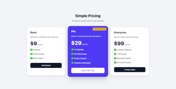
You should see a modern responsive pricing table with:
- Three pricing plans
- Featured “Pro” plan
- Hover effects
- Mobile responsiveness
- Smooth shadows and rounded cards
Step 5 — Understanding the Design
Responsive Grid
<div class="grid gap-8 md:grid-cols-3">This creates:
- Single column on mobile
- Three columns on medium screens and larger
Featured Pricing Card
<div class="bg-indigo-600 text-white scale-105">This visually emphasizes the recommended plan.
Hover Effects
hover:shadow-2xl transition duration-300Adds smooth animation when hovering over cards.
Rounded UI
rounded-3xlCreates modern soft corners popular in SaaS landing pages.
Final Result Features
Your pricing table now includes:
- Clean modern design
- Fully responsive layout
- Highlighted featured plan
- Elegant hover interactions
- Reusable Tailwind components
This component can easily be integrated into:
- SaaS landing pages
- Startup websites
- Hosting services
- Subscription platforms
- Product marketing pages
Conclusion
In this tutorial, you learned how to build a beautiful pricing table using Tailwind CSS.
You also explored:
- Responsive layouts
- Utility-first styling
- Hover animations
- Featured pricing plans
- Modern card design
Tailwind CSS makes it incredibly easy to create professional UI components without writing extensive custom CSS.
From here, you can enhance the pricing table further by adding:
- Dark mode support
- Toggle between monthly/yearly billing
- Icons from Font Awesome or Heroicons
- Payment integration
- Animated transitions
You can find the full source code on our GitHub.
We know that building beautifully designed Mobile and Web Apps from scratch can be frustrating and very time-consuming. Check Envato unlimited downloads and save development and design time.
That's just the basics. If you need more deep learning about CSS, SASS, SCSS, TailwindCSS, you can take the following cheap course:
- CSS - The Complete Guide 2025 (incl. Flexbox, Grid & Sass)
- Advanced CSS and Sass: Flexbox, Grid, Animations and More!
- Creative Advanced CSS & JavaScript Animations - 150 Projects
- CSS Layouts Masterclass: Build Responsive-Adaptive Websites
- The Complete Sass & SCSS Course: From Beginner to Advanced
- SASS - The Complete SASS Course (CSS Preprocessor)
- The Modern Flexbox, Grid, Sass & Animations Developer Course
- Tailwind CSS From Scratch | Learn By Building Projects
- Tailwind CSS v4 - Beginner to Pro
- Tailwind CSS – The Practical Bootcamp in 2025
Happy coding!