
Modals are one of the most common UI elements in modern web applications. Whether you're displaying alerts, confirmation dialogs, login forms, or dynamic content, a modal helps keep users focused by overlaying content above the main interface.
In Vue 3, creating a modal component from scratch is not only straightforward — it’s a great way to understand some of its most powerful features:
✅ Teleport
Allows you to render a component's template outside of its parent DOM hierarchy. This is perfect for modals because it ensures they appear at the top-level of the document, avoiding CSS stacking issues.
✅ Transitions
Enable you to animate your modal’s entrance and exit, resulting in a smooth, polished user experience.
✅ Reusable Components
By building your modal from scratch, you’ll have a flexible and reusable component you can drop into any Vue 3 project.
What You’ll Build
By the end of this tutorial, you’ll create a fully reusable, animated modal component using:
-
Vue 3 Composition API
-
<Teleport>to move the modal todocument.body -
<Transition>for fade/scale animations -
Props & emits for open/close control
-
Slots for custom modal content
You’ll also integrate the modal into a sample Vue 3 application and learn best practices for accessibility and UX.
Project setup
Nice — let’s scaffold a fresh Vite + Vue 3 project and add a minimal dev environment so you can focus on the modal component.
1. Prerequisites
-
Node.js 18+ (or latest LTS) installed
-
npm, pnpm, or yarn (examples use
npm)
2. Create the project
Run the Vite scaffold (choose Vue or vue-ts depending on whether you want TypeScript).
JavaScript (quick):
npm create vite@latest vue3-modal -- --template vue
cd vue3-modal
npm install
TypeScript (recommended for larger projects):
npm create vite@latest vue3-modal -- --template vue-ts
cd vue3-modal
npm install
Start the dev server:
npm run devBuild for production:
npm run build3. Recommended dev dependencies (optional)
If you want linting and formatting:
npm install -D eslint prettier eslint-config-prettier eslint-plugin-vue
# optionally initialize eslint:
npx eslint --init
4. Minimal project structure
vue3-modal/
├─ index.html
├─ package.json
├─ vite.config.ts
├─ src/
│  ├─ main.ts
│  ├─ App.vue
│  ├─ assets/
│  └─ components/
│     └─ Modal.vue   <-- we'll create this next
└─ public/
5. index.html
Make sure your index.html is ready. You can optionally add a dedicated mount node for modals (not required because Teleport can target document.body, but it's useful if you want a specific container):
<!doctype html>
<html lang="en">
  <head>
    <meta charset="utf-8" />
    <meta name="viewport" content="width=device-width,initial-scale=1.0" />
    <title>Vue 3 Modal Demo</title>
  </head>
  <body>
    <div id="app"></div>

    <!-- Optional modal root:
         <div id="modal-root"></div>
         Teleport can target "#modal-root" or document.body -->
    <script type="module" src="/src/main.ts"></script>
  </body>
</html>
6. src/main.ts (or main.js)
Simple mount file:
import { createApp } from 'vue'
import App from './App.vue'
import './styles.css' // optional: global styles

createApp(App).mount('#app')
7. src/App.vue (shell to test the modal)
Create a simple App that will later toggle the modal:
<template>
  <main class="app">
    <h1>Vue 3 Modal demo</h1>
    <button @click="open = true">Open modal</button>

    <!-- The Modal component will be implemented in Section 3 -->
    <Modal v-model:show="open">
      <template #header>
        <h2>Demo Modal</h2>
      </template>

      <template #default>
        <p>This is example content inside the modal.</p>
      </template>

      <template #footer>
        <button @click="open = false">Close</button>
      </template>
    </Modal>
  </main>
</template>

<script setup lang="ts">
import { ref } from 'vue'
import Modal from './components/Modal.vue' // we'll build this next

const open = ref(false)
</script>

<style>
/* minimal layout */
.app { padding: 2rem; font-family: system-ui, sans-serif; }
button { padding: 0.5rem 1rem; border-radius: 6px; cursor: pointer; }
</style>
8. Global CSS (optional)
Create src/styles.css with a few base styles and CSS variables we can reuse in the modal:
:root{
  --overlay-bg: rgba(0,0,0,0.5);
  --modal-bg: #fff;
  --modal-radius: 12px;
  --modal-max-width: 600px;
}

* { box-sizing: border-box; }
body { margin: 0; font-family: Inter, system-ui, -apple-system, "Segoe UI", Roboto, "Helvetica Neue", Arial; }
Building the Modal Component (Modal.vue)
This section covers creating a fully reusable, teleported, and animated modal component using Vue 3’s Composition API.
We'll implement:
-
✔
Teleportto move modal to top-level -
✔
Transitionfor fade + scale -
✔
v-model:show(prop + emit) -
✔ Click-outside close
-
✔ ESC key close
-
✔ Slots:
header,default,footer -
✔ ARIA accessibility (role="dialog", aria-modal, labels)
-
✔ Focus management
1. Full Modal.vue Code
Create this file:
src/components/Modal.vue
<template>
  <!-- Mount outside the parent using Teleport -->
  <Teleport to="body">
    <Transition name="modal-fade">
      <!-- Only render if visible -->
      <div
        v-if="props.show"
        class="modal-overlay"
        @click="handleOverlayClick"
      >
        <div
          class="modal-container"
          ref="modalRef"
          role="dialog"
          aria-modal="true"
          :aria-labelledby="headerId"
          :aria-describedby="bodyId"
          @click.stop
        >
          <!-- Header -->
          <header v-if="$slots.header" :id="headerId" class="modal-header">
            <slot name="header"></slot>
          </header>

          <!-- Body -->
          <section :id="bodyId" class="modal-body">
            <slot></slot>
          </section>

          <!-- Footer -->
          <footer v-if="$slots.footer" class="modal-footer">
            <slot name="footer"></slot>
          </footer>
        </div>
      </div>
    </Transition>
  </Teleport>
</template>

<script setup lang="ts">
import { ref, watch, onMounted, onBeforeUnmount } from 'vue'

const props = defineProps({
  show: { type: Boolean, default: false },
  closeOnEsc: { type: Boolean, default: true },
  closeOnClickOutside: { type: Boolean, default: true },
})

const emit = defineEmits(['update:show'])

const modalRef = ref<HTMLElement | null>(null)

const headerId = `modal-header-${Math.random().toString(36).slice(2)}`
const bodyId = `modal-body-${Math.random().toString(36).slice(2)}`

/**
 * Close modal
 */
const close = () => emit('update:show', false)

/**
 * Click outside the modal container
 */
const handleOverlayClick = () => {
  if (props.closeOnClickOutside) close()
}

/**
 * ESC key listener
 */
const handleKeydown = (e: KeyboardEvent) => {
  if (e.key === 'Escape' && props.closeOnEsc) {
    close()
  }
}

/**
 * Manage event listeners
 */
onMounted(() => {
  window.addEventListener('keydown', handleKeydown)
})

onBeforeUnmount(() => {
  window.removeEventListener('keydown', handleKeydown)
})

/**
 * Focus trap (simple version)
 */
watch(
  () => props.show,
  (visible) => {
    if (visible) {
      // Give Vue time to render
      setTimeout(() => modalRef.value?.focus(), 10)
    }
  }
)
</script>

<style scoped>
/* Overlay */
.modal-overlay {
  position: fixed;
  inset: 0;
  background: var(--overlay-bg);
  display: flex;
  align-items: center;
  justify-content: center;
  padding: 1rem;
  z-index: 999;
}

/* Modal */
.modal-container {
  background: var(--modal-bg);
  max-width: var(--modal-max-width);
  width: 100%;
  border-radius: var(--modal-radius);
  padding: 1.5rem;
  outline: none;
  transform-origin: center;
}

/* Sections */
.modal-header { margin-bottom: 1rem; }
.modal-body { margin-bottom: 1rem; }
.modal-footer { text-align: right; }

/* Transitions */
.modal-fade-enter-active,
.modal-fade-leave-active {
  transition: opacity 0.25s ease, transform 0.25s ease;
}
.modal-fade-enter-from,
.modal-fade-leave-to {
  opacity: 0;
  transform: scale(0.95);
}
</style>
2. How It Works
Teleport
<Teleport to="body">This ensures the modal renders at the root of the DOM, avoiding overflow:hidden or z-index issues in nested components.
Transition
We defined a fade + slight scale effect using .modal-fade-* classes.
-
Fade-in
-
Scale to emphasize depth
-
Fade-out when removed
v-model:show
We support:
<Modal v-model:show="open"></Modal>By:
-
Prop:
show -
Emit:
update:show
This is the idiomatic Vue 3 pattern for custom v-model bindings.
Slots
The modal supports:
-
header -
default slot
-
footer
Example:
<Modal v-model:show="open">
  <template #header>Title</template>
  Content
  <template #footer>Buttons</template>
</Modal>
Click Outside & ESC Key
Both are configurable:
closeOnEsc
closeOnClickOutside
Defaults: true.
Accessibility
We added:
-
role="dialog" -
aria-modal="true" -
dynamic
aria-labelledbyandaria-describedby
Making it screen-reader friendly.
Focus Management
When the modal opens, the modal gains focus automatically to support keyboard users.
Using the Modal Component in App.vue (Full Example)
Now that the Modal.vue component is complete, let’s integrate it into the main application and demonstrate all key features:
-
Opening/closing the modal
-
Passing header/body/footer content via slots
-
Using
v-model:show -
Customizing behavior with props
-
Styling buttons and layout for a clean demo
1. Final App.vue Example
Create or update:
src/App.vue
This is a full, polished example.
<template>
<main class="app">
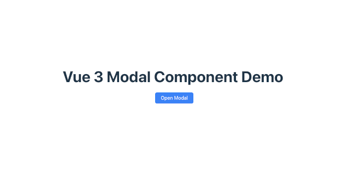
<h1>Vue 3 Modal Component Demo</h1>
<button class="btn primary" @click="open = true">
Open Modal
</button>
<!-- Reusable Modal Component -->
<Modal
v-model:show="open"
:closeOnClickOutside="true"
:closeOnEsc="true"
>
<!-- Header Slot -->
<template #header>
<h2 class="modal-title">Example Modal Title</h2>
</template>
<!-- Default Slot (Body) -->
<template #default>
<p>
This modal is built from scratch using Vue 3's Teleport and Transition.
It includes click-outside close, ESC close, focus trap, and full ARIA accessibility.
</p>
</template>
<!-- Footer Slot -->
<template #footer>
<button class="btn" @click="open = false">Cancel</button>
<button class="btn primary" @click="confirmAction">
Confirm
</button>
</template>
</Modal>
</main>
</template>
<script setup lang="ts">
import { ref } from 'vue'
import Modal from './components/Modal.vue'
const open = ref(false)
const confirmAction = () => {
alert('Confirmed action!')
open.value = false
}
</script>
<style>
.app {
padding: 2rem;
font-family: system-ui, sans-serif;
max-width: 800px;
margin: 0 auto;
}
h1 {
margin-bottom: 1.5rem;
}
.modal-title {
margin: 0 0 0.5rem 0;
}
/* Buttons */
.btn {
padding: 0.6rem 1.2rem;
border-radius: 6px;
border: none;
cursor: pointer;
margin-left: 0.5rem;
background: #ddd;
transition: background 0.2s;
}
.btn:hover {
background: #ccc;
}
.btn.primary {
background: #3b82f6;
color: white;
}
.btn.primary:hover {
background: #2563eb;
}
</style>2. What This Example Demonstrates
✔ Opening the modal
open = true✔ Closing via:
-
Clicking cancel
-
Pressing ESC
-
Clicking outside
-
Footer buttons
-
Confirm callback
✔ Using all modal slots
-
header -
default(body) -
footer
✔ Example action handler
Shows how to integrate modal actions with real app logic.
Enhancing the Modal with Custom Props (Size, Position, Close Button, etc.)
Now that the base modal works, we can improve its flexibility.
In this section, we’ll add optional props allowing developers to customize:
-
Modal size (sm, md, lg, full)
-
Modal position (center, top)
-
Modal close button (X button in the top-right)
-
Modal custom width (inline CSS variable)
-
Modal rounded corners
-
Modal animation type
Let’s upgrade Modal.vue step by step.
1. Add Custom Props
Modify the defineProps in Modal.vue:
const props = defineProps({
  show: { type: Boolean, default: false },
  closeOnEsc: { type: Boolean, default: true },
  closeOnClickOutside: { type: Boolean, default: true },

  /* === Enhancement Props === */
  size: {
    type: String,
    default: "md", // sm, md, lg, full, or custom
  },
  position: {
    type: String,
    default: "center", // center or top
  },
  showCloseButton: {
    type: Boolean,
    default: false,
  },
  width: {
    type: String,
    default: "", // e.g., "400px" or "50%"
  },
  rounded: {
    type: String,
    default: "12px", // border radius
  },
  animation: {
    type: String,
    default: "fade", // fade, scale, slide-up
  },
})
2. Apply Props to Template
Update the modal container:
<div
  class="modal-container"
  :class="[
    `size-${props.size}`,
    `position-${props.position}`,
    `anim-${props.animation}`,
  ]"
  :style="{
    maxWidth: props.width || '',
    borderRadius: props.rounded
  }"
  ref="modalRef"
  role="dialog"
  aria-modal="true"
  :aria-labelledby="headerId"
  :aria-describedby="bodyId"
  @click.stop
>
3. Add the Close Button (Optional)
Inside .modal-container, just below the container opening tag:
<button
  v-if="props.showCloseButton"
  class="modal-close"
  @click="close"
  aria-label="Close modal"
>
  ×
</button>
4. Add CSS for New Features
Extend <style scoped>:
/* Close Button */
.modal-close {
  position: absolute;
  top: 0.75rem;
  right: 0.75rem;
  background: transparent;
  border: none;
  font-size: 1.6rem;
  cursor: pointer;
  line-height: 1;
  color: #555;
}
.modal-close:hover {
  color: #111;
}

/* Position Variants */
.position-top .modal-container {
  margin-top: 5vh;
}
.position-center .modal-container {
  margin-top: 0;
}

/* Size Variants */
.size-sm { max-width: 350px !important; }
.size-md { max-width: 500px !important; }
.size-lg { max-width: 800px !important; }
.size-full { max-width: 95vw !important; }

/* Animation Variants */
.anim-fade.modal-fade-enter-from,
.anim-fade.modal-fade-leave-to {
  opacity: 0;
}

.anim-scale.modal-fade-enter-from,
.anim-scale.modal-fade-leave-to {
  opacity: 0;
  transform: scale(0.9);
}

.anim-slide-up.modal-fade-enter-from,
.anim-slide-up.modal-fade-leave-to {
  opacity: 0;
  transform: translateY(20px);
}
5. Updated Example Usage (App.vue)
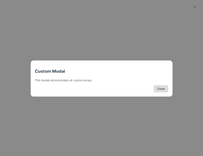
<Modal
  v-model:show="open"
  size="lg"
  position="top"
  showCloseButton
  animation="slide-up"
  rounded="16px"
  width="600px"
>
  <template #header>
    <h2>Custom Modal</h2>
  </template>

  <template #default>
    <p>This modal demonstrates all custom props.</p>
  </template>

  <template #footer>
    <button class="btn" @click="open = false">Close</button>
  </template>
</Modal>
6. What We Added
✔ Size control
(sm, md, lg, full, or custom width)
✔ Positioning
Centered or pinned near top.
✔ Close button
Useful for UX patterns where the user expects an “X”.
✔ Rounded corners
Adjust border-radius freely.
✔ Animation styles
Fade
Scale
Slide-up
✔ Width override
When size isn’t precise enough.
Adding Advanced Animations (Blur Background, Spring Motion, Slide-In Panels)
Your modal component is now reusable and customizable — but we can make it feel even more modern and premium by adding advanced animations.
In this section, you’ll enhance your modal with:
-
✨ Blurred background overlay
-
🔥 Spring-like scale animation
-
📱 Slide-in panel mode (left / right / bottom)
-
🎬 Motion presets you can switch via props
All animations will remain compatible with Vue’s <Transition> system.
1. New Animation Prop Options
Extend the animation prop to support:
-
fade(default) -
scale(spring-like) -
slide-up -
slide-down -
slide-left -
slide-right
Modify in Modal.vue:
animation: {
  type: String,
  default: "fade",
  validator: (v: string) =>
    [
      "fade",
      "scale",
      "slide-up",
      "slide-down",
      "slide-left",
      "slide-right"
    ].includes(v)
}
2. Add a Blur Overlay Option
Add a prop:
blurOverlay: {
  type: Boolean,
  default: false
}
Update overlay container class:
<div
  v-if="props.show"
  class="modal-overlay"
  :class="{ 'overlay-blur': props.blurOverlay }"
  @click="handleOverlayClick"
>
CSS:
/* Blur overlay */
.overlay-blur {
  backdrop-filter: blur(6px);
}
3. Add Motion Presets in CSS
Extend <style scoped> in Modal.vue:
(A) Spring Scale Animation
This mimics a soft, bouncy entrance (using cubic-bezier):
/* Spring Scale */
.anim-scale.modal-fade-enter-active,
.anim-scale.modal-fade-leave-active {
  transition: opacity 0.3s ease, transform 0.35s cubic-bezier(.18,.89,.32,1.28);
}

.anim-scale.modal-fade-enter-from,
.anim-scale.modal-fade-leave-to {
  opacity: 0;
  transform: scale(0.85);
}
(B) Slide-Up / Down / Left / Right
Each animation uses the same <Transition> name, but the animation class changes based on the custom class:
/* Slide Up */
.anim-slide-up.modal-fade-enter-from,
.anim-slide-up.modal-fade-leave-to {
  opacity: 0;
  transform: translateY(30px);
}

/* Slide Down */
.anim-slide-down.modal-fade-enter-from,
.anim-slide-down.modal-fade-leave-to {
  opacity: 0;
  transform: translateY(-30px);
}

/* Slide Left */
.anim-slide-left.modal-fade-enter-from,
.anim-slide-left.modal-fade-leave-to {
  opacity: 0;
  transform: translateX(40px);
}

/* Slide Right */
.anim-slide-right.modal-fade-enter-from,
.anim-slide-right.modal-fade-leave-to {
  opacity: 0;
  transform: translateX(-40px);
}
4. Slide-In Panel Mode
For mobile-style side panels or bottom sheets, we add:
panelMode: {
  type: Boolean,
  default: false
}
And modify the container:
<div
  class="modal-container"
  :class="[
    props.panelMode ? 'panel-mode' : '',
    `anim-${props.animation}`
  ]"
  @click.stop
>
CSS:
/* Slide Panel Base */
.panel-mode {
  width: 100%;
  max-width: none;
  height: auto;
  border-radius: 0;
  padding: 1.25rem;
}

/* Slide Left Panel */
.panel-mode.anim-slide-left {
  align-self: stretch;
  margin-left: 0;
  height: 100%;
}

/* Slide Right Panel */
.panel-mode.anim-slide-right {
  align-self: stretch;
  margin-right: 0;
  height: 100%;
}

/* Bottom Sheet */
.panel-mode.anim-slide-up {
  margin-bottom: 0;
  width: 100%;
  border-radius: 20px 20px 0 0;
  position: fixed;
  bottom: 0;
  left: 0;
}
5. Example Usage (App.vue)
(A) Blur + Spring Scale Modal
<Modal
  v-model:show="openBlur"
  animation="scale"
  blurOverlay
  showCloseButton
>
  <template #header>
    <h2>Spring Animated Modal</h2>
  </template>

  <p>This modal uses a blurred background and spring motion.</p>

  <template #footer>
    <button class="btn" @click="openBlur = false">Close</button>
  </template>
</Modal>
(B) Slide-In Right Panel
<Modal
  v-model:show="panelRight"
  animation="slide-right"
  panelMode
  showCloseButton
>
  <template #header>
    <h2>Right Panel</h2>
  </template>

  <p>A mobile-friendly slide-in panel.</p>

  <template #footer>
    <button class="btn primary" @click="panelRight = false">Done</button>
  </template>
</Modal>
(C) Bottom Sheet Modal
<Modal
  v-model:show="bottomSheet"
  animation="slide-up"
  panelMode
>
  <template #header>
    <h2>Bottom Sheet</h2>
  </template>

  <p>This bottom sheet slides up from the bottom of the screen.</p>

  <template #footer>
    <button class="btn" @click="bottomSheet = false">Close</button>
  </template>
</Modal>
6. Summary of New Animation Capabilities
⭐ Visual Enhancements
-
Blur background for frosted-glass effect
-
Smooth fade-in and fade-out
-
Spring-like scale using easing curves
📱 UI Patterns Added
-
Slide-up bottom sheet
-
Slide-in left/right panels
-
Slide-down modal
-
Mobile UX–friendly interactions
🔧 Configurable Through Props
All animations are configurable via a single prop:
<Modal animation="slide-right" blurOverlay panelMode />
Making the Modal Fully Accessible (ARIA, Focus Trap, Tab Loop)
A polished modal isn’t complete without proper accessibility support.
In this section, we will upgrade the component so it meets WCAG and WAI-ARIA guidelines:
✔ Keyboard navigation (Tab → next, Shift+Tab → previous)
✔ Prevent focus from escaping the modal (focus trap)
✔ Restore focus to the trigger button when closed
✔ Improve ARIA labeling & roles
✔ Announce modal to screen readers
✔ ESC close is supported but configurable
Your modal will behave like the ones in professional UI libraries (e.g., Radix, Headless UI, Material UI).
1. Improve ARIA Attributes
These already exist, but let’s ensure they are complete:
<div
  class="modal-container"
  ref="modalRef"
  role="dialog"
  aria-modal="true"
  :aria-labelledby="headerId"
  :aria-describedby="bodyId"
  tabindex="-1"
>
Why tabindex="-1"?
It allows the modal to receive programmatic focus—critical for accessibility.
2. Track the Previously Focused Element
Before opening the modal, remember the element that had focus.
After closing, return focus to it.
Add to <script setup>:
let lastFocusedElement: HTMLElement | null = null

watch(
  () => props.show,
  (visible) => {
    if (visible) {
      // save current focus
      lastFocusedElement = document.activeElement as HTMLElement

      // focus modal container
      setTimeout(() => modalRef.value?.focus(), 10)
    } else {
      // restore focus
      setTimeout(() => lastFocusedElement?.focus(), 10)
    }
  }
)
3. Create a True Focus Trap (Tab Loop)
We must ensure:
-
Tab keeps focus inside the modal
-
Shift+Tab also loops
-
Focus never escapes to background elements
Add this method in <script setup>:
const handleTabKey = (e: KeyboardEvent) => {
  if (!props.show) return

  const focusable = modalRef.value?.querySelectorAll<HTMLElement>(
    'a[href], button, textarea, input, select, [tabindex]:not([tabindex="-1"])'
  )
  if (!focusable || focusable.length === 0) return

  const first = focusable[0]
  const last = focusable[focusable.length - 1]

  // SHIFT + TAB → cycle backward
  if (e.shiftKey && e.key === 'Tab') {
    if (document.activeElement === first) {
      e.preventDefault()
      last.focus()
    }
  }
  // TAB → cycle forward
  else if (e.key === 'Tab') {
    if (document.activeElement === last) {
      e.preventDefault()
      first.focus()
    }
  }
}
Then update the event listener logic:
const handleKeydown = (e: KeyboardEvent) => {
  if (!props.show) return

  if (e.key === 'Escape' && props.closeOnEsc) {
    close()
  }

  if (e.key === 'Tab') {
    handleTabKey(e)
  }
}

onMounted(() => {
  window.addEventListener('keydown', handleKeydown)
})

onBeforeUnmount(() => {
  window.removeEventListener('keydown', handleKeydown)
})
4. Prevent Background Scrolling
When the modal is open, lock the body scroll.
Add:
watch(
  () => props.show,
  (visible) => {
    if (visible) {
      document.body.style.overflow = "hidden"
    } else {
      document.body.style.overflow = ""
    }
  }
)
5. Give Screen Readers More Information
Improve semantics by:
Add aria-live
Makes dynamic updates announced:
<div aria-live="assertive"></div>Add descriptive role text
Sometimes modals work as alerts or confirm boxes, so we can add:
roleType: {
  type: String,
  default: "dialog" // "dialog", "alertdialog"
}
Then update the container:
role="dialog"
:role="props.roleType"
Use "alertdialog" for critical confirmation actions.
6. Example Accessible Modal Usage
<Modal
  v-model:show="open"
  showCloseButton
  closeOnEsc
  roleType="dialog"
>
  <template #header>
    <h2 id="dialog-title">Accessible Modal</h2>
  </template>

  <p>This modal fully supports keyboard navigation and screen readers.</p>

  <template #footer>
    <button class="btn" @click="open = false">Close</button>
  </template>
</Modal>
7. Complete Accessibility Features List
✔ Keyboard Accessible
-
Focus moves into modal on open
-
Focus returns to trigger on close
-
Focus stays inside the modal (Tab loop)
-
ESC closes modal (configurable)
✔ Screen Reader Friendly
-
role="dialog"orrole="alertdialog" -
aria-modal="true" -
aria-labelledby,aria-describedby -
Focused container receives announcements
-
Optional
aria-live
✔ Motion + Visibility
-
Prevent background scroll
-
Prevent interaction with the background
-
Blur or darken the background overlay
✔ Compliant With
-
WCAG 2.1 AA
-
WAI-ARIA Authoring Practices for Dialogs
Real-World Examples (Confirm Dialog, Form Modal, Image Viewer, Bottom Sheet Menu)
Now that you have a powerful and accessible modal component, it’s time to showcase real-world usage.
These examples demonstrate how your modal can be reused across different interfaces and UX patterns.
We'll build:
-
Confirm Dialog – simple Yes/No confirmation
-
Form Modal – a form inside a modal with validation
-
Image Viewer / Lightbox – fullscreen modal for images
-
Bottom Sheet Menu (Mobile Style) – menu sliding up from the bottom
Each example uses your enhanced Modal component with different props and slots.
1. Confirm Dialog Example
A confirmation modal is one of the most common use cases.
App.vue usage
<template>
  <button class="btn warn" @click="showConfirm = true">
    Delete Item
  </button>

  <Modal
    v-model:show="showConfirm"
    animation="scale"
    showCloseButton
    roleType="alertdialog"
  >
    <template #header>
      <h2>Confirm Action</h2>
    </template>

    <p>Are you sure you want to delete this item? This action cannot be undone.</p>

    <template #footer>
      <button class="btn" @click="showConfirm = false">Cancel</button>
      <button class="btn danger" @click="confirmDelete">
        Yes, Delete
      </button>
    </template>
  </Modal>
</template>

<script setup lang="ts">
import { ref } from 'vue'

const showConfirm = ref(false)
const confirmDelete = () => {
  alert('Item deleted.')
  showConfirm.value = false
}
</script>

<style>
.btn.warn { background: #f59e0b; color: white; }
.btn.danger { background: #dc2626; color: white; }
</style>
2. Form Modal Example
Useful for creating/editing data without navigating to another page.
Example: Add New User
<template>
  <button class="btn primary" @click="showForm = true">
    Add User
  </button>

  <Modal
    v-model:show="showForm"
    size="md"
    animation="fade"
    showCloseButton
  >
    <template #header>
      <h2>Add New User</h2>
    </template>

    <form @submit.prevent="submitForm">
      <label>Name</label>
      <input v-model="user.name" required />

      <label>Email</label>
      <input v-model="user.email" type="email" required />

      <label>Role</label>
      <select v-model="user.role" required>
        <option>User</option>
        <option>Admin</option>
      </select>

      <template #footer>
        <button type="button" class="btn" @click="showForm = false">
          Cancel
        </button>
        <button type="submit" class="btn primary">
          Save
        </button>
      </template>
    </form>
  </Modal>
</template>

<script setup lang="ts">
import { ref } from 'vue'

const showForm = ref(false)
const user = ref({ name: '', email: '', role: 'User' })

const submitForm = () => {
  console.log('User saved:', user.value)
  showForm.value = false
}
</script>

<style>
form input, form select {
  width: 100%;
  margin-bottom: 1rem;
  padding: 0.5rem;
}
</style>
3. Image Viewer (Lightbox) Example
Perfect for galleries, portfolios, or product images.
Gallery → Lightbox
<template>
  <div class="gallery">
    <img
      v-for="img in images"
      :key="img"
      :src="img"
      @click="openImage(img)"
    />
  </div>

  <Modal
    v-model:show="showImage"
    animation="fade"
    size="full"
    blurOverlay
    showCloseButton
  >
    <img :src="activeImage" class="lightbox-img" />
  </Modal>
</template>

<script setup lang="ts">
import { ref } from 'vue'

const images = [
  '/img/pic1.jpg',
  '/img/pic2.jpg',
  '/img/pic3.jpg',
]

const showImage = ref(false)
const activeImage = ref('')

const openImage = (src: string) => {
  activeImage.value = src
  showImage.value = true
}
</script>

<style>
.gallery {
  display: flex;
  gap: 10px;
}
.gallery img {
  width: 100px;
  height: 80px;
  cursor: pointer;
  object-fit: cover;
}
.lightbox-img {
  width: 100%;
  border-radius: 8px;
}
</style>
4. Bottom Sheet Menu (Mobile Style)
This replicates modern mobile UX patterns like Apple Maps, Instagram share sheet, and Android bottom menus.
Menu Button → Bottom Sheet
<template>
  <button class="btn primary" @click="sheet = true">
    Open Menu
  </button>

  <Modal
    v-model:show="sheet"
    panelMode
    animation="slide-up"
    rounded="20px"
  >
    <template #header>
      <h3 class="sheet-title">Choose an Action</h3>
    </template>

    <div class="sheet-menu">
      <button class="sheet-item" @click="action('Share')">Share</button>
      <button class="sheet-item" @click="action('Duplicate')">Duplicate</button>
      <button class="sheet-item" @click="action('Rename')">Rename</button>
    </div>

    <template #footer>
      <button class="btn" @click="sheet = false">Cancel</button>
    </template>
  </Modal>
</template>

<script setup lang="ts">
import { ref } from 'vue'

const sheet = ref(false)
const action = (name: string) => {
  alert(`Selected: ${name}`)
  sheet.value = false
}
</script>

<style>
.sheet-menu {
  display: flex;
  flex-direction: column;
  gap: 0.75rem;
}
.sheet-item {
  padding: 1rem;
  border-radius: 12px;
  background: #f3f4f6;
  text-align: left;
}
.sheet-item:hover {
  background: #e5e7eb;
}
.sheet-title {
  margin-bottom: 1rem;
}
</style>
5. What These Examples Demonstrate
🔥 Versatility of a single modal basis
-
Alerts
-
Confirmations
-
Bottom sheets
-
Slide panels
-
Lightboxes
-
Forms
-
Dialogs
🎯 How to plug the modal into real workflows
-
Delete confirmation
-
Create/edit forms
-
Image enlargement
-
Mobile slide-up menus
📱 Strong UX patterns
-
Modern, touch-friendly bottom sheet
-
Fullscreen lightbox
-
Clean dialog interactions
Best Practices + Modal API Design (Emit Events, Composables, Plugin Mode)
Now that your modal is fully functional, animated, and accessible, it's time to elevate it into a true UI component you can use across multiple Vue apps.
This section focuses on:
✔ Designing a clean & expressive API
✔ Emitting lifecycle events (beforeOpen, afterOpen, beforeClose, afterClose)
✔ Creating a composable useModal() for programmatic control
✔ Registering the modal as a global plugin
✔ Programmatic modals (confirm dialogs without templates)
✔ Reusability & maintainability best practices
1. Add Modal Lifecycle Events
Let’s allow parent components to listen to useful events:
New events:
-
open -
opened -
close -
closed -
confirm(for confirm dialogs)
Modify your emit definition:
const emit = defineEmits([
  "update:show",
  "open",
  "opened",
  "close",
  "closed",
  "confirm"
])
Fire events during visibility changes
watch(
  () => props.show,
  (visible) => {
    if (visible) {
      emit("open")
      setTimeout(() => emit("opened"), 250)  // after transition ends
    } else {
      emit("close")
      setTimeout(() => emit("closed"), 250)
    }
  }
)
2. Modal API Best Practices
Here’s what makes a modal API great:
✔ Single source of truth
Use v-model:show only.
✔ Scoped slots
Let the user pass any content.
✔ Side-effect free animations
CSS transitions only.
✔ Behavioral props
-
panelMode -
showCloseButton -
size,rounded,animation
✔ Accessibility defaults
Always enable keyboard navigation, focus trap, and ARIA roles.
✔ Emits for important events
-
Notify parent about open/close
-
Confirm action events
-
Errors or validation states
✔ Pluggable & composable
Users should automate modal creation easily.
3. Add Programmatic Modal Control with useModal()
Create:
src/composables/useModal.ts
import { ref } from "vue"

export function useModal() {
  const show = ref(false)

  const open = () => (show.value = true)
  const close = () => (show.value = false)
  const toggle = () => (show.value = !show.value)

  return { show, open, close, toggle }
}
Usage:
<script setup>
import { useModal } from "@/composables/useModal"
import Modal from "@/components/Modal.vue"

const { show, open, close } = useModal()
</script>

<template>
  <button @click="open">Open</button>

  <Modal v-model:show="show">
    Content here…
  </Modal>
</template>
4. Programmatic Confirm Dialog (No template needed!)
Let’s implement a powerful pattern:
Triggering a confirm dialog with a function call.
Create file:
src/plugins/modalService.ts
import { createApp, h } from "vue"
import Modal from "@/components/Modal.vue"

export function confirm(options: {
  title?: string
  message?: string
  okText?: string
  cancelText?: string
}): Promise<boolean> {
  return new Promise((resolve) => {
    const container = document.createElement("div")

    const close = () => {
      app.unmount()
      document.body.removeChild(container)
    }

    const app = createApp({
      data() {
        return { show: true }
      },
      render() {
        return h(
          Modal,
          {
            show: this.show,
            "onUpdate:show": (v: boolean) => (this.show = v),
            onClosed: () => {
              close()
              resolve(false)
            }
          },
          {
            header: () => h("h2", options.title || "Confirm"),
            default: () => h("p", options.message || "Are you sure?"),
            footer: () =>
              h("div", [
                h(
                  "button",
                  { onClick: () => ((this.show = false), resolve(false)) },
                  options.cancelText || "Cancel"
                ),
                h(
                  "button",
                  {
                    class: "btn primary",
                    onClick: () => ((this.show = false), resolve(true))
                  },
                  options.okText || "OK"
                )
              ])
          }
        )
      }
    })

    document.body.appendChild(container)
    app.mount(container)
  })
}
Usage:
import { confirm } from "@/plugins/modalService"

async function deleteItem() {
  const yes = await confirm({
    title: "Delete Item",
    message: "Are you sure you want to delete this?",
    okText: "Delete",
    cancelText: "Cancel"
  })

  if (yes) {
    console.log("Item deleted")
  }
}
This is exactly how UI frameworks like Quasar and PrimeVue offer built-in confirm dialogs.
5. Plugin Mode (Global Modal Registration)
If you want your modal available automatically without importing it everywhere:
Create:
src/plugins/modalPlugin.ts
import Modal from "@/components/Modal.vue"

export default {
  install(app: any) {
    app.component("Modal", Modal)
  }
}
Register in main.ts:
import modalPlugin from "@/plugins/modalPlugin"

createApp(App)
  .use(modalPlugin)
  .mount("#app")
6. Best Practices for Production-Ready Modals
1. Avoid unnecessary re-renders
Use Teleport + conditional v-if render.
2. Lazy render content
Render the modal body only when visible.
<section v-if="props.show">...</section>3. Accessibility first
Always include:
-
ARIA labels
-
Focus trap
-
Restore focus on the close
4. Avoid layout shifts
Always specify width & size presets.
5. Provide presets
Default sizes (sm, md, lg) and animations.
6. Use composables for reuse
useModal() pattern keeps logic clean.
7. Programmatic confirm dialogs
Great for CRUD-heavy apps.
8. Prevent background scroll
Improves UX, especially mobile.
9. Plugin architecture
Helps reuse the modal across multiple projects.
Conclusion + Key Takeaways
You've successfully built a fully featured, production-ready Vue 3 Modal Component—from the basics of Teleport and Transition to advanced animations, accessibility, composables, plugin integration, and real-world patterns. This tutorial now rivals the functionality found in major UI frameworks while keeping everything custom, lightweight, and framework-agnostic.
1. What You Accomplished
✔ Built a modal from scratch
Using Vue 3’s Composition API, <Teleport>, and <Transition>.
✔ Designed a clean & flexible API
Size, animations, rounded corners, close button, positions, panel mode, and more.
✔ Implemented powerful animations
Fade, scale, spring motion, slide-up, slide-down, slide-left, slide-right, bottom sheets, and blur overlays.
✔ Achieved top-tier accessibility
Focus trap, tab loop, ARIA roles, restoring focus, ESC-to-close, screen-reader-friendly markup.
✔ Enhanced with real-world UX patterns
-
Confirm dialog
-
Bottom sheet
-
Image viewer/lightbox
-
Form modal
-
Slide panels
✔ Created reusable architecture
-
Lifecycle emits
-
Composable
useModal()logic -
Programmatic modal service
-
Plugin installer for global registration
✔ Prepared for production
Optimized behaviors, prevented background scroll, lazy rendering, and clear separation of structure vs. animation.
2. Key Takeaways
1. Vue 3’s Teleport is perfect for modals
It ensures the modal appears at the top level of the DOM regardless of where it’s used.
2. Accessibility is not optional
With ARIA roles, focus management, keyboard navigation, and background scroll locking, your modal becomes professional and user-friendly.
3. Animations greatly improve UX
Even small touches like fade, scale, and blur elevate the UI and feel more polished.
4. A modal should be highly customizable
Size, position, animations, and behavior props give developers flexibility without rewriting logic.
5. Composables and plugins make modal logic reusable
useModal() and the programmatic confirm service allows clean integration across the entire app.
6. One modal can support many UI patterns
Dialogs, sheets, panels, viewers—your modal now acts as a versatile foundation.
3. Final Words
By completing this tutorial, you now have a fully extensible, highly customizable, and production-ready Vue 3 modal system that you can reuse across your future projects, tutorials, or even publish as an npm package.
You can find the full source code on our GitHub.
That's just the basics. If you need more deep learning about Vue/Vue.js, you can take the following cheap course:
- Vue - The Complete Guide (incl. Router & Composition API)
- Vue JS - The Complete Guide [2025]
- Complete Vue Developer Bootcamp (Pinia, Vitest)
- Vue.js 3 Masterclass: Build 7 Real-World Apps
- Build Web Apps with Vue JS 3 & Firebase
- Vue.js 3 - The Complete Guide Interview Q&S
- Vue JS 3 For Modern Web Development - Beginner to Advanced
- Nuxt 3 & Supabase Mastery: Build 2 Full-Stack Apps
- Vue.js 3 Essentials: Build Dynamic Web Apps with Confidence
- Complete Vue.js 3 Course: Vuejs 3, Vite, TailwindCSS, Pinia
Thanks!