
The modern web landscape is filled with powerful frameworks—React, Angular, Vue, Svelte—but sometimes the best solution doesn’t require a framework at all. Web Components give developers a native, standards-based way to build reusable UI elements directly in the browser using plain HTML, CSS, and JavaScript.
Web Components provide a way to create custom, encapsulated, and reusable UI elements that work anywhere: inside frameworks, across frameworks, or without any framework. This makes them especially valuable for design systems, shared component libraries, enterprise dashboards, and highly modular applications.
In this tutorial, you’ll learn:
-
How Web Components work
-
How to build your own Custom Elements
-
How the Shadow DOM isolates styles and structure
-
How to use slots for flexible and reusable content
-
How to create real, framework-agnostic components for production
By the end, we’ll build a polished UI component:
👉 <djam-card> — a fully encapsulated card element with custom styling, title, and slotted content.
Ultimately, Web Components give you the power of framework-level components—without the heavy bundle sizes, build tools, or libraries. They are fast, portable, and future-proof, making them a key skill in modern frontend engineering.
Understanding Web Components


Web Components are built on a collection of modern web platform standards that allow developers to create reusable, encapsulated, and framework-agnostic UI elements. These standards are natively supported by browsers, meaning no external library is required to define or use them.
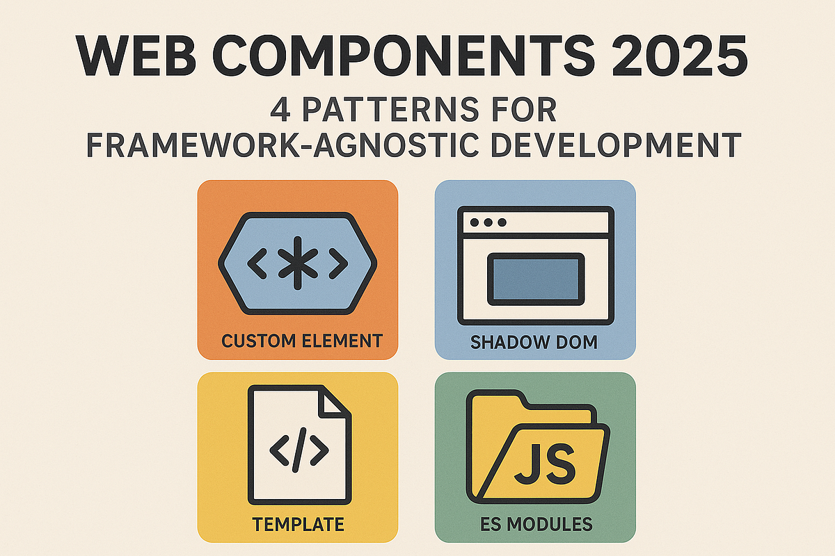
At the heart of Web Components are four key specifications:
1. Custom Elements — Define Your Own HTML Tags
Custom Elements let you create entirely new HTML elements, such as:
<user-profile></user-profile>
<theme-switch></theme-switch>
<djam-card></djam-card>
You define them by extending HTMLElement (or derived classes like HTMLButtonElement) and registering them using:
customElements.define('djam-card', DjamCard);Custom Elements come with lifecycle callbacks:
-
connectedCallback() -
disconnectedCallback() -
attributeChangedCallback()
This gives you control from creation to destruction.
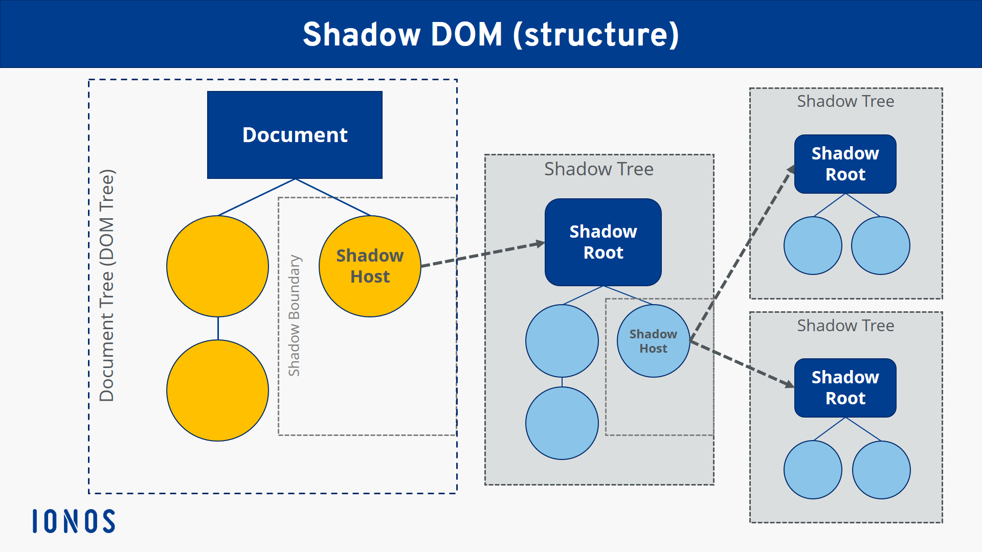
2. Shadow DOM — Encapsulation for Structure & Styles
Shadow DOM allows a component to have its own isolated DOM tree, completely separate from the main document. Styles inside this shadow tree do not leak out, and outside styles do not leak in—solving a long-standing problem in web development.
Benefits:
-
Style isolation
-
Avoid CSS collisions
-
Predictable components
-
Secure, encapsulated markup
Shadow DOM can be open (accessible through JavaScript) or closed (hidden).
this.attachShadow({ mode: 'open' });3. HTML Templates — Blueprint for Reusable Markup
The <template> element lets you store HTML that isn’t rendered until you clone and insert it. Templates are ideal for:
-
Repeated UI structures
-
Dynamically updating components
-
Cleaner, declarative markup
Example:
<template id="card-template">
  <style>
    /* Scoped CSS will go inside Shadow DOM */
  </style>
  <div class="card">
    <slot></slot>
  </div>
</template>
Templates become powerful when combined with Shadow DOM.
4. ES Modules — Component-Based Architecture
With native ES modules, you can organize Web Components into separate files:
<script type="module" src="djam-card.js"></script>This makes your components:
-
Modular
-
Reusable
-
Tree-shakable
-
Easy to load only when needed
Modules also allow modern JavaScript (imports, exports, classes).
Should You Use Web Components?
Web Components shine when you need:
-
Reusable UI elements across multiple projects
-
Framework-neutral components
-
A design system used by diverse stacks
-
Encapsulated UI with predictable behavior
They may not be ideal when:
-
You need reactive data binding like React/Vue (unless using lit-html or SolidJS interoperability)
-
SEO-heavy content needs server-side rendering
But overall, Web Components are now widely supported and production-ready.
Setting Up the Project (No Framework Needed!)


One of the biggest advantages of Web Components is how lightweight and simple the setup is.
You don’t need Node.js, bundlers, or frameworks to get started—just HTML, CSS, and JavaScript.
For this tutorial, we’ll build everything using a minimalist folder structure so developers can easily follow and replicate your project.
📁 Project Structure
Create a new folder such as web-components-demo, then inside it create the following structure:
web-components-demo/
│
├── index.html
├── components/
│     └── djam-card.js
└── assets/
└── styles.css (optional)-
index.html— the entry point -
components/— holds all Web Component classes -
djam-card.js— our main component -
assets/styles.css— global styles (if needed)
🧱 Basic HTML File
Let’s create a simple HTML structure to load our component.
index.html
<!DOCTYPE html>
<html lang="en">
<head>
  <meta charset="UTF-8" />
  <meta name="viewport" content="width=device-width, initial-scale=1.0" />
  <title>Web Components Demo</title>
</head>
<body>
  <h1>Web Components: Djam Card Demo</h1>

  <!-- Custom element will be used here -->
  <djam-card title="Hello World">
    This is content inside a Web Component!
  </djam-card>

  <!-- Load component from ES module -->
  <script type="module" src="./components/djam-card.js"></script>
</body>
</html>
Key points:
-
Web Components must be loaded via ES modules (
type="module"). -
Custom elements (like
<djam-card>) can be used before or after the script loads—browsers upgrade them automatically.
💡 Optional: Using a Local Server
Although you can open this file directly in a browser, ES modules work more reliably on a local server.
You can start one easily:
Using VS Code
-
Right-click → Open with Live Server (if extension installed)
Using Python
python3 -m http.server 8000Using Node.js (if installed)
npx serveNow visit:
👉 http://localhost:8000
✔️ You’re Ready to Build Your First Component
In the next section, we’ll start with the basics and create a simple <djam-hello> custom element before building the full card component.
Creating Your First Custom Element

Let’s start by building a simple custom element to understand how Web Components work.
In this section, we’ll build a <djam-hello> component that displays a small greeting message.
This will introduce you to:
-
How to define a custom element using JavaScript
-
Lifecycle callbacks (
connectedCallback, etc.) -
Adding content inside the component
-
Using attributes
📌 Step 1: Create the Component File
Inside your components/ folder, create a file named:
components/djam-hello.jsThen add the following code:
class DjamHello extends HTMLElement {
  constructor() {
    super();
    this.innerHTML = `<p>Hello from <strong>DjamHello</strong> component!</p>`;
  }

  connectedCallback() {
    console.log('djam-hello was added to the page.');
  }

  disconnectedCallback() {
    console.log('djam-hello was removed from the page.');
  }
}

customElements.define('djam-hello', DjamHello);
What’s happening here?
-
We extend
HTMLElement→ now we can define our own HTML tag. -
constructor()runs when the element is created. -
connectedCallback()runs when the element is added to the DOM. -
disconnectedCallback()runs when removed. -
customElements.define()registers the tag name.
📌 Step 2: Use <djam-hello> in HTML
Open index.html and add the following:
<script type="module" src="./components/djam-hello.js"></script>

<djam-hello></djam-hello>
You should now see:
Hello from DjamHello component!
📌 Step 3: Adding Attributes
Custom elements can be configured using attributes:
<djam-hello greeting="Selamat Datang!"></djam-hello>Modify your component to react to this:
class DjamHello extends HTMLElement {
  static get observedAttributes() {
    return ['greeting'];
  }

  constructor() {
    super();
    this.render();
  }

  attributeChangedCallback(name, oldValue, newValue) {
    this.render();
  }

  render() {
    const greeting = this.getAttribute('greeting') || 'Hello';
    this.innerHTML = `<p>${greeting} from <strong>DjamHello</strong> component!</p>`;
  }
}

customElements.define('djam-hello', DjamHello);
Now changing attributes updates the UI dynamically.
✨ What You’ve Learned So Far
You now know how to build a basic custom element using:
-
Lifecycle methods
-
Attributes
-
Dynamic rendering
This sets the foundation for the next section, where we’ll improve encapsulation using the Shadow DOM.
Styling Components with Shadow DOM

So far, our custom elements work—but they still share styles with the rest of the page.
This can create conflicts:
-
Global CSS is leaking into your component
-
Component styles are unintentionally affecting the page
-
Hard-to-maintain UI inconsistencies
The Shadow DOM solves all of this by giving your component a private, encapsulated DOM tree with its own styles.
Let’s learn how to use it.
📌 What Is the Shadow DOM?
The Shadow DOM is a separate subtree attached to an element—styles inside it do not leak out, and external styles cannot affect it.
Think of it like a component living inside a CSS sandbox.
To create a Shadow DOM, you attach a shadow root:
this.attachShadow({ mode: 'open' });-
open→ accessible viaelement.shadowRoot -
closed→ completely hidden (not recommended for tutorials or reusable components)
📌 Enhancing <djam-hello> With Shadow DOM
Let’s upgrade our previous component.
Create or update:
components/djam-hello.jsclass DjamHello extends HTMLElement {
constructor() {
super();
this.attachShadow({ mode: 'open' }); // enable Shadow DOM
this.render();
}
static get observedAttributes() {
return ['greeting'];
}
attributeChangedCallback() {
this.render();
}
render() {
const greeting = this.getAttribute('greeting') || 'Hello';
this.shadowRoot.innerHTML = `
<style>
p {
color: #0d6efd;
font-family: Arial, sans-serif;
border-left: 4px solid #0d6efd;
padding-left: 8px;
}
</style>
<p>${greeting} from <strong>DjamHello</strong> component!</p>
`;
}
}
customElements.define('djam-hello', DjamHello);🔍 What’s New Here?
1. Private Styles
-
The
<style>tag inside the shadow root affects only this component. -
Global CSS from the page cannot override it.
2. Encapsulated Markup
Everything rendered is:
this.shadowRoot.innerHTML = ...not inside this.innerHTML.
3. Cleaner Components
-
No CSS collisions
-
Predictable rendering
-
Easier reuse across projects or frameworks
📌 Host & Part Styling
The Shadow DOM provides two powerful styling features:
:host — Style the Component Itself
:host {
  display: block;
  margin: 10px 0;
}
::part() — Expose Elements for External Styling
You can opt-in to allow some styling from outside (for design systems):
Inside component:
<p part="text">Hello!</p>On the page:
djam-hello::part(text) {
  color: red;
}
This gives you full control.
✨ What’s Next
Now you understand:
-
Shadow DOM encapsulation
-
Private styles
-
Component host styling
-
Exposing elements via parts
Next, we’ll build a real, reusable UI element:
Building a Real Component — Djam Card

Now we’re ready to build a real, reusable, production-friendly Web Component:
👉 <djam-card> — a modern card UI with slots, title, styling, and encapsulation.
This is the component you’ll showcase in your Djamware tutorial as a practical, framework-agnostic Web Component.
📌 Component Features
Our <djam-card> will include:
✔️ Shadow DOM encapsulation
✔️ Customizable title attribute
✔️ Slotted content (<slot>)
✔️ Responsive design
✔️ Styled container, header, and body
✔️ Host styling for layout control
📁 Step 1: Create the File
Create:
components/djam-card.js📌 Step 2: Implement the Component
Add this code:
class DjamCard extends HTMLElement {
  constructor() {
    super();
    this.attachShadow({ mode: 'open' });
    this.render();
  }

  static get observedAttributes() {
    return ['title'];
  }

  attributeChangedCallback() {
    this.render();
  }

  render() {
    const title = this.getAttribute('title') || 'Untitled Card';

    this.shadowRoot.innerHTML = `
      <style>
        :host {
          display: block;
          max-width: 400px;
          border-radius: 10px;
          box-shadow: 0 4px 12px rgba(0,0,0,0.1);
          overflow: hidden;
          background: #fff;
          font-family: Arial, sans-serif;
        }

        .header {
          background: #0d6efd;
          color: white;
          padding: 12px 16px;
          font-size: 1.2rem;
          font-weight: bold;
        }

        .body {
          padding: 16px;
          color: #333;
        }

        ::slotted(img) {
          width: 100%;
          display: block;
          border-bottom: 1px solid #eee;
        }
      </style>

      <div class="header">${title}</div>
      <div class="body">
        <slot></slot>
      </div>
    `;
  }
}

customElements.define('djam-card', DjamCard);
🔍 What You’ve Built
1. Title Attribute
title="..." updates the header dynamically.
2. Shadow DOM Structure
All UI is encapsulated with:
this.attachShadow({ mode: 'open' });3. Slots for Flexible Content
This allows any HTML inside the component:
<slot></slot>4. Scoped Styles
Styles inside <style> are isolated to the component.
5. Slotted Image Styling
::slotted(img) ➝ ensures any inserted image fits cleanly.
✨ Visual Result
-
Clean card with bold header
-
Body text rendered through slot
-
Optional image support
-
Fully reusable, portable, framework-free
This component is now ready for real-world use—even in React, Vue, Angular, Svelte, or plain HTML.
Passing Data to Web Components


Passing data to Web Components is one of the most important concepts to understand.
Unlike framework components (React props, Vue props, Angular inputs), Web Components rely on attributes and properties as their API surface.
In this section, you’ll learn:
-
The difference between attributes and properties
-
When to use each
-
How to detect attribute changes
-
How to expose setters/getters
-
How to pass data into your
<djam-card>component
📌 Attributes vs Properties (Important!)
| Concept | Lives In | Type | Reacts to Changes? | Best Use Case |
|---|---|---|---|---|
| Attributes | HTML | Always strings | Yes (via attributeChangedCallback) |
Static values, configuration |
| Properties | JS object | Any type | No automatic reaction | Complex data (arrays, objects), runtime updates |
Web Components often use attributes for simple props (title, size, color)
and properties for richer data (objects, arrays).
📌 Using Attributes in <djam-card>
You already defined:
<djam-card title="My Card"></djam-card>Attributes are declared with:
static get observedAttributes() {
  return ['title'];
}
And detected via:
attributeChangedCallback(name, oldVal, newVal) {
  this.render();
}
📌 Adding More Attributes (Example)
Let’s extend <djam-card> to accept a color attribute:
Usage:
<djam-card title="Info Card" color="#0d6efd"></djam-card>Inside djam-card.js (modify render):
const color = this.getAttribute('color') || '#0d6efd';Style:
.header {
  background: ${color};
}
Don’t forget to add it to observedAttributes:
static get observedAttributes() {
  return ['title', 'color'];
}
📌 Using JavaScript Properties (for non-string data)
If you want to pass complex data (objects/arrays), use properties instead.
Example:
document.querySelector('djam-card').data = {
  id: 1,
  content: 'Hello world'
};
Inside your component:
set data(value) {
  this._data = value;
  this.render();
}

get data() {
  return this._data;
}
This is helpful for:
-
Passing JSON objects
-
Passing arrays
-
Passing state updates from frameworks
📌 Two-Way Data Flow
Web Components can also emit events to send data back up.
Example:
this.dispatchEvent(new CustomEvent('card-click', {
  detail: { title: this.title }
}));
And in HTML:
<djam-card title="Hello"></djam-card>

<script>
  document.querySelector('djam-card')
    .addEventListener('card-click', e => console.log(e.detail));
</script>
We’ll cover events deeper in Section 8.
📌 Summary: How <djam-card> Receives Data
✔️ Via Attributes
Perfect for:
-
title -
color -
variant -
size
✔️ Via Properties
Best for:
-
JSON data
-
Complex configuration
-
Framework integration
✔️ Via Slots
Best for:
-
Arbitrary HTML content
-
Images
-
Buttons, text, icons
You now understand how to pass dynamic data into Web Components in a clean, structured way.
Advanced Patterns


Now that you’ve mastered the fundamentals of Web Components, it’s time to go deeper.
This section covers advanced techniques that make components scalable, maintainable, and production-ready.
We’ll explore:
-
Lifecycle patterns
-
Component composition
-
Custom events
-
Re-rendering with templates
-
Internal state management
-
Exposing API methods
-
Reusable templates and performance tips
These patterns are what turn simple components into a real design system.
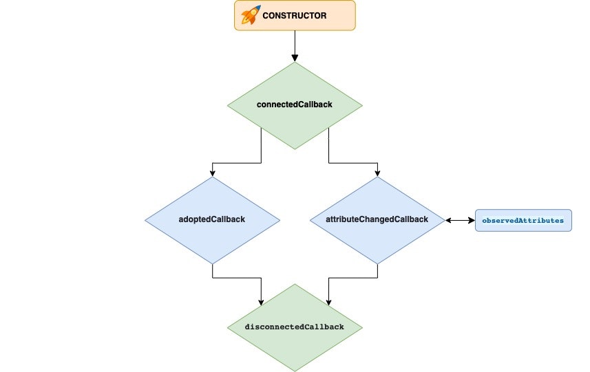
📌 1. Mastering Lifecycle Patterns
Every custom element has these main lifecycle callbacks:
| Callback | When It Runs | Use Case |
|---|---|---|
constructor() |
Element created | Initialize state, attach shadow DOM |
connectedCallback() |
Element added to the DOM | Fetch data, add event listeners |
disconnectedCallback() |
Element removed | Clean up listeners, timers |
attributeChangedCallback() |
Observed attribute changes | Re-render UI |
adoptedCallback() |
Moved to a new document | Rare: used in iframes, portals |
Example:
connectedCallback() {
  this.addEventListener('click', this._onClick);
}

disconnectedCallback() {
  this.removeEventListener('click', this._onClick);
}
Cleaning up in disconnectedCallback() prevents memory leaks.
📌 2. Component Composition (Using Components Inside Components)
Web Components work great together.
Example:
<djam-card title="Profile">
  <user-avatar src="avatar.jpg"></user-avatar>
  <user-info name="Djamware"></user-info>
</djam-card>
Because each component has its own Shadow DOM, styles never collide.
This is how design systems like Salesforce Lightning and Adobe Spectrum structure their UI libraries.
📌 3. Emitting Custom Events (Component → Page)
To communicate upward, dispatch events:
this.dispatchEvent(
  new CustomEvent('card-click', {
    detail: { title: this.getAttribute('title') },
    bubbles: true,
    composed: true
  })
);-
bubbles: true→ event moves up the DOM -
composed: true→ event crosses Shadow DOM boundary
Outside:
document
  .querySelector('djam-card')
  .addEventListener('card-click', e => console.log(e.detail));
This makes components interactive.
📌 4. Re-render Pattern Using Templates (Efficient Rendering)
Instead of writing innerHTML manually, use <template> cloning:
template.js
const template = document.createElement('template');
template.innerHTML = `
  <style>
    .box { padding: 16px; border: 1px solid #ddd; }
  </style>
  <div class="box">
    <slot></slot>
  </div>
`;
Inside the component:
this.shadowRoot.appendChild(template.content.cloneNode(true));Advantages:
-
Faster rendering
-
Cleaner separation
-
Templates are cached
This is the pattern used by LitHTML and other libraries.
📌 5. Internal State Management
Web Components don’t have built-in reactive state like React or Vue,
but you can create your own simple state system.
Example:
this._state = {
  count: 0
};
Expose a method:
set count(value) {
  this._state.count = value;
  this.render();
}
Now you can update the component:
document.querySelector('djam-counter').count = 10;📌 6. Exposing Public Methods (Component API)
You can let pages or apps call component functions directly:
open() {
  this.setAttribute('open', '');
}

close() {
  this.removeAttribute('open');
}
Now:
document.querySelector('djam-modal').open();This is how modal components and dropdown components expose APIs.
📌 7. Performance Patterns
✔️ Use one Shadow DOM per component
Don’t attach multiple shadow roots.
✔️ Cache DOM references
Avoid repeated queries:
this._titleEl = this.shadowRoot.querySelector('.header');✔️ Prefer template cloning over innerHTML
Much faster for dynamic updates.
✔️ Debounce attribute changes
Useful when attributes update frequently.
✨ Summary of Advanced Patterns
You now understand how to build:
-
Interactive components
-
Composable component systems
-
Efficient rendering
-
Custom event-driven communication
-
State-driven UI
-
Public component APIs
This is what separates toy examples from real-world, professional Web Components.
Best Practices


As your library of Web Components grows—especially if you're building a design system or reusable UI kit—it’s crucial to follow best practices. These ensure your components remain maintainable, accessible, and performant, and can be safely used across multiple projects or frameworks.
Below are the best practices every professional Web Component developer should follow.
📌 1. Naming Conventions
Web Components must use kebab-case and contain a hyphen:
✔️ Good
djam-card
user-profile
theme-switch
❌ Not allowed
card
userprofile
This prevents naming collisions with native HTML tags.
📌 2. Keep Shadow DOM Encapsulated
Put styles, layout, and internal structure inside the Shadow DOM.
✔️ Good
this.shadowRoot.innerHTML = `
  <style> ... </style>
  <div class="body">...</div>
`;
❌ Avoid leaking internal DOM to the outside.
Use ::part and :host only when purposely exposing styling hooks.
📌 3. Use Templates for Performance
Avoid inline innerHTML for every render cycle.
Use <template> cloning for faster re-renders and cleaner separation.
Templates give:
-
Better performance
-
Safer HTML
-
Cleaner component structure
📌 4. Keep Public APIs Simple
Expose only what’s necessary:
-
A small set of attributes
-
A small set of properties
-
A couple of public methods
-
Clear custom events
Example:
open() {}
close() {}
A clean API makes your component predictable.
📌 5. Avoid Heavy Logic in Components
Web Components excel at UI, not business logic.
Don’t place:
-
Data fetching
-
Complex transformations
-
Global state logic
Prefer separating business logic from UI presentation.
📌 6. Ensure Accessibility (A11y)
Accessibility is critical. Follow these rules:
✔️ Provide accessible names
<djam-button aria-label="Submit form"></djam-button>✔️ Use role where needed
<div role="dialog"></div>✔️ Keyboard support
Handle Enter and Space for interactive elements.
✔️ Respect user preferences
Use:
@media (prefers-color-scheme: dark) { ... }📌 7. Don’t Overuse Shadow DOM
Shadow DOM is powerful, but avoid using it when:
-
You need heavy SEO
-
You need global styles shared across many components
-
The structure needs to be accessible to styling systems like Tailwind
Use it where encapsulation truly matters.
📌 8. Emit Custom Events Thoughtfully
Use custom events sparingly and clearly.
✔️ Good
card-select
modal-open
theme-change
❌ Avoid vague events
clicked
update
change
Always include useful detail data:
detail: { id: this.id }📌 9. Avoid Memory Leaks
Detach event listeners in disconnectedCallback:
connectedCallback() {
  this._onClick = () => this.handleClick();
  this.addEventListener('click', this._onClick);
}

disconnectedCallback() {
  this.removeEventListener('click', this._onClick);
}
Frameworks do this automatically—Web Components require manual care.
📌 10. Provide Slots Instead of Hardcoding Layouts
Slots make components flexible.
✔️ Good
<slot></slot>✔️ Named slots
<slot name="footer"></slot>❌ Avoid rigid markup buried inside components.
📌 11. Document Your Component API
Document:
-
Attributes
-
Properties
-
Events
-
Slots
-
CSS parts
This helps teams adopt your components like standard UI libraries.
📌 12. Make Components Framework-Friendly
If components must integrate with React/Vue/Angular:
✔️ Use CustomEvent with bubbles: true & composed: true
✔️ Use attributes for simple values
✔️ Use properties for objects
✔️ Avoid changing the HTMLElement prototype
This ensures compatibility across ecosystems.
✨ Summary
Following best practices ensures your Web Components are:
-
Clean
-
Predictable
-
Reusable
-
Accessible
-
Performant
-
Easy to integrate anywhere
Your library becomes a solid foundation for future development.
Conclusion
Web Components give developers a powerful, standards-based way to build reusable, encapsulated, and framework-independent UI elements. In this tutorial, you’ve learned how to design and implement modern components using native browser features—without relying on React, Angular, Vue, or any external library.
You now understand:
✔️ The foundations of Web Components
-
Custom Elements
-
Shadow DOM
-
HTML Templates
-
ES Modules
✔️ How to build real components
You created:
-
<djam-hello>(intro component) -
<djam-card>(a fully styled, production-ready card UI)
These components are fully encapsulated, portable, and easy to integrate anywhere.
✔️ How to manage component data
-
Passing data via attributes and properties
-
Slotted content for flexible UI
-
Using getters/setters for better APIs
✔️ Advanced patterns
-
Custom events for communication
-
Template cloning for performance
-
Composition of components
-
State management
-
Public methods and cleaner APIs
✔️ Best practices
You learned how to structure, style, optimize, and maintain Web Components at a professional level.
Why Web Components Matter
As the web continues to mature, the appeal of lightweight, framework-agnostic components increases. Web Components allow developers to:
-
Build once, reuse everywhere
-
Avoid framework lock-in
-
Ship small, efficient UI elements
-
Maintain consistent design in multi-framework environments
-
Future-proof UI libraries
Whether you're building a design system, dashboard UI, or standalone widgets, Web Components empower you to scale without complexity.
What’s Next?
You can extend this tutorial by creating more components, such as:
-
<djam-modal> -
<djam-button> -
<djam-tabs> -
<djam-tooltip>
Or go even further:
-
Build a full Web Components design system
-
Add TypeScript for better DX
-
Add Lit or Stencil for enhanced reactivity
-
Integrate components into React, Vue, Angular, or Svelte
You can find the full source code on our GitHub.
That's just the basics. If you need more deep learning about HTML, you can take the following cheap course:
- The Complete Full-Stack Web Development Bootcamp
- Build Responsive Real-World Websites with HTML and CSS
- The HTML & CSS Bootcamp 2025 Edition
- The Complete Guide to HTML
- Learn HTML and CSS in 7 Days | Web Developer Bootcamp
- HTML, CSS, & JavaScript - Certification Course for Beginners
- 50 Projects In 50 Days - HTML, CSS & JavaScript
- Modern HTML & CSS From The Beginning 2.0 (2024 Revamp)
- HTML - Introduction to HTML Web Development
- HTML & CSS Masterclass 2025 — From Beginner to Pro
Thanks!