
In today’s digital world, users browse websites on a wide variety of devices — from large desktop monitors to small smartphones. That’s where responsive web design comes in. A responsive webpage automatically adjusts its layout, images, and text so it looks great and works seamlessly on any screen size.
In this beginner-friendly guide, you’ll learn how to create a responsive webpage using only HTML and CSS. No frameworks, no JavaScript — just the core web technologies that every developer should master first. By the end of this tutorial, you’ll be able to:
-
Build a clean, semantic HTML structure
-
Style your webpage with CSS for an attractive layout
-
Use Flexbox, Grid, and media queries to adapt your design to mobile, tablet, and desktop screens
-
Make images and text scale naturally across devices
Whether you’re completely new to web development or brushing up your skills, this guide will give you a solid foundation to start building modern, responsive websites.
Setting Up Your Project
Before we start coding, let’s prepare a simple project structure. This will keep your files organized and make it easy to manage your HTML and CSS.
Step 1: Create a Project Folder
Create a new folder on your computer. You can name it something like:
mkdir responsive-websiteInside this folder, we’ll have:
responsive-website/
│
├── index.html   ← main HTML file
└── style.css    ← CSS stylesheet
Step 2: Create the HTML File
Inside your responsive-website folder, create a file named index.html and add this basic HTML boilerplate:
<!DOCTYPE html>
<html lang="en">
<head>
<meta charset="UTF-8">
<meta name="viewport" content="width=device-width, initial-scale=1.0">
<title>Responsive Webpage</title>
<link rel="stylesheet" href="style.css">
</head>
<body>
<header>
<h1>Welcome to My Responsive Webpage</h1>
</header>
<main>
<p>This is where your content will go.</p>
</main>
<footer>
<p>© 2025 My Website</p>
</footer>
</body>
</html>👉 Notice the line:
<meta name="viewport" content="width=device-width, initial-scale=1.0">This is crucial for responsive design. It tells the browser to scale the page correctly on different devices.
Step 3: Create the CSS File
Now, create a file style.css in the same folder. For now, just add a simple reset and body styling:
/* Reset some default styles */
* {
  margin: 0;
  padding: 0;
  box-sizing: border-box;
}

body {
  font-family: Arial, sans-serif;
  line-height: 1.6;
  padding: 20px;
}
With this setup, you’re ready to start building the structure of your responsive webpage.
Basic HTML Structure
A well-structured HTML document is the foundation of any responsive webpage. Using semantic HTML tags not only makes your code cleaner and easier to read but also improves accessibility and SEO.
Here’s how we’ll structure our page:
-
A header containing the site title and navigation
-
A hero section with an introductory message
-
A main content area is divided into sections
-
A footer with copyright information
Updated index.html
<!DOCTYPE html>
<html lang="en">
<head>
<meta charset="UTF-8">
<meta name="viewport" content="width=device-width, initial-scale=1.0">
<title>Responsive Webpage</title>
<link rel="stylesheet" href="style.css">
</head>
<body>
<!-- Header Section -->
<header>
<h1>My Responsive Website</h1>
<nav>
<ul>
<li><a href="#">Home</a></li>
<li><a href="#">About</a></li>
<li><a href="#">Services</a></li>
<li><a href="#">Contact</a></li>
</ul>
</nav>
</header>
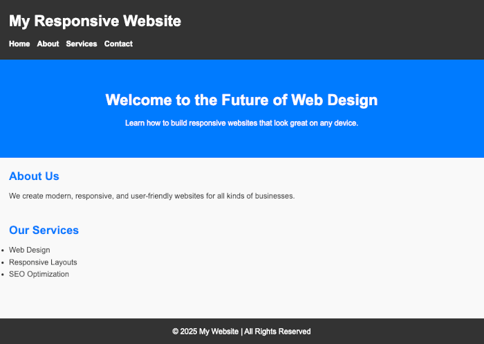
<!-- Hero Section -->
<section class="hero">
<h2>Welcome to the Future of Web Design</h2>
<p>Learn how to build responsive websites that look great on any device.</p>
</section>
<!-- Main Content -->
<main>
<section class="about">
<h2>About Us</h2>
<p>We create modern, responsive, and user-friendly websites for all kinds of businesses.</p>
</section>
<section class="services">
<h2>Our Services</h2>
<ul>
<li>Web Design</li>
<li>Responsive Layouts</li>
<li>SEO Optimization</li>
</ul>
</section>
</main>
<!-- Footer -->
<footer>
<p>© 2025 My Website | All Rights Reserved</p>
</footer>
</body>
</html>Why Use Semantic Tags?
-
<header>→ Groups the top area of your site. -
<nav>→ Defines the navigation menu. -
<section>→ Divides content into logical parts. -
<main>→ Holds the central content. -
<footer>→ Wraps up the page with credits or links.
This semantic structure will make styling easier in the next section and help search engines understand your content better.
Applying CSS Styling
Now that we have a solid HTML structure, it’s time to make our webpage visually appealing. We’ll apply fonts, colors, spacing, and simple layout rules to give it a modern look.
Open your style.css file and update it with the following styles:
/* Reset some default styles */
* {
  margin: 0;
  padding: 0;
  box-sizing: border-box;
}

/* Global styles */
body {
  font-family: Arial, sans-serif;
  line-height: 1.6;
  padding: 0;
  margin: 0;
  color: #333;
  background-color: #f9f9f9;
}

/* Header styling */
header {
  background: #333;
  color: #fff;
  padding: 20px;
}

header h1 {
  margin-bottom: 10px;
}

nav ul {
  list-style: none;
  display: flex;
  gap: 15px;
}

nav ul li a {
  color: #fff;
  text-decoration: none;
  font-weight: bold;
}

nav ul li a:hover {
  text-decoration: underline;
}

/* Hero section */
.hero {
  background: #007BFF;
  color: #fff;
  padding: 60px 20px;
  text-align: center;
}

.hero h2 {
  font-size: 2rem;
  margin-bottom: 10px;
}

/* Main content */
main {
  padding: 20px;
}

main section {
  margin-bottom: 40px;
}

main h2 {
  margin-bottom: 10px;
  color: #007BFF;
}

/* Footer */
footer {
  background: #333;
  color: #fff;
  text-align: center;
  padding: 15px;
  margin-top: 20px;
}
What We Did Here:
-
Set a global font and background color.
-
Styled the header and navigation with a dark theme.
-
Created a hero section with bold colors and centered text.
-
Gave sections some spacing and colored section titles.
-
Added a footer with consistent styling.
At this stage, your webpage already looks more professional and structured.
Building a Simple Layout
Now that our webpage has some styling, we’ll make the navigation bar and content sections more organized using Flexbox. Flexbox is one of the most powerful tools in CSS for creating responsive layouts without relying on floats or complicated hacks.
Step 1: Update the Navigation with Flexbox
We’ll align the site title on the left and the navigation menu on the right.
Update your style.css:
/* Header layout with Flexbox */
header {
  background: #333;
  color: #fff;
  padding: 20px;
  display: flex;
  justify-content: space-between;
  align-items: center;
}

header h1 {
  margin: 0;
}

nav ul {
  list-style: none;
  display: flex;
  gap: 20px;
}
✅ Now, your site title and menu should be on opposite sides of the header.
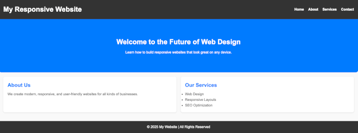
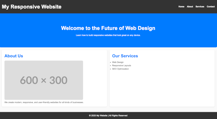
Step 2: Create a Two-Column Layout for Content
We’ll make the About section and Services section display side by side on larger screens.
Update your style.css:
/* Main content layout */
main {
  display: flex;
  gap: 20px;
  padding: 20px;
  flex-wrap: wrap; /* allows content to wrap on smaller screens */
}

main section {
  flex: 1 1 300px; /* flexible columns with a minimum width */
  background: #fff;
  padding: 20px;
  border-radius: 8px;
  box-shadow: 0 2px 5px rgba(0,0,0,0.1);
}
✅ This makes each section appear as a card and sit next to each other when space allows, but automatically stack on smaller screens.
Step 3: Improve the Hero Section Layout
Let’s keep the hero section centered and bold.
.hero {
  background: #007BFF;
  color: #fff;
  padding: 80px 20px;
  text-align: center;
  border-radius: 0 0 12px 12px;
}
Result So Far
-
A flexbox header with logo + navigation.
-
A two-column layout for content that wraps nicely.
-
A hero section that pops out visually.
Your webpage is now structured with Flexbox, making it easier to adapt to different screen sizes.
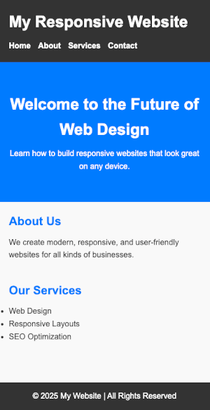
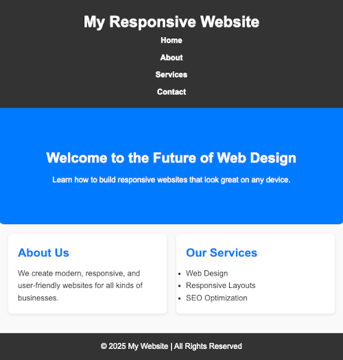
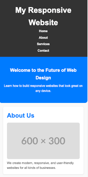
Making It Responsive with Media Queries
Right now, our layout adapts somewhat because of Flexbox, but we can make it truly responsive by using media queries. Media queries allow us to define different styles depending on the screen size — ensuring our design looks great on mobile, tablet, and desktop.
Step 1: Add Media Queries to Your CSS
At the bottom of your style.css, add:
/* =========================
   MEDIA QUERIES
   ========================= */

/* Tablet screens (768px and up) */
@media (max-width: 768px) {
  nav ul {
    flex-direction: column;
    gap: 10px;
  }

  header {
    flex-direction: column;
    text-align: center;
  }

  .hero h2 {
    font-size: 1.8rem;
  }
}

/* Mobile screens (480px and down) */
@media (max-width: 480px) {
  body {
    font-size: 16px;
  }

  nav ul {
    gap: 8px;
  }

  .hero {
    padding: 50px 15px;
  }

  .hero h2 {
    font-size: 1.5rem;
  }

  main {
    flex-direction: column;
  }

  main section {
    flex: 1 1 100%;
  }
}
Step 2: How It Works
-
Desktop (default styles): Two-column layout, horizontal navigation.
-
Tablet (≤768px):
-
Navigation switches to vertical.
-
Header stacks site title and nav menu.
-
Hero text scales down slightly.
-
-
Mobile (≤480px):
-
Content stacks in a single column.
-
Smaller font sizes for readability.
-
Hero section padding reduced for smaller screens.
-
Step 3: Test Responsiveness
Open your browser’s Developer Tools (F12 or right-click → Inspect → Toggle Device Toolbar) and test your site in:
-
Mobile view (iPhone, Android)
-
Tablet view (iPad, Galaxy Tab)
-
Desktop view
You should see the layout automatically adjust 🎉
Responsive Images and Typography
A truly responsive website doesn’t just rely on layout adjustments — images and text also need to adapt smoothly across different devices. If images are too large or text too small, users won’t have a good experience.
Step 1: Make Images Responsive
By default, images may overflow their containers on small screens. To prevent this, we use max-width: 100% and height: auto.
Add this rule to your style.css:
/* Responsive images */
img {
  max-width: 100%;
  height: auto;
  border-radius: 8px;
}
✅ This ensures images shrink to fit smaller screens while maintaining their aspect ratio.
Step 2: Use Flexible Units for Text
Instead of fixed pixel sizes (px), it’s better to use relative units like:
-
em/rem→ scale relative to font size -
vw/vh→ scale relative to viewport width/height
Update your typography styles:
/* Global font sizing */
body {
  font-size: 1rem; /* 1rem = 16px default */
  line-height: 1.6;
}

/* Headings */
h1 {
  font-size: 2.5rem; /* scales with screen */
}

h2 {
  font-size: 2rem;
}

p {
  font-size: 1rem;
}
Step 3: Add Fluid Typography with Clamp()
The clamp() function is great for responsive text. It takes three values:
clamp(minimum, preferred, maximum)For example:
.hero h2 {
  font-size: clamp(1.5rem, 5vw, 2.5rem);
}
✅ This means the hero heading will never be smaller than 1.5rem, will scale up with 5vw (viewport width), but won’t exceed 2.5rem.
Step 4: Example with an Image Section
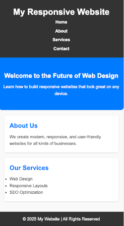
Let’s add an image to our About section in index.html:
      <section class="about">
        <h2>About Us</h2>
        <img src="https://placehold.co/600x300" alt="About our company" />
        <p>
          We create modern, responsive, and user-friendly websites for all kinds
          of businesses.
        </p>
      </section>
With the CSS above, this image will scale nicely on all screen sizes.
✅ Now your webpage’s text and images are fully responsive — no more cut-off images or hard-to-read text on small screens!
Adding a Responsive Grid Section
Flexbox is great for one-dimensional layouts (rows or columns), but sometimes we need a multi-dimensional layout — like a gallery, product list, or feature cards. That’s where CSS Grid shines.
In this section, we’ll add a three-column grid that automatically adjusts to two columns on tablets and one column on mobile.
Step 1: Add a New Grid Section in HTML
Open your index.html and add this inside <main>:
<section class="features">
  <h2>Our Features</h2>
  <div class="grid">
    <div class="card">Fast Performance</div>
    <div class="card">Modern Design</div>
    <div class="card">SEO Friendly</div>
    <div class="card">Cross-Browser Support</div>
    <div class="card">Secure Code</div>
    <div class="card">Responsive Layout</div>
  </div>
</section>
Step 2: Style the Grid with CSS
Open style.css and add:
/* Features Grid Section */
.features {
  margin: 40px 20px;
}

.features h2 {
  text-align: center;
  margin-bottom: 20px;
  color: #007BFF;
}

.grid {
  display: grid;
  grid-template-columns: repeat(3, 1fr);
  gap: 20px;
}

.card {
  background: #fff;
  padding: 20px;
  border-radius: 8px;
  box-shadow: 0 2px 5px rgba(0,0,0,0.1);
  text-align: center;
  font-weight: bold;
}
Step 3: Make the Grid Responsive
Use media queries to adjust the grid:
/* Responsive grid adjustments */
@media (max-width: 992px) {
  .grid {
    grid-template-columns: repeat(2, 1fr);
  }
}

@media (max-width: 600px) {
  .grid {
    grid-template-columns: 1fr;
  }
}
✅ Now the grid shows:
-
3 columns on desktop
-
2 columns on tablets
-
1 column on mobile
Result So Far
-
A features section with neat, card-style boxes.
-
A grid layout that adapts automatically to any screen.
Final Touches & Testing
At this point, your webpage is fully structured, styled, and responsive. Now let’s do some polishing and testing to ensure it looks professional on all devices.
Step 1: Improve the Footer
Make the footer simple and consistent:
footer {
  background: #222;
  color: #ddd;
  text-align: center;
  padding: 20px;
  font-size: 0.9rem;
}

footer a {
  color: #007BFF;
  text-decoration: none;
}

footer a:hover {
  text-decoration: underline;
}
You could also add quick links or social icons if needed.
Step 2: Add Smooth Hover Effects
Give cards and links a subtle hover effect for a better user experience:
.card:hover {
  transform: translateY(-5px);
  transition: transform 0.3s ease;
  box-shadow: 0 4px 8px rgba(0,0,0,0.15);
}
Step 3: Test Responsiveness
Open your browser’s Developer Tools and test with device emulators (mobile, tablet, desktop). Check:
-
Does the navigation stack correctly on smaller screens?
-
Do images scale without breaking the layout?
-
Does text remain readable at all sizes?
-
Does the grid collapse properly into fewer columns?
Step 4: Optimize for Best Practices
-
Use semantic HTML (done ✅).
-
Ensure images include alt attributes for accessibility.
-
Compress images for faster loading.
-
Validate your HTML & CSS with tools like W3C Validator.
Conclusion
Congratulations! You’ve built a fully responsive webpage using just HTML and CSS 🎉
Along the way, you learned how to:
-
Structure a webpage with semantic HTML
-
Style it with CSS for a modern, clean design
-
Use Flexbox for layout alignment
-
Use CSS Grid for multi-column sections
-
Add media queries to handle different screen sizes
-
Make images and typography responsive
This is just the beginning — with these skills, you can now build responsive portfolios, blogs, or business websites.
👉 Next Steps:
-
Explore CSS frameworks like Bootstrap or Tailwind CSS to speed up development.
-
Learn about responsive navigation menus (hamburger menus).
-
Experiment with animations and transitions to enhance interactivity.
You can find the full source code on our GitHub.
That's just the basics. If you need more deep learning about HTML, you can take the following cheap course:
- The Complete Full-Stack Web Development Bootcamp
- Build Responsive Real-World Websites with HTML and CSS
- The HTML & CSS Bootcamp 2025 Edition
- The Complete Guide to HTML
- Learn HTML and CSS in 7 Days | Web Developer Bootcamp
- HTML, CSS, & JavaScript - Certification Course for Beginners
- 50 Projects In 50 Days - HTML, CSS & JavaScript
- Modern HTML & CSS From The Beginning 2.0 (2024 Revamp)
- HTML - Introduction to HTML Web Development
- HTML & CSS Masterclass 2025 — From Beginner to Pro
Thanks!