
Form handling and validation are among the most essential parts of any web application. Whether you’re building a login, registration, or contact form, ensuring that user input is correct and complete is critical for both user experience and data integrity.
While React provides flexibility for building forms, managing form state and validation manually can quickly become cumbersome. This is where Formik and Yup come in handy.
Formik is a lightweight library that simplifies form management in React applications. It helps you handle form state, validation, and submission without the need for repetitive boilerplate code. On the other hand, Yup is a JavaScript schema validation library that integrates seamlessly with Formik to define validation rules in a clean, declarative way.
In this tutorial, you will learn how to build a complete React form with validation using Formik and Yup. We’ll create a simple user registration form that includes the following fields:
-
Full Name
-
Email Address
-
Password
-
Confirm Password
Each field will include proper validation — such as required fields, valid email format, and password confirmation — to ensure user input meets the desired criteria before submission.
By the end of this tutorial, you will be able to:
-
Build and manage forms in React using Formik
-
Validate form inputs using Yup schemas
-
Display meaningful error messages to guide users
-
Write clean, maintainable, and reusable form code
Let’s begin by setting up the project.
Prerequisites
Before getting started, make sure you have the following tools and knowledge in place:
1. Node.js and npm Installed
You’ll need Node.js (version 18 or later) and npm (Node Package Manager) installed on your machine. You can verify their installation by running the following commands in your terminal:
node -v
npm -v
If you don’t have them installed yet, you can download the latest version of Node.js from the official Node.js website.
2. Basic Knowledge of React
This tutorial assumes you have a basic understanding of React, including:
-
Creating and using functional components
-
Using hooks like
useStateanduseEffect -
Basic JSX syntax
If you’re new to React, it might help to read the official React documentation before continuing.
3. A Code Editor
You can use any text editor you like, but Visual Studio Code is highly recommended because of its great ecosystem and React extensions.
Download it from https://code.visualstudio.com.
4. A Modern Web Browser
For testing and running your React app, use a modern browser such as Google Chrome, Firefox, or Microsoft Edge.
✅ Ready? In the next section, we’ll create a new React project using Vite — a fast and modern build tool that makes setting up React applications quick and easy.
Create a New React App
To get started, we’ll create a new React application using Vite, a fast and modern frontend build tool that provides instant development feedback and optimized production builds. Unlike Create React App, Vite uses ES modules under the hood and supports React 18+ out of the box.
Step 1: Create a New React Project
Open your terminal or command prompt, navigate to your preferred project folder, and run the following command:
npm create vite@latest react-formik-yup -- --template reactThis command will:
-
Create a new folder named
react-formik-yup -
Initialize a React project using the Vite template
-
Install all dependencies
-
Start the application
You should see output similar to:
  VITE v7.1.12  ready in 5334 ms

  ➜  Local:   http://localhost:5173/
Open your browser and navigate to http://localhost:5173/. You should see the default Vite + React welcome page.

Once the setup wizard finishes, navigate to your project directory:
cd react-formik-yupStep 2: Clean Up the Default Files
Let’s simplify the default structure before adding Formik and Yup:
-
Open the
srcfolder and delete the following files:-
App.css -
index.css -
assets/react.svg
-
-
Replace the contents of
App.jsxwith a basic component:
function App() {
  return (
    <div>
      <h1>React Forms with Formik and Yup</h1>
    </div>
  );
}

export default App;- In
main.jsx, ensure it looks like this:
import { StrictMode } from 'react'
import { createRoot } from 'react-dom/client'
import './index.css'
import App from './App.jsx'

createRoot(document.getElementById('root')).render(
  <StrictMode>
    <App />
  </StrictMode>,
)
Now your project is clean and ready to use.
✅ At this point, your React app is up and running — ready for integration with Formik and Yup.
Install and Set Up Formik and Yup
Now that your React app is ready, the next step is to install Formik and Yup, two powerful libraries that work perfectly together to handle form management and validation.
Step 1: Install Formik and Yup
Run the following command inside your project folder:
npm install formik yupThis will install both libraries:
-
Formik: Simplifies handling form state, validation, and submission.
-
Yup: Provides a declarative and schema-based way to validate form inputs.
Step 2: Create a Form Component
Inside your src folder, create a new file named RegisterForm.jsx.
This component will contain our registration form built using Formik and Yup.
touch src/RegisterForm.jsxThen, open RegisterForm.jsx and add the following starter code:
import React from "react";
import { useFormik } from "formik";

function RegisterForm() {
  const formik = useFormik({
    initialValues: {
      fullName: "",
      email: "",
      password: "",
      confirmPassword: "",
    },
    onSubmit: (values) => {
      console.log("Form data:", values);
    },
  });

  return (
    <form onSubmit={formik.handleSubmit}>
      <div>
        <label htmlFor="fullName">Full Name</label>
        <input
          id="fullName"
          name="fullName"
          type="text"
          onChange={formik.handleChange}
          value={formik.values.fullName}
        />
      </div>

      <div>
        <label htmlFor="email">Email Address</label>
        <input
          id="email"
          name="email"
          type="email"
          onChange={formik.handleChange}
          value={formik.values.email}
        />
      </div>

      <div>
        <label htmlFor="password">Password</label>
        <input
          id="password"
          name="password"
          type="password"
          onChange={formik.handleChange}
          value={formik.values.password}
        />
      </div>

      <div>
        <label htmlFor="confirmPassword">Confirm Password</label>
        <input
          id="confirmPassword"
          name="confirmPassword"
          type="password"
          onChange={formik.handleChange}
          value={formik.values.confirmPassword}
        />
      </div>

      <button type="submit">Register</button>
    </form>
  );
}

export default RegisterForm;
Step 3: Use the Form Component in App.jsx
Next, import and render this form inside your App.jsx file:
import RegisterForm from "./RegisterForm";

function App() {
  return (
    <div>
      <h1>React Forms with Formik and Yup</h1>
      <RegisterForm />
    </div>
  );
}

export default App;
Step 4: Test the Form
Now run your app again:
npm run devGo to http://localhost:5173/. You should see a simple registration form.
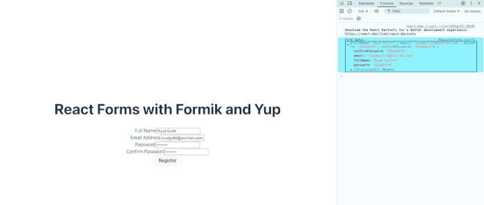
Try typing in each field and submit the form — your input data should appear in the browser console.
At this stage, the form works but has no validation yet. We’ll fix that in the next section by integrating Yup validation schemas.
✅ Next: Add schema-based validation to enforce rules such as required fields, valid email format, and matching passwords using Yup.
Build the Registration Form
Now that we have Formik set up, let’s improve the registration form by structuring it neatly and adding labels, placeholders, and minimal styling to make it more user-friendly.
We’ll keep things simple with basic HTML and inline styling, so you can focus on understanding how Formik works before we add validation in the next section.
Step 1: Update the RegisterForm Component
Open the file src/RegisterForm.jsx and replace its content with the following code:
import React from "react";
import { useFormik } from "formik";

function RegisterForm() {
  const formik = useFormik({
    initialValues: {
      fullName: "",
      email: "",
      password: "",
      confirmPassword: "",
    },
    onSubmit: (values) => {
      console.log("Form Data:", values);
      alert("Registration successful!");
    },
  });

  return (
    <div style={styles.container}>
      <h2>Register</h2>
      <form onSubmit={formik.handleSubmit} style={styles.form}>
        <div style={styles.field}>
          <label htmlFor="fullName">Full Name</label>
          <input
            id="fullName"
            name="fullName"
            type="text"
            placeholder="Enter your full name"
            onChange={formik.handleChange}
            value={formik.values.fullName}
          />
        </div>

        <div style={styles.field}>
          <label htmlFor="email">Email Address</label>
          <input
            id="email"
            name="email"
            type="email"
            placeholder="Enter your email"
            onChange={formik.handleChange}
            value={formik.values.email}
          />
        </div>

        <div style={styles.field}>
          <label htmlFor="password">Password</label>
          <input
            id="password"
            name="password"
            type="password"
            placeholder="Enter your password"
            onChange={formik.handleChange}
            value={formik.values.password}
          />
        </div>

        <div style={styles.field}>
          <label htmlFor="confirmPassword">Confirm Password</label>
          <input
            id="confirmPassword"
            name="confirmPassword"
            type="password"
            placeholder="Re-enter your password"
            onChange={formik.handleChange}
            value={formik.values.confirmPassword}
          />
        </div>

        <button type="submit" style={styles.button}>Register</button>
      </form>
    </div>
  );
}

const styles = {
  container: {
    maxWidth: "400px",
    margin: "50px auto",
    padding: "20px",
    border: "1px solid #ddd",
    borderRadius: "8px",
    backgroundColor: "#f9f9f9",
  },
  form: {
    display: "flex",
    flexDirection: "column",
    gap: "15px",
  },
  field: {
    display: "flex",
    flexDirection: "column",
  },
  button: {
    padding: "10px",
    backgroundColor: "#007bff",
    color: "#fff",
    border: "none",
    borderRadius: "4px",
    cursor: "pointer",
  },
};

export default RegisterForm;
Step 2: Test the Form Layout
Run the development server if it isn’t already running:
npm run devThen open your browser at http://localhost:5173/.
You should now see a styled registration form with inputs for:
-
Full Name
-
Email Address
-
Password
-
Confirm Password
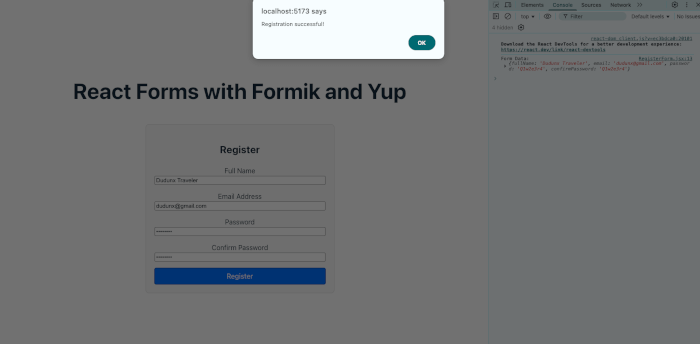
When you fill out the form and click Register, the form data will appear in the browser console, and you’ll see an alert message saying “Registration successful!”.
Step 3: Verify Form State Handling
Formik automatically manages form state under the hood. Each time you type in an input field, the state updates via the formik.handleChange handler, and you can access the current values in formik.values.
For debugging or curiosity, you can display form values live under the form by adding this line inside your JSX (temporarily):
<pre>{JSON.stringify(formik.values, null, 2)}</pre>This will show your form’s data updating in real time.
✅ Next: Let’s make this form truly functional by adding validation rules using Yup — ensuring users can’t submit invalid or incomplete data.
Add Validation with Yup
Now that our form is functional and styled, it’s time to make it smarter by adding input validation using Yup. With Yup, we can define a clear and reusable validation schema to ensure users provide valid information before submitting the form.
Step 1: Import Yup and Connect It to Formik
Open src/RegisterForm.jsx and import Yup at the top:
import * as Yup from "yup";Then, inside your useFormik() configuration, add a new property called validationSchema and define your Yup rules.
Here’s the complete updated RegisterForm.jsx file:
import React from "react";
import { useFormik } from "formik";
import * as Yup from "yup";

function RegisterForm() {
  const formik = useFormik({
    initialValues: {
      fullName: "",
      email: "",
      password: "",
      confirmPassword: "",
    },
    validationSchema: Yup.object({
      fullName: Yup.string()
        .min(3, "Full Name must be at least 3 characters")
        .required("Full Name is required"),
      email: Yup.string()
        .email("Invalid email address")
        .required("Email is required"),
      password: Yup.string()
        .min(6, "Password must be at least 6 characters")
        .required("Password is required"),
      confirmPassword: Yup.string()
        .oneOf([Yup.ref("password"), null], "Passwords must match")
        .required("Confirm Password is required"),
    }),
    onSubmit: (values) => {
      console.log("Form Data:", values);
      alert("Registration successful!");
    },
  });

  return (
    <div style={styles.container}>
      <h2>Register</h2>
      <form onSubmit={formik.handleSubmit} style={styles.form}>
        {/* Full Name */}
        <div style={styles.field}>
          <label htmlFor="fullName">Full Name</label>
          <input
            id="fullName"
            name="fullName"
            type="text"
            placeholder="Enter your full name"
            onChange={formik.handleChange}
            onBlur={formik.handleBlur}
            value={formik.values.fullName}
          />
          {formik.touched.fullName && formik.errors.fullName ? (
            <div style={styles.error}>{formik.errors.fullName}</div>
          ) : null}
        </div>

        {/* Email */}
        <div style={styles.field}>
          <label htmlFor="email">Email Address</label>
          <input
            id="email"
            name="email"
            type="email"
            placeholder="Enter your email"
            onChange={formik.handleChange}
            onBlur={formik.handleBlur}
            value={formik.values.email}
          />
          {formik.touched.email && formik.errors.email ? (
            <div style={styles.error}>{formik.errors.email}</div>
          ) : null}
        </div>

        {/* Password */}
        <div style={styles.field}>
          <label htmlFor="password">Password</label>
          <input
            id="password"
            name="password"
            type="password"
            placeholder="Enter your password"
            onChange={formik.handleChange}
            onBlur={formik.handleBlur}
            value={formik.values.password}
          />
          {formik.touched.password && formik.errors.password ? (
            <div style={styles.error}>{formik.errors.password}</div>
          ) : null}
        </div>

        {/* Confirm Password */}
        <div style={styles.field}>
          <label htmlFor="confirmPassword">Confirm Password</label>
          <input
            id="confirmPassword"
            name="confirmPassword"
            type="password"
            placeholder="Re-enter your password"
            onChange={formik.handleChange}
            onBlur={formik.handleBlur}
            value={formik.values.confirmPassword}
          />
          {formik.touched.confirmPassword && formik.errors.confirmPassword ? (
            <div style={styles.error}>{formik.errors.confirmPassword}</div>
          ) : null}
        </div>

        <button type="submit" style={styles.button}>
          Register
        </button>
      </form>
    </div>
  );
}

const styles = {
  container: {
    maxWidth: "400px",
    margin: "50px auto",
    padding: "20px",
    border: "1px solid #ddd",
    borderRadius: "8px",
    backgroundColor: "#f9f9f9",
  },
  form: {
    display: "flex",
    flexDirection: "column",
    gap: "15px",
  },
  field: {
    display: "flex",
    flexDirection: "column",
  },
  button: {
    padding: "10px",
    backgroundColor: "#007bff",
    color: "#fff",
    border: "none",
    borderRadius: "4px",
    cursor: "pointer",
  },
  error: {
    color: "red",
    fontSize: "0.875rem",
    marginTop: "5px",
  },
};

export default RegisterForm;
Step 2: How Yup Validation Works
Let’s break down the validation schema:
-
Yup.string().required()— ensures the field is not empty. -
min(3)ormin(6)— checks minimum character length. -
email()— ensures the email has a valid format. -
oneOf([Yup.ref("password"), null])— ensures thatconfirmPasswordmatchespassword.
Step 3: Test the Validation
Restart your app (if needed):
npm run devNow, try submitting the form:
-
Leave fields empty → you’ll see required field messages.
-
Enter invalid email → shows “Invalid email address.”
-
Enter short passwords → shows “Password must be at least 6 characters.”
-
Enter mismatched passwords → shows “Passwords must match.”
Formik will automatically disable submission until all validations pass.
✅ Next: We’ll improve the user experience by displaying validation feedback more clearly using Formik’s touched and error states, along with some styling refinements.
Display Validation Feedback
In the previous section, we integrated Yup to add validation rules. Now, we’ll enhance the user experience (UX) by displaying better visual feedback whenever users make mistakes — showing clear error messages and styling invalid fields.
Formik provides two key helpers for this:
-
touched— tracks whether a user has interacted with a field (blur event). -
errors— stores any validation errors generated by Yup.
By combining these, we can ensure error messages only appear after the user has interacted with a field — a best practice for form UX.
Step 1: Add Conditional Styling for Invalid Inputs
Let’s make invalid fields visually stand out. Update your RegisterForm.jsx file to include a conditional border color for inputs with validation errors.
Here’s the modified version of your RegisterForm.jsx file with feedback improvements:
import React from "react";
import { useFormik } from "formik";
import * as Yup from "yup";

function RegisterForm() {
  const formik = useFormik({
    initialValues: {
      fullName: "",
      email: "",
      password: "",
      confirmPassword: "",
    },
    validationSchema: Yup.object({
      fullName: Yup.string()
        .min(3, "Full Name must be at least 3 characters")
        .required("Full Name is required"),
      email: Yup.string()
        .email("Invalid email address")
        .required("Email is required"),
      password: Yup.string()
        .min(6, "Password must be at least 6 characters")
        .required("Password is required"),
      confirmPassword: Yup.string()
        .oneOf([Yup.ref("password"), null], "Passwords must match")
        .required("Confirm Password is required"),
    }),
    onSubmit: (values) => {
      console.log("Form Data:", values);
      alert("Registration successful!");
      formik.resetForm();
    },
  });

  return (
    <div style={styles.container}>
      <h2>Register</h2>
      <form onSubmit={formik.handleSubmit} style={styles.form}>
        {/* Full Name */}
        <div style={styles.field}>
          <label htmlFor="fullName">Full Name</label>
          <input
            id="fullName"
            name="fullName"
            type="text"
            placeholder="Enter your full name"
            onChange={formik.handleChange}
            onBlur={formik.handleBlur}
            value={formik.values.fullName}
            style={{
              ...styles.input,
              borderColor:
                formik.touched.fullName && formik.errors.fullName
                  ? "red"
                  : "#ccc",
            }}
          />
          {formik.touched.fullName && formik.errors.fullName && (
            <div style={styles.error}>{formik.errors.fullName}</div>
          )}
        </div>

        {/* Email */}
        <div style={styles.field}>
          <label htmlFor="email">Email Address</label>
          <input
            id="email"
            name="email"
            type="email"
            placeholder="Enter your email"
            onChange={formik.handleChange}
            onBlur={formik.handleBlur}
            value={formik.values.email}
            style={{
              ...styles.input,
              borderColor:
                formik.touched.email && formik.errors.email ? "red" : "#ccc",
            }}
          />
          {formik.touched.email && formik.errors.email && (
            <div style={styles.error}>{formik.errors.email}</div>
          )}
        </div>

        {/* Password */}
        <div style={styles.field}>
          <label htmlFor="password">Password</label>
          <input
            id="password"
            name="password"
            type="password"
            placeholder="Enter your password"
            onChange={formik.handleChange}
            onBlur={formik.handleBlur}
            value={formik.values.password}
            style={{
              ...styles.input,
              borderColor:
                formik.touched.password && formik.errors.password
                  ? "red"
                  : "#ccc",
            }}
          />
          {formik.touched.password && formik.errors.password && (
            <div style={styles.error}>{formik.errors.password}</div>
          )}
        </div>

        {/* Confirm Password */}
        <div style={styles.field}>
          <label htmlFor="confirmPassword">Confirm Password</label>
          <input
            id="confirmPassword"
            name="confirmPassword"
            type="password"
            placeholder="Re-enter your password"
            onChange={formik.handleChange}
            onBlur={formik.handleBlur}
            value={formik.values.confirmPassword}
            style={{
              ...styles.input,
              borderColor:
                formik.touched.confirmPassword && formik.errors.confirmPassword
                  ? "red"
                  : "#ccc",
            }}
          />
          {formik.touched.confirmPassword &&
            formik.errors.confirmPassword && (
              <div style={styles.error}>
                {formik.errors.confirmPassword}
              </div>
            )}
        </div>

        <button type="submit" style={styles.button}>
          Register
        </button>
      </form>
    </div>
  );
}

const styles = {
  container: {
    maxWidth: "400px",
    margin: "50px auto",
    padding: "20px",
    border: "1px solid #ddd",
    borderRadius: "8px",
    backgroundColor: "#f9f9f9",
  },
  form: {
    display: "flex",
    flexDirection: "column",
    gap: "15px",
  },
  field: {
    display: "flex",
    flexDirection: "column",
  },
  input: {
    padding: "8px",
    borderRadius: "4px",
    border: "1px solid #ccc",
    outline: "none",
    fontSize: "1rem",
  },
  button: {
    padding: "10px",
    backgroundColor: "#007bff",
    color: "#fff",
    border: "none",
    borderRadius: "4px",
    cursor: "pointer",
  },
  error: {
    color: "red",
    fontSize: "0.875rem",
    marginTop: "5px",
  },
};

export default RegisterForm;
Step 2: Test the Feedback
Run your development server again (if not running):
npm run devNow, when you:
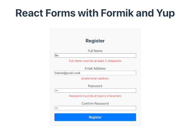
-
Click into a field and leave it empty → you’ll see an error message appear.
-
Enter invalid data → the border color turns red and a message displays.
-
Correct the input → the error message disappears automatically.
This creates an intuitive and responsive validation experience — essential for good form UX.
✅ Now you have:
-
A fully working registration form
-
Dynamic validation using Formik + Yup
-
User-friendly visual feedback for errors
Test the Form
Now that our form includes proper validation and visual feedback, it’s time to test how it behaves with different inputs. This step ensures that the validation rules, error messages, and submission logic all work as expected.
Step 1: Run the Application
Start your React app if it’s not already running:
npm run devThen, open your browser and navigate to:
👉 http://localhost:5173/
You should see your Registration Form with all four fields:
Full Name, Email, Password, and Confirm Password.
Step 2: Test Various Input Scenarios
🧪 Case 1: Empty Submission
Click the Register button without entering anything.
-
Each field should display a red border.
-
Validation messages like “Full Name is required” or “Email is required” should appear.
✅ Expected result: Form does not submit, and errors display for all empty fields.
🧪 Case 2: Invalid Email Format
Enter:
Full Name: John Doe
Email: johnexample.com
Password: secret123
Confirm Password: secret123-
The email field should show “Invalid email address.”
✅ Expected result: Submission blocked until a valid email format (like[email protected]) is entered.
🧪 Case 3: Weak or Short Password
Enter:
Full Name: John Doe
Email: [email protected]
Password: 123
Confirm Password: 123-
You should see: “Passwords must match.”
✅ Expected result: Validation prevents submission until both passwords are identical.
🧪 Case 5: All Valid Data
Enter:
Full Name: John Doe
Email: [email protected]
Password: secret123
Confirm Password: secret123
Click Register.
-
You should see an alert message: “Registration successful!”
-
The form resets automatically.
-
The console logs the submitted data:
Form Data: {
  fullName: "John Doe",
  email: "[email protected]",
  password: "secret123",
  confirmPassword: "secret123"
}
✅ Expected result: Successful submission and clean form reset.
Step 3: Optional — Handle Real Submissions
Right now, the form just logs data to the console.
In a real-world application, you would send the form data to an API or backend service.
You can simulate that by replacing the onSubmit handler inside useFormik with something like this:
onSubmit: async (values, { resetForm }) => {
  try {
    // Simulate API request
    await new Promise((resolve) => setTimeout(resolve, 1000));
    console.log("User registered:", values);
    alert("Registration successful!");
    resetForm();
  } catch (error) {
    console.error("Registration failed:", error);
  }
}
This example simulates an asynchronous form submission and adds graceful success handling.
✅ At this point, you’ve built and tested a fully functional, validated React form powered by Formik and Yup.
Best Practices
Building a form that works is great — but building one that’s scalable, maintainable, and user-friendly is even better.
Here are some best practices to follow when using Formik and Yup in your React projects.
1. Keep Validation Logic Separate
Always define your Yup schema in a separate file or at least outside the component.
This makes your code cleaner and easier to test or reuse across multiple forms.
Example:
// validationSchema.js
import * as Yup from 'yup';

export const registrationSchema = Yup.object({
  fullName: Yup.string().required('Full Name is required'),
  email: Yup.string().email('Invalid email').required('Email is required'),
  password: Yup.string().min(6).required('Password is required'),
  confirmPassword: Yup.string()
    .oneOf([Yup.ref('password')], 'Passwords must match')
    .required('Confirm Password is required'),
});
Then import it into your form component:
import { registrationSchema } from './validationSchema';2. Use Reusable Input Components
If you have multiple forms, consider creating reusable input components that handle:
-
Labels and placeholders
-
Error messages
-
Touch states and styling
This keeps your UI consistent and your code DRY (Don’t Repeat Yourself).
Example:
const TextInput = ({ label, name, type, formik }) => (
  <div className="form-control">
    <label>{label}</label>
    <input
      type={type}
      name={name}
      value={formik.values[name]}
      onChange={formik.handleChange}
      onBlur={formik.handleBlur}
    />
    {formik.touched[name] && formik.errors[name] && (
      <div className="error">{formik.errors[name]}</div>
    )}
  </div>
);
3. Leverage Formik’s <Field> and <ErrorMessage> Components
Formik provides these helper components to simplify input and error handling:
import { Formik, Form, Field, ErrorMessage } from 'formik';

<Formik ...>
  <Form>
    <label>Full Name</label>
    <Field name="fullName" type="text" />
    <ErrorMessage name="fullName" component="div" className="error" />
  </Form>
</Formik>
Using these components keeps your form markup cleaner and reduces boilerplate code.
4. Provide Instant Feedback
Users appreciate instant validation feedback — use validateOnChange and validateOnBlur options in Formik to control when validation runs.
Example:
useFormik({
  initialValues: {...},
  validationSchema: registrationSchema,
  validateOnChange: true,
  validateOnBlur: true,
});
5. Handle Submissions Gracefully
Always provide feedback when users submit a form.
For example:
-
Show a loading spinner while submitting.
-
Disable the submit button temporarily.
-
Show success or error messages after completion.
Example:
<button type="submit" disabled={formik.isSubmitting}>
  {formik.isSubmitting ? 'Submitting...' : 'Register'}
</button>
6. Keep Accessibility in Mind
Always associate labels with inputs using the htmlFor and id attributes.
Example:
<label htmlFor="email">Email</label>
<input id="email" name="email" type="email" />
This helps screen readers interpret your form properly, improving accessibility.
7. Use TypeScript for Better Safety (Optional)
If your project uses TypeScript, define form value types to prevent typos and improve autocompletion:
interface FormValues {
  fullName: string;
  email: string;
  password: string;
  confirmPassword: string;
}
By following these best practices, your forms will not only work correctly but also remain scalable, readable, and maintainable as your application grows.
Conclusion and Next Steps
In this tutorial, you’ve learned how to build and validate forms in React using Formik and Yup — two powerful libraries that make form handling clean, efficient, and scalable.
Here’s a quick recap of what we covered:
-
✅ Set up a React app using Vite for a fast development environment
-
✅ Installed and configured Formik to manage form state, handle input, and process submissions
-
✅ Added Yup validation for enforcing input rules and ensuring data integrity
-
✅ Displayed real-time validation feedback to guide users as they fill out the form
-
✅ Tested various scenarios to confirm that validation and submission worked correctly
-
✅ Learned best practices for reusable, maintainable, and accessible form components
By now, you should have a fully functional Registration Form that prevents invalid input, provides instant feedback, and can easily be extended for more complex use cases.
🚀 Next Steps
Here are a few ideas for what you can do next to expand your project:
-
Connect to a Backend API
Usefetch()or Axios to send form data to your server or authentication API. -
Add a Success Page or Redirect
After successful registration, redirect users to a dashboard or login page using React Router. -
Use Formik’s
<Field>and<ErrorMessage>Components
Simplify your JSX by replacing manual inputs with Formik’s built-in helpers. -
Integrate Advanced Validation Rules
Add pattern matching (e.g., password strength, phone numbers) or asynchronous validation (e.g., checking if an email already exists). -
Style Your Form with a UI Library
Try using Tailwind CSS, Material UI, or Chakra UI to improve the look and feel of your form.
💡 Final Thoughts
Forms are one of the most important parts of any web application — and with Formik and Yup, managing them doesn’t have to be painful.
These tools allow you to focus on building user-friendly, reliable forms while keeping your code organized and maintainable.
You can get the full source code on our GitHub.
That's just the basics. If you need more deep learning about React, you can take the following cheap course:
- React - The Complete Guide 2025 (incl. Next.js, Redux)
- The Ultimate React Course 2025: React, Next.js, Redux & More
- Modern React From The Beginning
- Complete React, Next.js & TypeScript Projects Course 2025
- 100 Hours Web Development Bootcamp - Build 23 React Projects
- React JS Masterclass: Zero To Job Ready With 10 Projects
- Big React JS Course With AI (Redux / Router / Tailwind CSS)
- React JS + ChatGPT Crash Course: Build Dynamic React Apps
- Advanced React: Design System, Design Patterns, Performance
- Microfrontends with React: A Complete Developer's Guide
Thanks!