
Building modern web applications requires not only functionality but also clean, responsive, and visually appealing user interfaces. While React provides the flexibility and power to create dynamic components, styling them from scratch can often be time-consuming. That’s where Tailwind CSS comes in.
Tailwind CSS is a utility-first CSS framework that lets you rapidly build custom designs without leaving your HTML (or JSX). Instead of writing lengthy CSS files, you use pre-defined utility classes directly in your components, making development faster and more consistent.
In this tutorial, we’ll walk through how to set up a React project with Tailwind CSS and build a responsive, modern-looking UI step by step. By the end, you’ll learn how to:
-
Set up React with Tailwind CSS.
-
Use Tailwind utility classes to style components.
-
Create responsive layouts without writing custom CSS.
-
Build a polished UI faster than traditional styling methods.
Whether you’re new to Tailwind CSS or want to improve your React workflow, this guide will give you a practical foundation to create beautiful interfaces quickly.
Project Setup (React + Tailwind Installation)
Before we can start building our UI, we need to set up a new React project and integrate Tailwind CSS.
Step 1: Create a New React Project
We’ll use Vite as the build tool since it’s much faster than Create React App and is now the recommended way to scaffold React projects.
Run the following commands:
# Create a new React project with Vite
npm create vite@latest react-tailwind-ui

# Navigate into the project folder
cd react-tailwind-ui

# Install dependencies
npm install
When prompted, choose:
-
Framework:
React -
Variant:
JavaScript(orTypeScriptif you prefer)
Step 2: Install Tailwind CSS
Next, install Tailwind CSS and its required dependencies:
npm install tailwindcss @tailwindcss/viteAdd the @tailwindcss/vite plugin to your Vite configuration.
import { defineConfig } from 'vite'
import react from '@vitejs/plugin-react'
import tailwindcss from '@tailwindcss/vite'

// https://vite.dev/config/
export default defineConfig({
  plugins: [
    react(),
    tailwindcss(),
  ],
})
Add an @import to your CSS file src/index.css that imports Tailwind CSS.
@import "tailwindcss";Step 3: Run the Development Server
Now, start your development server:
npm run devOpen the provided local URL (usually http://localhost:5173) and you should see the default Vite + React app running.
✅ Tailwind CSS is now successfully integrated into your React project!
Building the Layout (Header, Main, Footer)
Now that React and Tailwind CSS are set up, let’s create a simple page layout that we can expand later. We’ll structure the UI into three parts:
-
Header – Contains the site logo and navigation.
-
Main Content – The core content of the page.
-
Footer – Basic footer with copyright info.
Step 1: Clean Up the Starter Files
Inside src/, remove unused files like App.css and assets/react.svg.
Then, update your App.tsx file so it looks like this:
import React from "react";
const App: React.FC = () => {
return (
<div className="flex flex-col min-h-screen">
{/* Header */}
<header className="bg-blue-600 text-white shadow-md">
<div className="container mx-auto flex justify-between items-center p-4">
<h1 className="text-xl font-bold">MyApp</h1>
<nav className="space-x-4">
<a href="#" className="hover:underline">Home</a>
<a href="#" className="hover:underline">About</a>
<a href="#" className="hover:underline">Contact</a>
</nav>
</div>
</header>
{/* Main Content */}
<main className="flex-grow container mx-auto p-4">
<h2 className="text-2xl font-semibold mb-4">Welcome to MyApp</h2>
<p className="text-gray-700">
This is a simple React + Tailwind CSS application. We’ll continue
building more components to make the UI beautiful and responsive.
</p>
</main>
{/* Footer */}
<footer className="bg-gray-800 text-gray-200 py-4 mt-8">
<div className="container mx-auto text-center">
<p>© {new Date().getFullYear()} MyApp. All rights reserved.</p>
</div>
</footer>
</div>
);
};
export default App;Step 2: Explanation of Key Tailwind Classes
-
flex flex-col min-h-screen→ Makes the layout fill the full screen and stack vertically. -
container mx-auto→ Centers content with max-width breakpoints. -
flex justify-between items-center→ Spaces out logo and navigation in the header. -
flex-grow→ Ensures the main section takes up remaining space between header and footer. -
bg-blue-600 text-white→ Gives the header a blue background with white text. -
bg-gray-800 text-gray-200→ Styles the footer with a dark theme.
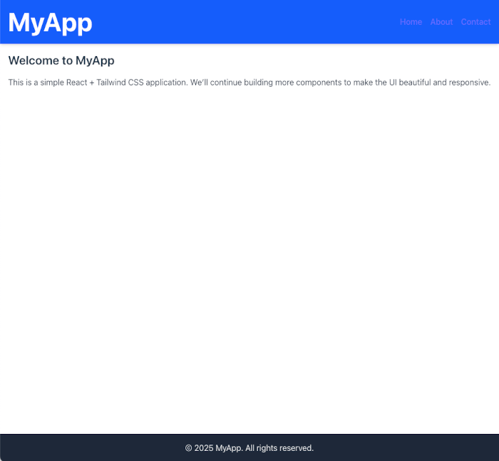
Step 3: Preview
When you refresh the page, you should see:
✅ A sticky header at the top with navigation links.
✅ A main content section in the middle.
✅ A footer at the bottom with copyright info.
This gives us a solid foundation for building out our UI further.
Creating a Hero Section with Tailwind CSS (TSX)
The Hero Section will sit inside the <main> area, right below the header. It will use responsive classes to adapt nicely to different screen sizes.
Step 1: Update App.tsx
Modify the main section in your App.tsx file like this:
import React from "react";
const App: React.FC = () => {
return (
<div className="flex flex-col min-h-screen">
{/* Header */}
<header className="bg-blue-600 text-white shadow-md">
<div className="container mx-auto flex justify-between items-center p-4">
<h1 className="text-xl font-bold">MyApp</h1>
<nav className="space-x-4">
<a href="#" className="hover:underline">Home</a>
<a href="#" className="hover:underline">About</a>
<a href="#" className="hover:underline">Contact</a>
</nav>
</div>
</header>
{/* Main Content */}
<main className="flex-grow">
{/* Hero Section */}
<section className="bg-gray-100">
<div className="container mx-auto px-6 py-16 text-center">
<h2 className="text-4xl md:text-5xl font-bold text-gray-800 mb-4">
Build Beautiful UIs Faster with React + Tailwind
</h2>
<p className="text-lg text-gray-600 mb-8 max-w-2xl mx-auto">
Tailwind CSS helps you create modern, responsive, and customizable
interfaces without writing a single line of custom CSS.
</p>
<button className="bg-blue-600 text-white px-6 py-3 rounded-lg text-lg font-medium hover:bg-blue-700 transition">
Get Started
</button>
</div>
</section>
</main>
{/* Footer */}
<footer className="bg-gray-800 text-gray-200 py-4 mt-8">
<div className="container mx-auto text-center">
<p>© {new Date().getFullYear()} MyApp. All rights reserved.</p>
</div>
</footer>
</div>
);
};
export default App;Step 2: Key Tailwind Classes Used
-
bg-gray-100→ Light background for contrast. -
container mx-auto px-6 py-16→ Centers and adds spacing inside the hero. -
text-4xl md:text-5xl font-bold→ Large, bold heading that scales on bigger screens. -
max-w-2xl mx-auto→ Restricts paragraph width for better readability. -
bg-blue-600 hover:bg-blue-700→ Button styling with hover effect. -
transition→ Smooth color transition on hover.
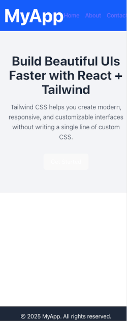
Step 3: Preview
When you refresh the app, you’ll see a hero section with a headline, description, and call-to-action button centered on the page.
✅ It’s already responsive — try resizing the browser to see the heading scale down gracefully.

Adding Responsive Cards (Features/Services Section)
Step 1: Update App.tsx
We’ll place the cards section right under the Hero inside the <main> content.
import React from "react";
const App: React.FC = () => {
return (
<div className="flex flex-col min-h-screen">
{/* Header */}
<header className="bg-blue-600 text-white shadow-md">
<div className="container mx-auto flex justify-between items-center p-4">
<h1 className="text-xl font-bold">MyApp</h1>
<nav className="space-x-4">
<a href="#" className="hover:underline">Home</a>
<a href="#" className="hover:underline">About</a>
<a href="#" className="hover:underline">Contact</a>
</nav>
</div>
</header>
{/* Main Content */}
<main className="flex-grow">
{/* Hero Section */}
<section className="bg-gray-100">
<div className="container mx-auto px-6 py-16 text-center">
<h2 className="text-4xl md:text-5xl font-bold text-gray-800 mb-4">
Build Beautiful UIs Faster with React + Tailwind
</h2>
<p className="text-lg text-gray-600 mb-8 max-w-2xl mx-auto">
Tailwind CSS helps you create modern, responsive, and customizable
interfaces without writing a single line of custom CSS.
</p>
<button className="bg-blue-600 text-white px-6 py-3 rounded-lg text-lg font-medium hover:bg-blue-700 transition">
Get Started
</button>
</div>
</section>
{/* Features Section */}
<section className="py-16 bg-white">
<div className="container mx-auto px-6 text-center">
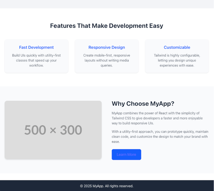
<h3 className="text-3xl font-bold text-gray-800 mb-12">
Features That Make Development Easy
</h3>
<div className="grid gap-8 md:grid-cols-3">
{/* Card 1 */}
<div className="bg-gray-50 p-6 rounded-xl shadow hover:shadow-lg transition">
<h4 className="text-xl font-semibold mb-3 text-blue-600">
Fast Development
</h4>
<p className="text-gray-600">
Build UIs quickly with utility-first classes that speed up
your workflow.
</p>
</div>
{/* Card 2 */}
<div className="bg-gray-50 p-6 rounded-xl shadow hover:shadow-lg transition">
<h4 className="text-xl font-semibold mb-3 text-blue-600">
Responsive Design
</h4>
<p className="text-gray-600">
Create mobile-first, responsive layouts without writing media
queries.
</p>
</div>
{/* Card 3 */}
<div className="bg-gray-50 p-6 rounded-xl shadow hover:shadow-lg transition">
<h4 className="text-xl font-semibold mb-3 text-blue-600">
Customizable
</h4>
<p className="text-gray-600">
Tailwind is highly configurable, letting you design unique
experiences with ease.
</p>
</div>
</div>
</div>
</section>
</main>
{/* Footer */}
<footer className="bg-gray-800 text-gray-200 py-4 mt-8">
<div className="container mx-auto text-center">
<p>© {new Date().getFullYear()} MyApp. All rights reserved.</p>
</div>
</footer>
</div>
);
};
export default App;Step 2: Key Tailwind Classes Used
-
grid gap-8 md:grid-cols-3→ Creates a responsive grid (1 column on mobile, 3 on medium+ screens). -
bg-gray-50 p-6 rounded-xl shadow hover:shadow-lg transition→ Styles the cards with padding, rounded corners, and hover effects. -
text-blue-600→ Gives headings a consistent accent color.
Step 3: Preview
Now, under the Hero section, you’ll see three responsive feature cards that adapt beautifully across screen sizes.

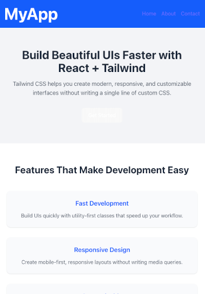
✅ On small screens → cards stack vertically.
✅ On larger screens → they align in three columns.
Adding an Image + Text Section (About/Info Section)
This section will display an image on one side and some descriptive text on the other. On smaller screens, the layout will stack vertically.
Step 1: Update App.tsx
Place this section below the Features Section and above the Footer:
import React from "react";
const App: React.FC = () => {
return (
<div className="flex flex-col min-h-screen">
{/* Header */}
<header className="bg-blue-600 text-white shadow-md">
<div className="container mx-auto flex justify-between items-center p-4">
<h1 className="text-xl font-bold">MyApp</h1>
<nav className="space-x-4">
<a href="#" className="hover:underline">Home</a>
<a href="#" className="hover:underline">About</a>
<a href="#" className="hover:underline">Contact</a>
</nav>
</div>
</header>
{/* Main Content */}
<main className="flex-grow">
{/* Hero Section */}
<section className="bg-gray-100">
<div className="container mx-auto px-6 py-16 text-center">
<h2 className="text-4xl md:text-5xl font-bold text-gray-800 mb-4">
Build Beautiful UIs Faster with React + Tailwind
</h2>
<p className="text-lg text-gray-600 mb-8 max-w-2xl mx-auto">
Tailwind CSS helps you create modern, responsive, and customizable
interfaces without writing a single line of custom CSS.
</p>
<button className="bg-blue-600 text-white px-6 py-3 rounded-lg text-lg font-medium hover:bg-blue-700 transition">
Get Started
</button>
</div>
</section>
{/* Features Section */}
<section className="py-16 bg-white">
<div className="container mx-auto px-6 text-center">
<h3 className="text-3xl font-bold text-gray-800 mb-12">
Features That Make Development Easy
</h3>
<div className="grid gap-8 md:grid-cols-3">
{/* Card 1 */}
<div className="bg-gray-50 p-6 rounded-xl shadow hover:shadow-lg transition">
<h4 className="text-xl font-semibold mb-3 text-blue-600">
Fast Development
</h4>
<p className="text-gray-600">
Build UIs quickly with utility-first classes that speed up
your workflow.
</p>
</div>
{/* Card 2 */}
<div className="bg-gray-50 p-6 rounded-xl shadow hover:shadow-lg transition">
<h4 className="text-xl font-semibold mb-3 text-blue-600">
Responsive Design
</h4>
<p className="text-gray-600">
Create mobile-first, responsive layouts without writing media
queries.
</p>
</div>
{/* Card 3 */}
<div className="bg-gray-50 p-6 rounded-xl shadow hover:shadow-lg transition">
<h4 className="text-xl font-semibold mb-3 text-blue-600">
Customizable
</h4>
<p className="text-gray-600">
Tailwind is highly configurable, letting you design unique
experiences with ease.
</p>
</div>
</div>
</div>
</section>
{/* About Section */}
<section className="py-16 bg-gray-50">
<div className="container mx-auto px-6 md:grid md:grid-cols-2 md:gap-12 items-center">
{/* Image */}
<div className="mb-8 md:mb-0">
<img
src="https://via.placeholder.com/500x300"
alt="About MyApp"
className="rounded-xl shadow-md"
/>
</div>
{/* Text */}
<div>
<h3 className="text-3xl font-bold text-gray-800 mb-4">
Why Choose MyApp?
</h3>
<p className="text-gray-600 mb-4">
MyApp combines the power of React with the simplicity of Tailwind CSS
to give developers a faster and more enjoyable way to build responsive UIs.
</p>
<p className="text-gray-600 mb-6">
With a utility-first approach, you can prototype quickly, maintain clean
code, and customize the design to match your brand with ease.
</p>
<a
href="#"
className="inline-block bg-blue-600 text-white px-6 py-3 rounded-lg text-lg font-medium hover:bg-blue-700 transition"
>
Learn More
</a>
</div>
</div>
</section>
</main>
{/* Footer */}
<footer className="bg-gray-800 text-gray-200 py-4 mt-8">
<div className="container mx-auto text-center">
<p>© {new Date().getFullYear()} MyApp. All rights reserved.</p>
</div>
</footer>
</div>
);
};
export default App;Step 2: Key Tailwind Classes Used
-
md:grid md:grid-cols-2 md:gap-12→ Splits layout into two columns on medium+ screens. -
rounded-xl shadow-md→ Gives the image a polished look. -
mb-8 md:mb-0→ Ensures proper spacing when stacked on mobile. -
inline-block bg-blue-600 hover:bg-blue-700→ Styles the call-to-action button.
Step 3: Preview
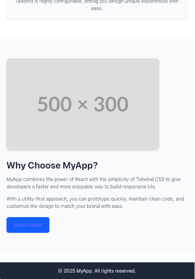
✅ On mobile screens → image stacks above text.
✅ On larger screens → image and text sit side by side for a professional layout.
Adding a Call-to-Action (CTA) Banner
The CTA banner will be a full-width section with a strong headline, a short description, and a button.
Step 1: Update App.tsx
Add the CTA Section just above the footer:
import React from "react";
const App: React.FC = () => {
return (
<div className="flex flex-col min-h-screen">
{/* Header */}
<header className="bg-blue-600 text-white shadow-md">
<div className="container mx-auto flex justify-between items-center p-4">
<h1 className="text-xl font-bold">MyApp</h1>
<nav className="space-x-4">
<a href="#" className="hover:underline">Home</a>
<a href="#" className="hover:underline">About</a>
<a href="#" className="hover:underline">Contact</a>
</nav>
</div>
</header>
{/* Main Content */}
<main className="flex-grow">
{/* Hero Section */}
<section className="bg-gray-100">
<div className="container mx-auto px-6 py-16 text-center">
<h2 className="text-4xl md:text-5xl font-bold text-gray-800 mb-4">
Build Beautiful UIs Faster with React + Tailwind
</h2>
<p className="text-lg text-gray-600 mb-8 max-w-2xl mx-auto">
Tailwind CSS helps you create modern, responsive, and customizable
interfaces without writing a single line of custom CSS.
</p>
<button className="bg-blue-600 text-white px-6 py-3 rounded-lg text-lg font-medium hover:bg-blue-700 transition">
Get Started
</button>
</div>
</section>
{/* Features Section */}
<section className="py-16 bg-white">
<div className="container mx-auto px-6 text-center">
<h3 className="text-3xl font-bold text-gray-800 mb-12">
Features That Make Development Easy
</h3>
<div className="grid gap-8 md:grid-cols-3">
{/* Card 1 */}
<div className="bg-gray-50 p-6 rounded-xl shadow hover:shadow-lg transition">
<h4 className="text-xl font-semibold mb-3 text-blue-600">
Fast Development
</h4>
<p className="text-gray-600">
Build UIs quickly with utility-first classes that speed up
your workflow.
</p>
</div>
{/* Card 2 */}
<div className="bg-gray-50 p-6 rounded-xl shadow hover:shadow-lg transition">
<h4 className="text-xl font-semibold mb-3 text-blue-600">
Responsive Design
</h4>
<p className="text-gray-600">
Create mobile-first, responsive layouts without writing media
queries.
</p>
</div>
{/* Card 3 */}
<div className="bg-gray-50 p-6 rounded-xl shadow hover:shadow-lg transition">
<h4 className="text-xl font-semibold mb-3 text-blue-600">
Customizable
</h4>
<p className="text-gray-600">
Tailwind is highly configurable, letting you design unique
experiences with ease.
</p>
</div>
</div>
</div>
</section>
{/* About Section */}
<section className="py-16 bg-gray-50">
<div className="container mx-auto px-6 md:grid md:grid-cols-2 md:gap-12 items-center">
{/* Image */}
<div className="mb-8 md:mb-0">
<img
src="https://via.placeholder.com/500x300"
alt="About MyApp"
className="rounded-xl shadow-md"
/>
</div>
{/* Text */}
<div>
<h3 className="text-3xl font-bold text-gray-800 mb-4">
Why Choose MyApp?
</h3>
<p className="text-gray-600 mb-4">
MyApp combines the power of React with the simplicity of Tailwind CSS
to give developers a faster and more enjoyable way to build responsive UIs.
</p>
<p className="text-gray-600 mb-6">
With a utility-first approach, you can prototype quickly, maintain clean
code, and customize the design to match your brand with ease.
</p>
<a
href="#"
className="inline-block bg-blue-600 text-white px-6 py-3 rounded-lg text-lg font-medium hover:bg-blue-700 transition"
>
Learn More
</a>
</div>
</div>
</section>
{/* CTA Section */}
<section className="bg-blue-600 text-white py-16">
<div className="container mx-auto px-6 text-center">
<h3 className="text-3xl md:text-4xl font-bold mb-4">
Ready to Build Your Next Project?
</h3>
<p className="text-lg text-blue-100 mb-8 max-w-xl mx-auto">
Get started with React and Tailwind today and create modern, responsive UIs faster than ever before.
</p>
<a
href="#"
className="inline-block bg-white text-blue-600 px-8 py-3 rounded-lg text-lg font-medium hover:bg-gray-100 transition"
>
Start Now
</a>
</div>
</section>
</main>
{/* Footer */}
<footer className="bg-gray-800 text-gray-200 py-4 mt-8">
<div className="container mx-auto text-center">
<p>© {new Date().getFullYear()} MyApp. All rights reserved.</p>
</div>
</footer>
</div>
);
};
export default App;Step 2: Key Tailwind Classes Used
-
bg-blue-600 text-white→ Creates a bold, attention-grabbing banner. -
text-blue-100→ Slightly lighter text for the description. -
bg-white text-blue-600→ Inverts the button color for contrast. -
max-w-xl mx-auto→ Centers and limits the width of the paragraph for readability.
Step 3: Preview
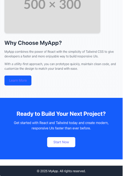
✅ You’ll now see a full-width CTA banner above the footer.
✅ On mobile screens, everything is centered.
✅ On larger screens, the banner remains bold and clean.
Conclusion + Final Thoughts
In this tutorial, we built a beautiful and responsive UI using React + Tailwind CSS step by step:
-
✅ Set up a React + Tailwind CSS project with TypeScript
-
✅ Created a clean layout with Header, Main, and Footer
-
✅ Designed a modern Hero section with a call-to-action button
-
✅ Added a responsive card grid for features or services
-
✅ Built an About section with an image + text layout
-
✅ Added a CTA banner to encourage user engagement
By now, you should have a fully responsive UI that works across desktop, tablet, and mobile — all styled with Tailwind’s utility-first classes.
Why Tailwind CSS?
-
🚀 Faster development: You don’t need to write custom CSS from scratch.
-
🎨 Consistent design: Predefined utility classes make styling predictable.
-
📱 Responsive by default: Built-in responsive modifiers like
sm:,md:,lg:make adapting to screen sizes effortless. -
🛠 Highly customizable: You can extend Tailwind to match your branding with a custom config.
Next Steps
From here, you can:
-
Add React Router for navigation
-
Use state management (like React Context or Redux)
-
Hook up real data from an API or backend
-
Add animations (e.g., with Framer Motion)
With React + Tailwind, you have a solid foundation to scale your app’s UI quickly and beautifully.
You can get the full source code on our GitHub.
That's just the basics. If you need more deep learning about React, you can take the following cheap course:
- React - The Complete Guide 2025 (incl. Next.js, Redux)
- The Ultimate React Course 2025: React, Next.js, Redux & More
- Modern React From The Beginning
- Complete React, Next.js & TypeScript Projects Course 2025
- 100 Hours Web Development Bootcamp - Build 23 React Projects
- React JS Masterclass: Zero To Job Ready With 10 Projects
- Big React JS Course With AI (Redux / Router / Tailwind CSS)
- React JS + ChatGPT Crash Course: Build Dynamic React Apps
- Advanced React: Design System, Design Patterns, Performance
- Microfrontends with React: A Complete Developer's Guide
Thanks!