In modern web applications, providing clear and timely feedback to users is essential for a great user experience. Whether it’s confirming an action, warning about an error, or simply notifying users of a background process, toast notifications play a vital role in keeping users informed without disrupting their workflow.
In Angular applications, the easiest and most elegant way to display such notifications is by using the Angular Material Snackbar component. A Snackbar is a lightweight, non-intrusive message bar that appears temporarily at the bottom of the screen. It’s perfect for showing short messages like:
-
“Form submitted successfully.”
-
“Failed to save data. Try again.”
-
“Item deleted. Undo?”
The Snackbar component is part of Angular Material, Google’s official UI library for Angular, which follows the Material Design principles. It provides a consistent and visually appealing way to deliver notifications and includes customization options for duration, position, actions, and styling.
In this tutorial, you’ll learn step-by-step how to:
-
Install and configure Angular Material in your Angular 20 project
-
Display simple and action-enabled Snackbar messages
-
Customize the appearance and duration
-
Create a reusable Snackbar service for your entire application
-
Use Snackbar in real-world scenarios such as API responses
By the end of this guide, you’ll be able to easily integrate Snackbar toast notifications into your Angular apps to enhance user interaction and feedback.
Prerequisites
Before getting started with Angular Material Snackbar, make sure your development environment is properly set up and you have the required tools installed.
✅ What You’ll Need
-
Node.js (v20 or later)
Angular 20 requires Node.js 20 or newer. You can check your version by running:node -vIf you need to install or update Node.js, download it from nodejs.org.
-
Angular CLI (v20 or later)
The Angular Command Line Interface (CLI) simplifies project setup, development, and deployment.
Install or update it globally with:npm install -g @angular/cliThen verify the version:
ng version -
A Code Editor
Use your preferred editor—Visual Studio Code is highly recommended for its Angular and TypeScript support. -
Basic Knowledge of Angular
You should be familiar with:-
Creating components and services
-
Using Angular modules
-
Basic TypeScript syntax
-
🧰 Project Setup Overview
In the next section, we’ll:
-
Create a new Angular 20 project using the CLI
-
Install Angular Material 20
-
Configure Material’s theme and typography
Once your environment is ready, you’ll be all set to start implementing Snackbar notifications.
Create a New Angular App and Install Angular Material
Now that your environment is ready, let’s create a fresh Angular 20 project and add Angular Material to it. This section will walk you through setting up everything needed to start working with Snackbar notifications.
🧱 Step 1: Create a New Angular Project
Open your terminal or command prompt, then run the following command to create a new Angular 20 project named angular-snackbar-demo:
ng new angular-snackbar-demoYou’ll be prompted to choose some configuration options:
-
Would you like to add Angular routing? →
Yes -
Which stylesheet format would you like to use? →
SCSS(recommended for Angular Material)
Once the setup is complete, navigate into your new project folder:
cd angular-snackbar-demoYou can test that the project works correctly by running:
ng serveThen open your browser at http://localhost:4200/.
You should see the default Angular welcome page.
🎨 Step 2: Install Angular Material
Next, install Angular Material, along with its animations and CDK packages, using this command:
ng add @angular/materialThis command will:
-
Automatically install Angular Material and dependencies
-
Configure animations (
BrowserAnimationsModule) -
Prompt you to select a pre-built theme
-
Add typography and set up Material icons
You’ll be asked a few questions during installation:
-
Choose a prebuilt theme name → e.g.,
Indigo/Pink -
Set up global typography styles? →
Yes -
Set up browser animations for Angular Material? →
Yes
After installation, Angular CLI automatically updates your project to include Angular Material modules and styles.
🧩 Step 3: Verify Angular Material Installation
To confirm that Angular Material was installed successfully, open your project’s angular.json and ensure the theme CSS file appears under the styles section, something like:
"styles": [
  "src/styles.scss",
  "node_modules/@angular/material/prebuilt-themes/indigo-pink.css"
]
You can also verify by importing a simple Material component (like a button) later in your app to check if the styling loads correctly.
With Angular Material successfully installed and configured, you’re ready to start working with Snackbar notifications in your app.
Import MatSnackBarModule (Standalone Setup)
In Angular 20 standalone applications, you no longer need AppModule.
Instead, you import all necessary Angular and Material modules directly inside your main component or app.config.ts using importProvidersFrom().
Let’s see how to integrate MatSnackBarModule in this setup.
⚙️ Step 1: Open Your Main Configuration File
Open your project’s src/main.ts or src/app/app.config.ts (depending on your project structure).
If you’re using the default standalone setup from ng new, you’ll likely find this line inside main.ts:
bootstrapApplication(AppComponent, appConfig);Now open src/app/app.config.ts — this file defines your application-wide configuration.
📦 Step 2: Import MatSnackBarModule
Modify your app.config.ts file to include MatSnackBarModule via importProvidersFrom().
Your file should look like this:
import { ApplicationConfig, importProvidersFrom, provideBrowserGlobalErrorListeners, provideZoneChangeDetection } from '@angular/core';
import { provideRouter } from '@angular/router';

import { routes } from './app.routes';
import { MatSnackBarModule } from '@angular/material/snack-bar';

export const appConfig: ApplicationConfig = {
  providers: [
    provideBrowserGlobalErrorListeners(),
    provideZoneChangeDetection({ eventCoalescing: true }),
    provideRouter(routes),
    importProvidersFrom(MatSnackBarModule)
  ]
};
Here’s what’s happening:
-
importProvidersFrom(MatSnackBarModule)— makes the Snackbar functionality available globally. -
provideAnimations()— enables Material’s built-in animations. -
provideRouter(routes)— standard Angular routing setup (if your app uses routes).
🎨 Step 3: Verify Angular Material Theme
During installation, Angular CLI added a prebuilt theme in angular.json.
Ensure the following entry exists under "styles":
"styles": [
  "src/styles.scss",
  "node_modules/@angular/material/prebuilt-themes/indigo-pink.css"
]
You can change indigo-pink.css to another theme if you prefer (deeppurple-amber.css, pink-bluegrey.css, etc.).
🧪 Step 4: Run the App
Run your app to confirm everything compiles correctly:
ng serveNavigate to http://localhost:4200/ and ensure the app loads without errors.
Now that Angular Material Snackbar is imported and ready, let’s display your first Snackbar notification using the MatSnackBar service.
Display a Simple Snackbar Message
With MatSnackBarModule configured in your standalone Angular 20 app, you’re now ready to show your first Snackbar notification.
This section demonstrates how to use Angular Material’s MatSnackBar service to display a simple, temporary message at the bottom of the screen.
⚙️ Step 1: Inject MatSnackBar in Your Component
Open your main component file — typically src/app/app.ts.
Import MatSnackBar from @angular/material/snack-bar, and use Angular’s dependency injection to access it.
Here’s how the code should look:
import { Component, signal } from '@angular/core';
import { MatButtonModule } from '@angular/material/button';
import { MatSnackBar } from '@angular/material/snack-bar';

@Component({
  selector: 'app-root',
  imports: [MatButtonModule],
  templateUrl: './app.html',
  styleUrl: './app.scss'
})
export class App {
  constructor(private snackBar: MatSnackBar) { }

  openSnackBar() {
    this.snackBar.open('Message sent successfully!', 'Close', {
      duration: 3000
    });
  }
}src/app/app.html.
<div class="container">
  <h1>Angular Material Snackbar Example</h1>
  <button mat-raised-button color="primary" (click)="openSnackBar()">Show Snackbar</button>
</div>src/app/app.scss.
.container {
  text-align: center;
  margin-top: 4rem;
}
🧠 How It Works
-
MatSnackBar.open(message, action, config)
Displays a Snackbar with your desired message and optional action button.-
message: The text to display (e.g., “Message sent successfully!”). -
action: The label for the action button (e.g., “Close”). -
config: An object to customize options like duration and position.
-
-
duration: 3000means the Snackbar automatically disappears after 3 seconds. -
The Snackbar appears at the bottom-center by default, following Material Design guidelines.
🧪 Step 2: Run the App and Test
Start your app:
ng serveGo to http://localhost:4200/ and click the “Show Snackbar” button.
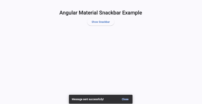
You should see a Snackbar message appear at the bottom with a “Close” button — congratulations, you’ve displayed your first toast notification! 🎉
Add Action Button to Snackbar
In many real-world cases, Snackbar notifications aren’t just for displaying information — they also let users take quick actions, like Undo, Retry, or Dismiss.
Angular Material’s MatSnackBar makes this easy by including an optional action button and an event listener to handle user clicks.
Let’s build on the previous example to add interactive behavior.
⚙️ Step 1: Update the Snackbar with an Action
Open your app.component.ts file and modify the openSnackBar() method to include an action and a response handler.
import { Component, signal } from '@angular/core';
import { MatButtonModule } from '@angular/material/button';
import { MatSnackBar } from '@angular/material/snack-bar';

@Component({
  selector: 'app-root',
  imports: [MatButtonModule],
  templateUrl: './app.html',
  styleUrl: './app.scss'
})
export class App {
  constructor(private snackBar: MatSnackBar) { }

  openSnackBar() {
    const snackBarRef = this.snackBar.open('Item deleted', 'Undo', {
      duration: 4000
    });

    // Listen for the action button click
    snackBarRef.onAction().subscribe(() => {
      this.undoDelete();
    });
  }

  undoDelete() {
    this.snackBar.open('Item restored', '', { duration: 2000 });
  }
}
app.component.html
<div class="container">
  <h1>Angular Material Snackbar with Action</h1>
  <button mat-raised-button color="primary" (click)="openSnackBar()">Delete Item</button>
</div>
🧠 How It Works
-
this.snackBar.open('Item deleted', 'Undo')
Displays a Snackbar with the message “Item deleted” and an Undo action button. -
onAction().subscribe()
Returns an observable that emits when the user clicks the action button.
In this case, it calls theundoDelete()method. -
undoDelete()
Shows another short Snackbar confirming the action was undone.
🧪 Step 2: Test the Action
Run your app again:
ng serveWhen you click “Delete Item”, you’ll see a Snackbar with the Undo button.
If you click Undo, a second Snackbar appears saying “Item restored”.
Congratulations — you’ve now added interactive functionality to your Snackbar! 🎉
Customize Snackbar Appearance and Duration
By default, Angular Material Snackbar appears at the bottom-center of the screen with a simple gray background. While this works for most cases, you can easily customize its position, duration, and styling to better match your app’s design and UX needs.
In this section, we’ll explore several ways to enhance your Snackbar’s appearance.
⚙️ Step 1: Change Duration and Position
You can modify how long the Snackbar stays visible and where it appears on the screen using the MatSnackBarConfig options.
Update your openSnackBar() method like this:
openSnackBar() {
  this.snackBar.open('Data saved successfully!', 'Close', {
    duration: 5000,
    horizontalPosition: 'right',
    verticalPosition: 'top'
  });
}
Configuration options:
-
duration: Sets how long the Snackbar stays visible (in milliseconds). -
horizontalPosition: Can be'start' | 'center' | 'end' | 'left' | 'right'. -
verticalPosition: Can be'top' | 'bottom'.
🧠 Example use cases:
-
Show success messages at the top-right for better visibility.
-
Keep error messages at the bottom for consistency.
🎨 Step 2: Add Custom Styles
To give your Snackbar a unique appearance, you can apply custom CSS classes using the panelClass property.
openSnackBar() {
  this.snackBar.open('Operation failed. Try again.', 'Retry', {
    duration: 4000,
    horizontalPosition: 'center',
    verticalPosition: 'bottom',
    panelClass: ['error-snackbar']
  });
}
Then, in your styles.scss file (or component styles if you prefer scoped CSS), define your custom style:
.error-snackbar {
  background-color: #d32f2f;
  color: #fff;
  font-weight: 500;
  border-radius: 4px;
}

.success-snackbar {
  background-color: #388e3c;
  color: #fff;
  font-weight: 500;
}
💡 Tip:
You can define multiple classes (e.g., ['success-snackbar', 'mat-elevation-z4']) for added Material elevation or shadows.
🧩 Step 3: Create Different Styles for Message Types
It’s common to use different colors for different message categories (success, error, info).
You can assign these classes dynamically:
showMessage(message: string, type: 'success' | 'error' | 'info') {
  const panelClass =
    type === 'success' ? 'success-snackbar' :
    type === 'error' ? 'error-snackbar' : 'info-snackbar';

  this.snackBar.open(message, 'Close', {
    duration: 3000,
    panelClass: [panelClass]
  });
}
This makes your Snackbar reusable for multiple message types throughout the app.
With these customizations, your Snackbar now feels like a natural part of your app’s UI — colorful, dynamic, and context-aware.
Create a Reusable Snackbar Service
As your application grows, you’ll likely need to display Snackbar notifications from many different components — for example, after a successful API call, when a form is submitted, or if an error occurs.
Instead of duplicating Snackbar logic everywhere, you can create a centralized, reusable Snackbar service.
This approach keeps your code cleaner, more maintainable, and easier to extend.
⚙️ Step 1: Generate the Snackbar Service
Run the following Angular CLI command to create a new service:
ng generate service services/snackbarThis creates two files:
src/app/services/snackbar.ts
src/app/services/snackbar.spec.ts
📦 Step 2: Implement the Snackbar Service
Open the newly created snackbar.ts and update it as follows:
import { Injectable } from '@angular/core';
import { MatSnackBar, MatSnackBarConfig } from '@angular/material/snack-bar';

@Injectable({
  providedIn: 'root',
})
export class Snackbar {
  constructor(private snackBar: MatSnackBar) { }

  open(message: string, action: string = 'Close', config?: MatSnackBarConfig) {
    this.snackBar.open(message, action, config);
  }

  success(message: string) {
    this.open(message, 'Close', {
      duration: 3000,
      panelClass: ['success-snackbar'],
      horizontalPosition: 'right',
      verticalPosition: 'top'
    });
  }

  error(message: string) {
    this.open(message, 'Close', {
      duration: 4000,
      panelClass: ['error-snackbar'],
      horizontalPosition: 'right',
      verticalPosition: 'top'
    });
  }

  info(message: string) {
    this.open(message, 'Close', {
      duration: 3000,
      panelClass: ['info-snackbar'],
      horizontalPosition: 'right',
      verticalPosition: 'top'
    });
  }
}
🧠 How it works:
-
open()is a generic method for displaying any Snackbar with custom configuration. -
success(),error(), andinfo()are convenience methods for common message types, each with distinct colors and durations. -
The service is provided in the root injector, so it can be used anywhere in the app without re-importing.
🎨 Step 3: Add Custom Snackbar Styles
In your global styles.scss, define CSS classes for each message type:
.success-snackbar {
  background-color: #4caf50;
  color: #fff;
  font-weight: 500;
}

.error-snackbar {
  background-color: #f44336;
  color: #fff;
  font-weight: 500;
}

.info-snackbar {
  background-color: #2196f3;
  color: #fff;
  font-weight: 500;
}
🧩 Step 4: Use the Snackbar Service in a Component
Now you can inject and use the service in any standalone component — for example, in app.ts:
import { Component, signal } from '@angular/core';
import { MatButtonModule } from '@angular/material/button';
import { Snackbar } from './services/snackbar';

@Component({
  selector: 'app-root',
  imports: [MatButtonModule],
  templateUrl: './app.html',
  styleUrl: './app.scss'
})
export class App {

  constructor(private snackbarService: Snackbar) { }

  showSuccess() {
    this.snackbarService.success('Data saved successfully!');
  }

  showError() {
    this.snackbarService.error('Failed to save data.');
  }

  showInfo() {
    this.snackbarService.info('This is an informational message.');
  }
}
Now you have a fully reusable, centralized Snackbar system ready to be used across your app!
Advanced Example — Show Snackbar After API Call
Now that you have a reusable SnackbarService, let’s apply it to a real-world scenario — displaying Snackbar notifications after an HTTP request.
In this section, you’ll learn how to integrate your service with Angular’s HttpClient to show success or error messages automatically after API calls.
⚙️ Step 1: Import HttpClientModule
Since this is a standalone Angular setup, import HttpClientModule using importProvidersFrom() in your app.config.ts file.
import { ApplicationConfig, importProvidersFrom, provideBrowserGlobalErrorListeners, provideZoneChangeDetection } from '@angular/core';
import { provideRouter } from '@angular/router';

import { routes } from './app.routes';
import { MatSnackBarModule } from '@angular/material/snack-bar';
import { provideHttpClient, withInterceptorsFromDi } from '@angular/common/http';

export const appConfig: ApplicationConfig = {
  providers: [
    provideBrowserGlobalErrorListeners(),
    provideZoneChangeDetection({ eventCoalescing: true }),
    provideRouter(routes),
    importProvidersFrom(MatSnackBarModule),
    provideHttpClient(withInterceptorsFromDi())
  ]
};
This makes HttpClient available throughout your app.
🧩 Step 2: Create a Demo API Service
Let’s create a simple service that simulates an API request.
Run this command:
ng generate service services/dataThen, open src/app/services/data.ts and replace its content with:
import { HttpClient } from '@angular/common/http';
import { Injectable } from '@angular/core';
import { delay, of, throwError } from 'rxjs';

@Injectable({
  providedIn: 'root',
})
export class Data {
  constructor(private http: HttpClient) { }

  // Simulate a successful request
  getDataSuccess() {
    return of({ message: 'Data fetched successfully!' }).pipe(delay(1000));
  }

  // Simulate a failed request
  getDataError() {
    return throwError(() => new Error('Failed to fetch data')).pipe(delay(1000));
  }
}
Here, we simulate both success and error scenarios using RxJS observables.
In a real app, you’d replace these with actual API calls like:
return this.http.get('https://api.example.com/data');🧠 Step 3: Use Snackbar in API Calls
Now, let’s call this service from a component and show Snackbar notifications accordingly.
Open src/app/app.ts and update it like this:
import { Component, signal } from '@angular/core';
import { MatButtonModule } from '@angular/material/button';
import { Snackbar } from './services/snackbar';
import { Data } from './services/data';

@Component({
  selector: 'app-root',
  imports: [MatButtonModule],
  templateUrl: './app.html',
  styleUrl: './app.scss'
})
export class App {

  constructor(
    private dataService: Data,
    private snackbarService: Snackbar
  ) { }

  fetchSuccess() {
    this.dataService.getDataSuccess().subscribe({
      next: (res: { message: string }) => this.snackbarService.success(res.message),
      error: () => this.snackbarService.error('Something went wrong!')
    });
  }

  fetchError() {
    this.dataService.getDataError().subscribe({
      next: (res: { message: string }) => this.snackbarService.success(res.message),
      error: (err: any) => this.snackbarService.error(err?.message ?? 'Unknown error')
    });
  }
}
src/app/app.html
<div class="container">
  <h1>Angular Material Snackbar + API Example</h1>
  <button mat-raised-button color="primary" (click)="fetchSuccess()">Fetch Success</button>
  <button mat-raised-button color="warn" (click)="fetchError()">Fetch Error</button>
</div>
src/app/app.scss
.container {
  text-align: center;
  margin-top: 4rem;
  display: flex;
  flex-direction: column;
  gap: 1rem;
}
🧪 Step 4: Test the Snackbar with API Calls
Run your app again:
ng serveWhen you click “Fetch Success”, a green Success Snackbar should appear after 1 second.
When you click “Fetch Error”, a red Error Snackbar will appear instead.
✅ You’ve now successfully integrated Angular Material Snackbar into a realistic API flow — a common use case in modern Angular apps.
Conclusion and Next Steps
In this tutorial, you learned how to implement Angular Material Snackbar in a standalone Angular 20 application.
Starting from the basics, you built up to a fully reusable solution suitable for real-world use cases.
Here’s a quick recap of what we covered:
✅ Set up Angular Material in a modern standalone Angular project
✅ Displayed simple Snackbar messages with MatSnackBar
✅ Added action buttons for user interaction
✅ Customized appearance and duration for different use cases
✅ Created a reusable Snackbar service for cleaner and reusable logic
✅ Integrated Snackbar with API calls for success and error notifications
By now, you should be comfortable using MatSnackBar to provide responsive, user-friendly notifications in your Angular apps.
🚀 Next Steps
Here are some ideas to take your Snackbar implementation even further:
-
Global HTTP Interceptor:
Automatically show Snackbar notifications for all API responses or errors in one place. -
Custom Snackbar Components:
Replace the default Snackbar text with fully customized Angular components, such as icons or multi-line content. -
Internationalization (i18n):
Translate Snackbar messages dynamically for multi-language apps. -
Accessibility Enhancements:
Ensure proper ARIA roles and focus management for screen readers.
🧩 Wrapping Up
Angular Material Snackbar is a powerful yet simple way to enhance the user experience by providing real-time feedback.
With the reusable service approach and customizable options, you can easily integrate toast-like notifications throughout your application.
You can find the full source code on our GitHub.
If you don’t want to waste your time designing your front-end or your budget to spend by hiring a web designer, then Angular Templates is the best place to go. So, speed up your front-end web development with premium Angular templates. Choose your template for your front-end project here.
That's just the basics. If you need more deep learning about Angular, you can take the following cheap course:
- Angular - The Complete Guide (2025 Edition)
- Complete Angular Course 2025 - Master Angular in only 6 days
- Angular Deep Dive - Beginner to Advanced (Angular 20)
- Modern Angular 20 with Signals - The missing guide
- The Modern Angular Bootcamp
- Angular (Full App) with Angular Material, Angularfire & NgRx
- Angular Front End Development Beginner to Master 2025
- 30 Days of Angular: Build 30 Projects with Angular
- Angular 20 Full Course - Complete Zero to Hero Angular 20
- Angular Material In Depth (Angular 20)
Thanks!