
Angular Material provides a powerful, flexible, and accessible UI library for building rich user interfaces in Angular applications. One of its most commonly used components is the Datepicker, which simplifies date selection for users in forms and scheduling interfaces.
In this tutorial, you’ll learn how to fully utilize the Angular Material Datepicker using the latest standalone component architecture. We’ll explore everything from basic usage to advanced features like custom date formats, reactive forms integration, date range selection, localization, and mobile-friendly UI enhancements.
By the end of this tutorial, you’ll be able to build robust and customizable date input components suitable for real-world apps such as booking systems, scheduling forms, or travel planners—all using clean, modern Angular practices.
Project Setup
Let’s begin by creating a fresh Angular project with standalone components and installing Angular Material.
📦 Step 1: Create a New Angular Project
Make sure you have the latest version of the Angular CLI installed:
npm install -g @angular/cliThen, create a new project using the standalone configuration:
ng new angular-material-datepicker --standaloneWhen prompted:
-
Would you like to add Angular routing? → Yes
-
Which stylesheet format would you like to use? → SCSS (or your preferred style)
Navigate into the project directory:
cd angular-material-datepicker🎨 Step 2: Add Angular Material
Run the Angular Material schematic to install the library and choose a theme:
ng add @angular/materialDuring installation:
-
Choose a prebuilt theme (e.g., Indigo/Pink)
-
Enable global typography and animations
This command will automatically install all Angular Material dependencies, update your angular.json, and include necessary styles.
📂 Step 3: Clean Up the Starter App
You can now remove boilerplate files, like the contents of app.component.ts and app.component.html, and start fresh with your standalone component structure.
Importing Angular Material Modules
To use the Material Datepicker, you need to import several Angular Material modules into your standalone component.
Here are the essential ones:
import { MatDatepickerModule } from '@angular/material/datepicker';
import { MatFormFieldModule } from '@angular/material/form-field';
import { MatInputModule } from '@angular/material/input';
import { MatNativeDateModule } from '@angular/material/core'; // or MatMomentDateModule
import { ReactiveFormsModule } from '@angular/forms';
Creating the Basic Datepicker Component
Let’s create a simple standalone component with a basic datepicker inside a form field.
📁 Step 1: Generate the Component
Use the Angular CLI to generate a new standalone component:
ng generate component components/basic-datepicker --standaloneThis will create basic-datepicker.ts with a standalone configuration by default.
🧑💻 Step 2: Implement the Datepicker
Open basic-datepicker.ts and replace it with the following:
import { CommonModule } from '@angular/common';
import { Component } from '@angular/core';
import { FormsModule } from '@angular/forms';
import { MatNativeDateModule } from '@angular/material/core';
import { MatDatepickerModule } from '@angular/material/datepicker';
import { MatFormFieldModule } from '@angular/material/form-field';
import { MatInputModule } from '@angular/material/input';

@Component({
  selector: 'app-basic-datepicker',
  imports: [
    CommonModule,
    FormsModule,
    MatFormFieldModule,
    MatInputModule,
    MatDatepickerModule,
    MatNativeDateModule
  ],
  templateUrl: './basic-datepicker.html',
  styleUrl: './basic-datepicker.scss'
})
export class BasicDatepicker {
  selectedDate: Date | null = null;
}
Open basic-datepicker.html and replace it with the following:
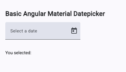
<h2>Basic Angular Material Datepicker</h2>
<mat-form-field appearance="fill">
<mat-label>Select a date</mat-label>
<input
matInput
[matDatepicker]="picker"
[(ngModel)]="selectedDate"
placeholder="Choose a date"
/>
<mat-datepicker-toggle matSuffix [for]="picker"></mat-datepicker-toggle>
<mat-datepicker #picker></mat-datepicker>
</mat-form-field>
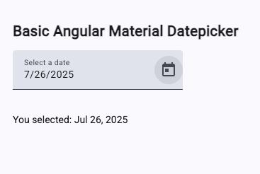
<p>You selected: {{ selectedDate | date }}</p>Update basic-datepicker.scss:
.container {
  margin: 10px;
  padding: 10px;
}
🧩 Step 3: Use the Component in App
Now open app.ts and import your new standalone component:
import { Component, signal } from '@angular/core';
import { BasicDatepicker } from './components/basic-datepicker/basic-datepicker';

@Component({
  selector: 'app-root',
  imports: [BasicDatepicker],
  templateUrl: './app.html',
  styleUrl: './app.scss'
})
export class App { }
Update app.html:
<app-basic-datepicker />Start the development server:
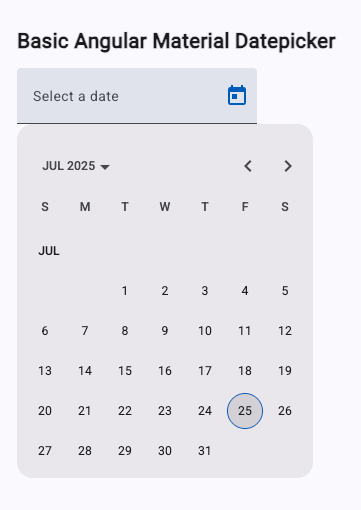
ng serveYou should now see a styled datepicker input that lets users pick a date and displays the selected value.
Using Reactive Forms with Angular Material Datepicker
Reactive Forms in Angular allow you to manage form state and validation in a more structured and predictable way. Here’s how to integrate the Angular Material Datepicker with a FormGroup.
🧱 Step 1: Create a New Component
Generate a new standalone component:
ng generate component components/reactive-datepicker --standalone🧠 Step 2: Implement the Component with Reactive Form Support
Update reactive-datepicker.ts with the following:
import { CommonModule } from '@angular/common';
import { Component } from '@angular/core';
import { ReactiveFormsModule, FormGroup, FormControl, Validators } from '@angular/forms';
import { MatNativeDateModule } from '@angular/material/core';
import { MatDatepickerModule } from '@angular/material/datepicker';
import { MatFormFieldModule } from '@angular/material/form-field';
import { MatInputModule } from '@angular/material/input';

@Component({
  selector: 'app-reactive-datepicker',
  imports: [
    CommonModule,
    ReactiveFormsModule,
    MatFormFieldModule,
    MatInputModule,
    MatDatepickerModule,
    MatNativeDateModule
  ],
  templateUrl: './reactive-datepicker.html',
  styleUrl: './reactive-datepicker.scss'
})
export class ReactiveDatepicker {
  form = new FormGroup({
    date: new FormControl<Date | null>(null, Validators.required)
  });
}
Update reactive-datepicker.html:
<div class="container">
  <h2>Reactive Form Datepicker</h2>
  <form [formGroup]="form">
    <mat-form-field appearance="outline">
      <mat-label>Pick a date</mat-label>
      <input matInput [matDatepicker]="picker" formControlName="date" />
      <mat-datepicker-toggle matSuffix [for]="picker"></mat-datepicker-toggle>
      <mat-datepicker #picker></mat-datepicker>
      <mat-error *ngIf="form.controls['date'].invalid">
        Date is required
      </mat-error>
    </mat-form-field>
  </form>

  <p *ngIf="form.valid">You selected: {{ form.value.date | date }}</p>
</div>
Update reactive-datepicker.scss:
.container {
  margin: 10px;
  padding: 10px;
}
🧩 Step 3: Display in App Component
To use it, update app.ts:
import { Component, signal } from '@angular/core';
import { ReactiveDatepicker } from "./components/reactive-datepicker/reactive-datepicker";

@Component({
  selector: 'app-root',
  imports: [ReactiveDatepicker],
  templateUrl: './app.html',
  styleUrl: './app.scss'
})
export class App { }
And app.html:
<app-reactive-datepicker />✅ Result
You now have a reactive form-based datepicker with:
-
Built-in validation
-
Custom error messages
-
Clear separation of form logic
Customizing the Date Format and Locale
Angular Material’s Datepicker uses DateAdapter, MAT_DATE_FORMATS, and MAT_DATE_LOCALE tokens to handle date parsing, display, and localization. Here’s how to override them.
🌍 Step 1: Set a Custom Locale (e.g., Indonesian)
To localize the datepicker (e.g., use dd/MM/yyyy format and Indonesian month/day names), provide a custom locale.
Update your app.config.ts to include:
import { ApplicationConfig, LOCALE_ID, provideBrowserGlobalErrorListeners, provideZoneChangeDetection } from '@angular/core';
import { provideRouter } from '@angular/router';

import { routes } from './app.routes';
import { registerLocaleData } from '@angular/common';
import id from '@angular/common/locales/id';

registerLocaleData(id);

export const appConfig: ApplicationConfig = {
  providers: [
    provideBrowserGlobalErrorListeners(),
    provideZoneChangeDetection({ eventCoalescing: true }),
    provideRouter(routes),
    { provide: LOCALE_ID, useValue: 'id-ID' }
  ]
};
⚠️ Don't forget to install the locale if you're not using
MatMomentDateModule.
🧾 Step 2: Provide Custom Date Formats
You can define your own display and parsing formats by overriding MAT_DATE_FORMATS.
📄 Create a date-formats.ts file:
import { MatDateFormats } from '@angular/material/core';

export const CUSTOM_DATE_FORMATS: MatDateFormats = {
  parse: {
    dateInput: 'DD/MM/YYYY',
  },
  display: {
    dateInput: 'DD/MM/YYYY',
    monthYearLabel: 'MMMM YYYY',
    dateA11yLabel: 'LL',
    monthYearA11yLabel: 'MMMM YYYY',
  },
};
If you're using MatNativeDateModule, use native formats like yyyy-MM-dd. If you're using MatMomentDateModule, Moment.js format tokens like DD/MM/YYYY will work.
🧱 Step 3: Use the Custom Formats in a Component
Update your reactive-datepicker.ts to provide the formats:
import { CUSTOM_DATE_FORMATS } from '../../date-formats';
import { MAT_DATE_FORMATS, MAT_DATE_LOCALE } from '@angular/material/core';

@Component({
  // ...
  providers: [
    { provide: MAT_DATE_FORMATS, useValue: CUSTOM_DATE_FORMATS },
    { provide: MAT_DATE_LOCALE, useValue: 'id-ID' }
  ]
})
Now your datepicker will:
-
Display and parse dates in
DD/MM/YYYYformat -
Show month and day names in Bahasa Indonesia
✅ Result
Your datepicker now:
-
Accepts and displays
DD/MM/YYYY -
Reflects Indonesian localization (e.g., "Juli", "Senin")
-
Works seamlessly with reactive forms
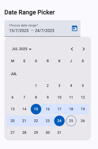
Using the Angular Material Date Range Picker
Angular Material provides a built-in date range picker via the mat-date-range-input and mat-date-range-picker components. This works seamlessly with Reactive Forms and supports validation and formatting just like the single datepicker.
🧱 Step 1: Generate a New Standalone Component
ng generate component components/date-range-picker --standalone🧠 Step 2: Implement the Date Range Picker Component
Open date-range-picker.ts and replace the contents with the following:
import { CommonModule } from '@angular/common';
import { Component } from '@angular/core';
import { ReactiveFormsModule, FormGroup, FormControl, Validators } from '@angular/forms';
import { MatNativeDateModule } from '@angular/material/core';
import { MatDatepickerModule } from '@angular/material/datepicker';
import { MatFormFieldModule } from '@angular/material/form-field';
import { MatInputModule } from '@angular/material/input';

@Component({
  selector: 'app-date-range-picker',
  imports: [
    CommonModule,
    ReactiveFormsModule,
    MatFormFieldModule,
    MatInputModule,
    MatDatepickerModule,
    MatNativeDateModule
  ],
  templateUrl: './date-range-picker.html',
  styleUrl: './date-range-picker.scss'
})
export class DateRangePicker {
  rangeForm = new FormGroup({
    range: new FormGroup({
      start: new FormControl<Date | null>(null, Validators.required),
      end: new FormControl<Date | null>(null, Validators.required),
    })
  });
}
Update date-range-picker.html:
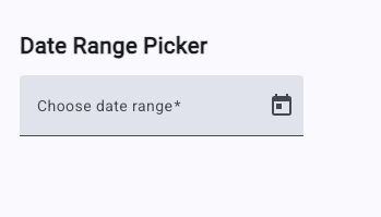
<div class="container">
<h2>Date Range Picker</h2>
<form [formGroup]="rangeForm">
<mat-form-field appearance="fill">
<mat-label>Choose date range</mat-label>
<mat-date-range-input [rangePicker]="rangePicker" formGroupName="range">
<input matStartDate formControlName="start" placeholder="Start date" />
<input matEndDate formControlName="end" placeholder="End date" />
</mat-date-range-input>
<mat-datepicker-toggle
matSuffix
[for]="rangePicker"
></mat-datepicker-toggle>
<mat-date-range-picker #rangePicker></mat-date-range-picker>
</mat-form-field>
</form>
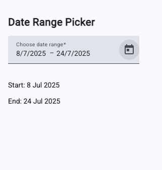
<div *ngIf="rangeForm.valid">
<p>Start: {{ rangeForm.value.range!.start | date }}</p>
<p>End: {{ rangeForm.value.range!.end | date }}</p>
</div>
</div>Update date-range-picker.scss:
.container {
  margin: 10px;
  padding: 10px;
}
📲 Step 3: Add the Component to App
Open app.ts and import the range picker component:
import { Component, signal } from '@angular/core';
import { DateRangePicker } from "./components/date-range-picker/date-range-picker";

@Component({
  selector: 'app-root',
  imports: [DateRangePicker],
  templateUrl: './app.html',
  styleUrl: './app.scss'
})
export class App { }
And app.html:
<app-date-range-picker />✅ Result
You now have a fully functional date range picker with:
-
Start and end date inputs
-
Validation using
ReactiveForms -
Built-in
mat-date-range-inputandmat-date-range-pickercomponents -
Automatic formatting and calendar navigation
Disabling and Filtering Dates in Angular Material Datepicker
You may want to:
-
Prevent users from selecting past or future dates
-
Disable weekends, holidays, or specific date ranges
-
Apply custom rules like "disable next 7 days"
Angular Material makes this easy with matDatepickerFilter and the min / max attributes.
🧱 Step 1: Generate a New Standalone Component
ng generate component components/datepicker-filter --standalone💡 Step 2: Implement Custom Filtering Logic
Update datepicker-filter.ts with this:
import { CommonModule } from '@angular/common';
import { Component } from '@angular/core';
import { ReactiveFormsModule, FormControl } from '@angular/forms';
import { MatNativeDateModule } from '@angular/material/core';
import { MatDatepickerModule } from '@angular/material/datepicker';
import { MatFormFieldModule } from '@angular/material/form-field';
import { MatInputModule } from '@angular/material/input';

@Component({
  selector: 'app-datepicker-filter',
  imports: [
    CommonModule,
    ReactiveFormsModule,
    MatFormFieldModule,
    MatInputModule,
    MatDatepickerModule,
    MatNativeDateModule
  ],
  templateUrl: './datepicker-filter.html',
  styleUrl: './datepicker-filter.scss'
})
export class DatepickerFilter {
  dateControl = new FormControl<Date | null>(null);

  // Only enable weekdays (disable Sat/Sun)
  weekdayFilter = (d: Date | null): boolean => {
    const day = (d || new Date()).getDay();
    return day !== 0 && day !== 6; // 0 = Sunday, 6 = Saturday
  };
}
Update datepicker-filter.html:
<div class="container">
  <h2>Filter and Disable Dates</h2>
  <mat-form-field appearance="fill">
    <mat-label>Select a weekday</mat-label>
    <input
      matInput
      [matDatepicker]="picker"
      [formControl]="dateControl"
      [matDatepickerFilter]="weekdayFilter"
    />
    <mat-datepicker-toggle matSuffix [for]="picker"></mat-datepicker-toggle>
    <mat-datepicker #picker></mat-datepicker>
  </mat-form-field>

  <p *ngIf="dateControl.value">You selected: {{ dateControl.value | date }}</p>
</div>
Update datepicker-filter.scss:
.container {
  margin: 10px;
  padding: 10px;
}
🛠️ Optional: Disable Past or Future Dates
You can also restrict the selectable range using min and max:
<input matInput [matDatepicker]="picker"
       [formControl]="dateControl"
       [min]="minDate"
       [max]="maxDate"
       [matDatepickerFilter]="weekdayFilter">
And in the component:
minDate = new Date(); // today
maxDate = new Date(new Date().setMonth(new Date().getMonth() + 1)); // 1 month ahead
✅ Result
With this setup:
-
Weekends are disabled using
matDatepickerFilter -
Past or future ranges can be disabled using
minandmax -
You can customize filtering logic with any function
Optimizing Angular Material Datepicker for Mobile (Touch UI)
Mobile users often struggle with small calendar pop-ups. Angular Material addresses this with a special touchUi mode that makes the datepicker:
-
Fullscreen on mobile
-
Easier to tap and navigate
-
More usable in small viewports
🧱 Step 1: Create a Mobile-Optimized Datepicker Component
ng generate component components/touch-ui-datepicker --standalone📱 Step 2: Implement a Datepicker with touchUi
Open touch-ui-datepicker.ts and add the following:
import { CommonModule } from '@angular/common';
import { Component } from '@angular/core';
import { ReactiveFormsModule, FormControl } from '@angular/forms';
import { MatNativeDateModule } from '@angular/material/core';
import { MatDatepickerModule } from '@angular/material/datepicker';
import { MatFormFieldModule } from '@angular/material/form-field';
import { MatInputModule } from '@angular/material/input';

@Component({
  selector: 'app-touch-ui-datepicker',
  imports: [
    CommonModule,
    ReactiveFormsModule,
    MatFormFieldModule,
    MatInputModule,
    MatDatepickerModule,
    MatNativeDateModule
  ],
  templateUrl: './touch-ui-datepicker.html',
  styleUrl: './touch-ui-datepicker.scss'
})
export class TouchUiDatepicker {
  mobileDateControl = new FormControl<Date | null>(null);
}
✅ touchUi="true" tells Angular Material to open the calendar in a mobile-friendly dialog.
Update touch-ui-datepicker.html:
<h2>Mobile-Friendly Datepicker</h2>
<mat-form-field appearance="fill">
  <mat-label>Pick a date</mat-label>
  <input
    matInput
    [matDatepicker]="picker"
    [formControl]="mobileDateControl"
    placeholder="Select date"
  />
  <mat-datepicker-toggle matSuffix [for]="picker"></mat-datepicker-toggle>
  <mat-datepicker #picker touchUi="true"></mat-datepicker>
</mat-form-field>

<p *ngIf="mobileDateControl.value">
  Selected: {{ mobileDateControl.value | date }}
</p>
💡 Optional Enhancements for Mobile UX
-
Add a Toggle Button Instead of Always Showing Input:
<mat-datepicker-toggle matSuffix [for]="picker"> <button mat-icon-button> <mat-icon>event</mat-icon> </button> </mat-datepicker-toggle> -
Use
appearance="fill"oroutline"to clearly define the input on smaller screens. -
Make Inputs Responsive using custom CSS or Angular Material’s layout features (e.g.,
@angular/flex-layout). -
Auto Close on Selection
Angular Material does this by default, but you can also manually trigger actions ondateChange.
✅ Result
With touchUi, your datepicker will:
-
Appear as a full-screen modal on touch devices
-
Improve tap targets and UX for mobile users
-
Look consistent across devices
Using Moment.js or date-fns with Angular Material Datepicker
By default, Angular Material uses the native JavaScript Date object, but you can use libraries like Moment.js or date-fns via custom adapters.
We’ll focus on Moment.js, as it's officially supported by Angular Material via @angular/material-moment-adapter.
📦 Step 1: Install Moment Adapter
npm install @angular/material-moment-adapter momentThis gives you access to MatMomentDateModule and Moment-based formatting.
🧱 Step 2: Use MatMomentDateModule Instead of Native
In your component or app bootstrap (if global), replace MatNativeDateModule with MatMomentDateModule.
Example in a standalone component:
import { MatMomentDateModule, MAT_MOMENT_DATE_ADAPTER_OPTIONS } from '@angular/material-moment-adapter';
import { MAT_DATE_FORMATS, DateAdapter } from '@angular/material/core';
import * as _moment from 'moment';

const moment = _moment;

export const MY_FORMATS = {
  parse: {
    dateInput: 'DD-MM-YYYY',
  },
  display: {
    dateInput: 'DD-MM-YYYY',
    monthYearLabel: 'MMMM YYYY',
    dateA11yLabel: 'LL',
    monthYearA11yLabel: 'MMMM YYYY',
  },
};
In the @Component metadata:
@Component({
  selector: 'app-moment-datepicker',
  imports: [
    CommonModule,
    ReactiveFormsModule,
    MatFormFieldModule,
    MatInputModule,
    MatDatepickerModule,
    MatNativeDateModule,
    MatMomentDateModule
  ],
  templateUrl: './moment-datepicker.html',
  styleUrl: './moment-datepicker.scss',
  providers: [
    { provide: MAT_DATE_FORMATS, useValue: MY_FORMATS },
    { provide: MAT_MOMENT_DATE_ADAPTER_OPTIONS, useValue: { useUtc: true } }
  ],
})
export class MomentDatepicker {
  dateControl = new FormControl(moment());
}
💡 Moment.js dates use
.format(...)instead of Angular’sdatepipe.
In moment-datepicker.html:
<mat-form-field appearance="fill">
  <mat-label>Select a date (Moment)</mat-label>
  <input matInput [matDatepicker]="picker" [formControl]="dateControl" />
  <mat-datepicker-toggle matSuffix [for]="picker"></mat-datepicker-toggle>
  <mat-datepicker #picker></mat-datepicker>
</mat-form-field>

<p>Selected (raw): {{ dateControl.value }}</p>
<p>Formatted: {{ dateControl.value?.format("LL") }}</p>
📘 Using date-fns (optional)
Angular Material does not ship with a date-fns adapter out of the box. You’d have to:
-
Implement a custom
DateAdapter -
Use third-party community projects (not officially supported)
So if you want to use date-fns, it’s best suited for post-processing or lightweight date operations, not for mat-datepicker integration.
✅ Benefits of Using Moment.js
-
Locale-aware and easily configurable
-
Supports custom formats and UTC
-
Works seamlessly with Angular Material via
MatMomentDateModule
Real-World Use Case: Booking Form with Angular Material Datepicker
In this example, we’ll build a booking form that lets users:
-
Select a check-in and check-out date using a date range picker
-
Choose a flexible date using a single datepicker
-
Handle validation and formatted outputs
-
Support mobile users with
touchUi
🧱 Step 1: Generate the Booking Component
ng generate component components/booking-form --standalone🧠 Step 2: Implement the Booking Form
In booking-form.component.ts:
import { CommonModule } from '@angular/common';
import { Component } from '@angular/core';
import { ReactiveFormsModule, FormGroup, FormControl, Validators } from '@angular/forms';
import { MatButtonModule } from '@angular/material/button';
import { MatNativeDateModule } from '@angular/material/core';
import { MatDatepickerModule } from '@angular/material/datepicker';
import { MatFormFieldModule } from '@angular/material/form-field';
import { MatInputModule } from '@angular/material/input';

@Component({
  selector: 'app-booking-form',
  imports: [
    CommonModule,
    ReactiveFormsModule,
    MatFormFieldModule,
    MatInputModule,
    MatDatepickerModule,
    MatNativeDateModule,
    MatButtonModule
  ],
  templateUrl: './booking-form.html',
  styleUrl: './booking-form.scss'
})
export class BookingForm {
  submitted = false;

  bookingForm = new FormGroup({
    stayPeriod: new FormGroup({
      checkin: new FormControl<Date | null>(null, Validators.required),
      checkout: new FormControl<Date | null>(null, Validators.required),
    }),
    alternativeDate: new FormControl<Date | null>(null)
  });

  submitBooking() {
    if (this.bookingForm.valid) {
      this.submitted = true;
      console.log('Booking submitted:', this.bookingForm.value);
    }
  }
}
Update booking-form.component.html:
<h2>Hotel Booking Form</h2>
<form
  [formGroup]="bookingForm"
  (ngSubmit)="submitBooking()"
  class="booking-form"
>
  <!-- Date Range -->
  <mat-form-field appearance="fill">
    <mat-label>Check-in & Check-out</mat-label>
    <mat-date-range-input
      [rangePicker]="rangePicker"
      formGroupName="stayPeriod"
    >
      <input matStartDate formControlName="checkin" placeholder="Check-in" />
      <input matEndDate formControlName="checkout" placeholder="Check-out" />
    </mat-date-range-input>
    <mat-datepicker-toggle
      matSuffix
      [for]="rangePicker"
    ></mat-datepicker-toggle>
    <mat-date-range-picker #rangePicker touchUi="true"></mat-date-range-picker>
    <mat-error *ngIf="bookingForm.get('stayPeriod')?.invalid">
      Both dates are required.
    </mat-error>
  </mat-form-field>

  <!-- Flexible Alternative Date -->
  <mat-form-field appearance="fill">
    <mat-label>Flexible alternative date</mat-label>
    <input
      matInput
      [matDatepicker]="altPicker"
      placeholder="Optional"
      formControlName="alternativeDate"
    />
    <mat-datepicker-toggle matSuffix [for]="altPicker"></mat-datepicker-toggle>
    <mat-datepicker #altPicker touchUi="true"></mat-datepicker>
  </mat-form-field>

  <!-- Submit Button -->
  <button mat-raised-button color="primary" [disabled]="bookingForm.invalid">
    Submit Booking
  </button>
</form>

<!-- Display Output -->
<div *ngIf="submitted">
  <h3>Booking Summary</h3>
  <p>
    <strong>Check-in:</strong>
    {{ bookingForm.value.stayPeriod!.checkin | date : "fullDate" }}
  </p>
  <p>
    <strong>Check-out:</strong>
    {{ bookingForm.value.stayPeriod!.checkout | date : "fullDate" }}
  </p>
  <p *ngIf="bookingForm.value.alternativeDate">
    <strong>Alternative Date:</strong>
    {{ bookingForm.value.alternativeDate | date : "fullDate" }}
  </p>
</div>
Update booking-form.component.scss:
.booking-form {
  display: flex;
  flex-direction: column;
  gap: 16px;
  max-width: 400px;
}
📲 Touch UI Support
Note how we use touchUi="true" for both pickers to make the form mobile-friendly.
🔍 Validation Tips
You can also add custom validators (e.g., checkout > checkin) if desired.
✅ Result
This booking form:
-
Combines a date range and a single datepicker
-
Works on desktop and mobile
-
Shows selected dates in a readable format
-
Uses Angular Material styling and validation
Conclusion
In this tutorial, you've learned how to fully utilize the Angular Material Datepicker using the latest Angular standalone APIs. We covered:
-
Installing and configuring Angular Material Datepicker
-
Using single and range date pickers
-
Formatting and localizing dates with Angular pipes
-
Disabling weekends and filtering invalid dates
-
Optimizing the picker for mobile/touch UI
-
Extending functionality using Moment.js
-
Building a real-world booking form with validation and user feedback
By combining Angular’s powerful forms with Material's intuitive UI components, you can quickly build production-ready date pickers tailored to your application's needs.
You can get the full source code on our GitHub.
If you don’t want to waste your time designing your front-end or your budget to spend by hiring a web designer, then Angular Templates is the best place to go. So, speed up your front-end web development with premium Angular templates. Choose your template for your front-end project here.
That's just the basics. If you need more deep learning about Angular, you can take the following cheap course:
- Angular - The Complete Guide (2025 Edition)
- Complete Angular Course 2025 - Master Angular in only 6 days
- Angular Deep Dive - Beginner to Advanced (Angular 20)
- Modern Angular 20 with Signals - The missing guide
- The Modern Angular Bootcamp
- Angular (Full App) with Angular Material, Angularfire & NgRx
- Angular Front End Development Beginner to Master 2025
- 30 Days of Angular: Build 30 Projects with Angular
- Angular 20 Full Course - Complete Zero to Hero Angular 20
- Angular Material In Depth (Angular 20)
Thanks!