
CSS (Cascading Style Sheets) is the language that makes web pages beautiful. Whether you’re just starting your journey or want to polish your front-end design skills, building small projects is the best way to practice.
In this article, we’ve compiled 25 fun and easy CSS projects. Each includes a description and source code snippet to help you understand layout, animation, and responsive design concepts.
1. Personal Portfolio Page
Build a simple portfolio website using flexbox and grid to showcase your projects.
<section class="portfolio">
  <h1>My Portfolio</h1>
  <div class="projects">
    <div class="card">Project 1</div>
    <div class="card">Project 2</div>
  </div>
</section>

<style>
  html,
  body {
    margin: 20px;
  }
  .projects {
    display: flex;
    gap: 20px;
  }
  .card {
    padding: 20px;
    background: #f5f5f5;
    border-radius: 8px;
  }
</style>
2. Animated Button Effects
Create interactive buttons with hover transitions and shadows.
<button class="btn">Hover Me</button>

<style>
  html,
  body {
    margin: 20px;
  }
  .btn {
    background: linear-gradient(45deg, #2196f3, #21cbf3);
    color: #fff;
    padding: 12px 24px;
    border: none;
    transition: transform 0.3s, box-shadow 0.3s;
  }
  .btn:hover {
    transform: scale(1.05);
    box-shadow: 0 5px 15px rgba(0, 0, 0, 0.3);
  }
</style>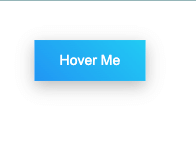
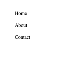
3. Responsive Navigation Menu
Use flexbox to make a navigation bar that adapts to screen size.
<nav>
  <ul>
    <li>Home</li>
    <li>About</li>
    <li>Contact</li>
  </ul>
</nav>

<style>
  html,
  body {
    margin: 20px;
  }
  nav ul {
    display: flex;
    list-style: none;
    gap: 20px;
    justify-content: center;
  }
  @media (max-width: 600px) {
    nav ul {
      flex-direction: column;
    }
  }
</style>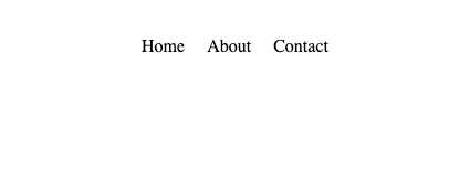
4. CSS Image Gallery
Create a responsive image grid using CSS Grid.
<div class="gallery">
  <img src="https://placehold.co/400" /><img
    src="https://placehold.co/400"
  /><img src="https://placehold.co/400" />
</div>

<style>
  html,
  body {
    margin: 20px;
  }
  .gallery {
    display: grid;
    grid-template-columns: repeat(auto-fit, minmax(150px, 1fr));
    gap: 10px;
  }
  .gallery img {
    width: 100%;
    border-radius: 8px;
  }
</style>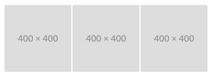
5. Pricing Table
Design a clean pricing layout with highlighted plans.
<div class="pricing">
  <div class="plan popular">Pro</div>
  <div class="plan">Basic</div>
</div>

<style>
  html,
  body {
    margin: 20px;
  }
  .pricing {
    display: flex;
    gap: 20px;
    justify-content: center;
  }
  .plan {
    padding: 20px;
    border: 2px solid #ccc;
    border-radius: 8px;
  }
  .popular {
    border-color: #2196f3;
    background: #e3f2fd;
  }
</style>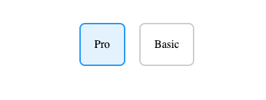
6. Login Form UI
Build a modern login form with CSS focus styles.
<form class="login">
  <input type="text" placeholder="Username" />
  <input type="password" placeholder="Password" />
</form>

<style>
  html,
  body {
    margin: 20px;
  }
  .login input {
    display: block;
    margin: 10px 0;
    padding: 10px;
    width: 100%;
    border: 1px solid #ccc;
    border-radius: 5px;
  }
  .login input:focus {
    border-color: #2196f3;
    outline: none;
  }
</style>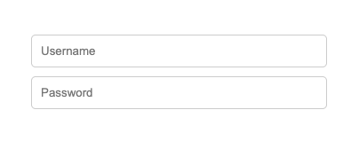
7. CSS Loading Spinner
Use keyframes for an infinite spinning loader.
<div class="spinner"></div>

<style>
.spinner {
  width: 40px; height: 40px; border: 5px solid #ccc;
  border-top-color: #2196f3; border-radius: 50%;
  animation: spin 1s linear infinite;
}
@keyframes spin { to { transform: rotate(360deg); } }
</style>
8. Tooltip on Hover
Show a tooltip using pseudo-elements.
<button class="tooltip">Hover me</button>

<style>
  html,
  body {
    margin: 20px;
  }
  .tooltip {
    position: relative;
  }
  .tooltip::after {
    content: "Tooltip text";
    position: absolute;
    bottom: 125%;
    left: 50%;
    transform: translateX(-50%);
    background: #333;
    color: #fff;
    padding: 5px 10px;
    border-radius: 5px;
    opacity: 0;
    transition: opacity 0.3s;
  }
  .tooltip:hover::after {
    opacity: 1;
  }
</style>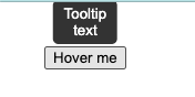
9. Card Hover Animation
Add a hover lift effect to cards.
<div class="card">Hover Me</div>

<style>
  html,
  body {
    margin: 20px;
  }
  .card {
    width: 200px;
    height: 120px;
    background: #eee;
    transition: transform 0.3s;
  }
  .card:hover {
    transform: translateY(-10px);
    box-shadow: 0 10px 15px rgba(0, 0, 0, 0.2);
  }
</style>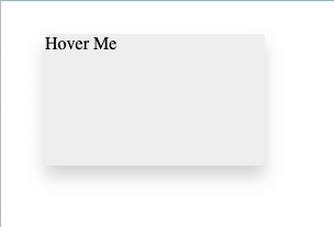
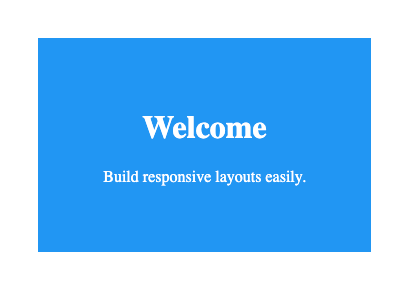
10. Responsive Landing Page
Create a simple hero layout.
<section class="hero">
  <h1>Welcome</h1>
  <p>Build responsive layouts easily.</p>
</section>

<style>
  html,
  body {
    margin: 20px;
  }
  .hero {
    text-align: center;
    padding: 100px 20px;
    background: #2196f3;
    color: white;
  }
  @media (max-width: 600px) {
    .hero {
      padding: 50px 10px;
    }
  }
</style>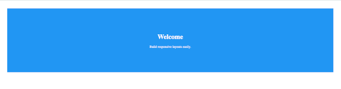
11. CSS Image Slider
Build a slider using radio inputs.
<div class="slider">
  <div class="slides">
    <!-- Radio Buttons -->
    <input type="radio" name="radio-btn" id="slide1" checked />
    <input type="radio" name="radio-btn" id="slide2" />
    <input type="radio" name="radio-btn" id="slide3" />

    <!-- Slide Images -->
    <div class="slide first">
      <img src="https://picsum.photos/id/1015/800/400" alt="Slide 1" />
    </div>
    <div class="slide">
      <img src="https://picsum.photos/id/1016/800/400" alt="Slide 2" />
    </div>
    <div class="slide">
      <img src="https://picsum.photos/id/1018/800/400" alt="Slide 3" />
    </div>

    <!-- Automatic Navigation -->
    <div class="navigation-auto">
      <div class="auto-btn1"></div>
      <div class="auto-btn2"></div>
      <div class="auto-btn3"></div>
    </div>
  </div>

  <!-- Manual Navigation -->
  <div class="navigation-manual">
    <label for="slide1" class="manual-btn"></label>
    <label for="slide2" class="manual-btn"></label>
    <label for="slide3" class="manual-btn"></label>
  </div>
</div>

<style>
  .slider {
    width: 800px;
    height: 400px;
    position: relative;
    overflow: hidden;
    border-radius: 10px;
    margin: auto;
  }
  .slides {
    width: 500%;
    height: 100%;
    display: flex;
  }
  .slides input {
    display: none;
  }
  .slide {
    width: 20%;
    transition: 0.6s ease;
  }
  .slide img {
    width: 800px;
    height: 400px;
    object-fit: cover;
    border-radius: 10px;
  }

  /* Manual navigation */
  .navigation-manual {
    position: absolute;
    width: 800px;
    bottom: 10px;
    display: flex;
    justify-content: center;
    gap: 10px;
  }
  .manual-btn {
    border: 2px solid #fff;
    padding: 5px;
    border-radius: 50%;
    cursor: pointer;
    transition: 0.3s;
  }
  .manual-btn:hover {
    background: #fff;
  }

  /* CSS for manual navigation behavior */
  #slide1:checked ~ .first {
    margin-left: 0;
  }
  #slide2:checked ~ .first {
    margin-left: -20%;
  }
  #slide3:checked ~ .first {
    margin-left: -40%;
  }

  /* Automatic navigation (optional animation) */
  .navigation-auto {
    position: absolute;
    display: flex;
    width: 800px;
    justify-content: center;
    bottom: 10px;
    opacity: 0;
  }
</style>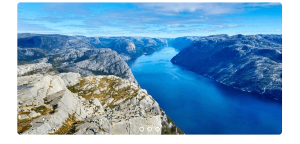
12. Animated Progress Bar
Create a smooth loading bar animation.
<div class="progress"><div class="bar"></div></div>

<style>
  html,
  body {
    margin: 20px;
  }
  .progress {
    background: #ddd;
    height: 10px;
    width: 100%;
  }
  .bar {
    height: 10px;
    background: #4caf50;
    animation: fill 3s linear infinite;
  }
  @keyframes fill {
    from {
      width: 0;
    }
    to {
      width: 100%;
    }
  }
</style>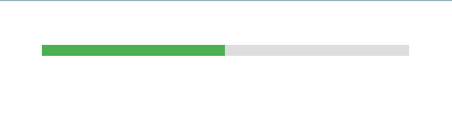
13. CSS Countdown Timer (Static)
Design a countdown layout with circular borders.
<div class="countdown"><div>10:00</div></div>

<style>
  html,
  body {
    margin: 20px;
  }
  .countdown {
    border: 5px solid #2196f3;
    width: 100px;
    height: 100px;
    border-radius: 50%;
    display: flex;
    align-items: center;
    justify-content: center;
  }
</style>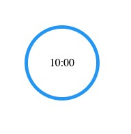
14. Custom Checkbox and Radio
Redesign input elements.
<h3>Custom Checkbox</h3>
<label class="custom">
  <input type="checkbox" checked />
  <span class="checkmark"></span>
  I agree to the terms
</label>

<h3>Custom Radio Buttons</h3>
<label class="custom">
  <input type="radio" name="option" checked />
  <span class="radiomark"></span>
  Option 1
</label>
<label class="custom">
  <input type="radio" name="option" />
  <span class="radiomark"></span>
  Option 2
</label>

<style>
  html,
  body {
    margin: 20px;
  }
  /* General label styling */
  .custom {
    display: flex;
    align-items: center;
    cursor: pointer;
    font-size: 16px;
    margin: 8px 0;
  }

  /* Hide native input */
  .custom input {
    display: none;
  }

  /* Custom checkbox style */
  .checkmark {
    width: 18px;
    height: 18px;
    border: 2px solid #555;
    border-radius: 4px;
    margin-right: 8px;
    position: relative;
    transition: all 0.3s ease;
  }

  /* Checkbox check symbol */
  .checkmark::after {
    content: "";
    position: absolute;
    left: 4px;
    top: 0px;
    width: 5px;
    height: 10px;
    border: solid white;
    border-width: 0 2px 2px 0;
    transform: rotate(45deg);
    opacity: 0;
  }

  /* Checked state for checkbox */
  .custom input[type="checkbox"]:checked + .checkmark {
    background-color: #2196f3;
    border-color: #2196f3;
  }
  .custom input[type="checkbox"]:checked + .checkmark::after {
    opacity: 1;
  }

  /* Custom radio style */
  .radiomark {
    width: 18px;
    height: 18px;
    border: 2px solid #555;
    border-radius: 50%;
    margin-right: 8px;
    position: relative;
    transition: all 0.3s ease;
  }

  /* Radio inner dot */
  .radiomark::after {
    content: "";
    position: absolute;
    width: 8px;
    height: 8px;
    top: 3px;
    left: 3px;
    background: #2196f3;
    border-radius: 50%;
    transform: scale(0);
    transition: transform 0.2s ease;
  }

  /* Checked state for radio */
  .custom input[type="radio"]:checked + .radiomark {
    border-color: #2196f3;
  }
  .custom input[type="radio"]:checked + .radiomark::after {
    transform: scale(1);
  }
</style>
15. Pure CSS Modal Popup
Use the :target selector.
<a href="#modal">Open Modal</a>
<div id="modal" class="modal">
  <div class="content">
    <a href="#">X</a>
    <p>Hello!</p>
  </div>
</div>

<style>
  html,
  body {
    margin: 20px;
  }
  .modal {
    display: none;
    position: fixed;
    inset: 0;
    background: rgba(0, 0, 0, 0.5);
  }
  .modal:target {
    display: flex;
    justify-content: center;
    align-items: center;
  }
  .content {
    background: white;
    padding: 20px;
    border-radius: 8px;
  }
</style>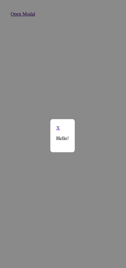
16. CSS Gradient Generator
Experiment with colorful backgrounds.
<div class="gradient"></div>

<style>
  html,
  body {
    margin: 20px;
  }
  .gradient {
    height: 150px;
    background: linear-gradient(135deg, #ff6f61, #42a5f5);
  }
</style>
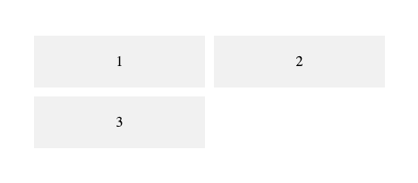
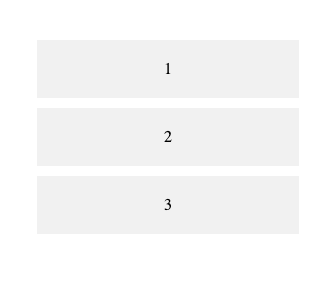
17. Responsive CSS Grid Layout
Practice auto-fit layouts.
<div class="grid">
  <div>1</div>
  <div>2</div>
  <div>3</div>
</div>

<style>
  html,
  body {
    margin: 20px;
  }
  .grid {
    display: grid;
    grid-template-columns: repeat(auto-fit, minmax(150px, 1fr));
    gap: 10px;
  }
  .grid div {
    background: #f1f1f1;
    padding: 20px;
    text-align: center;
  }
</style>
18. CSS Timeline
Create a vertical event timeline.
<ul class="timeline">
  <li>2020 - Started learning CSS</li>
  <li>2025 - Built this project</li>
</ul>

<style>
  html,
  body {
    margin: 20px;
  }
  .timeline {
    position: relative;
    list-style: none;
  }
  .timeline::before {
    content: "";
    position: absolute;
    left: 20px;
    width: 2px;
    height: 100%;
    background: #2196f3;
  }
  .timeline li {
    margin: 20px 0 20px 40px;
  }
</style>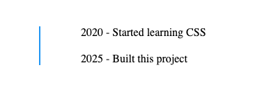
19. Animated Hamburger Menu
Create a toggle icon with animation.
<div class="menu"></div>

<style>
  html,
  body {
    margin: 20px;
  }
  .menu,
  .menu::before,
  .menu::after {
    width: 30px;
    height: 4px;
    background: #333;
    display: block;
    margin: 6px 0;
    transition: 0.3s;
  }
  .menu:hover {
    transform: rotate(45deg);
  }
</style>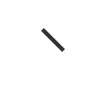
20. CSS Flip Card
Add a 3D flip effect.
<div class="flip">
  <div class="inner">
    <div class="front">Front</div>
    <div class="back">Back</div>
  </div>
</div>

<style>
  html,
  body {
    margin: 20px;
  }
  .flip {
    perspective: 1000px;
    width: 200px;
    height: 120px;
  }
  .inner {
    transition: transform 0.6s;
    transform-style: preserve-3d;
  }
  .flip:hover .inner {
    transform: rotateY(180deg);
  }
  .front,
  .back {
    position: absolute;
    width: 100%;
    backface-visibility: hidden;
  }
  .back {
    transform: rotateY(180deg);
    background: #2196f3;
    color: white;
  }
</style>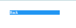
21. Image Overlay Hover
Reveal overlay text.
<div class="overlay">
  <img src="https://placehold.co/400" />
  <div class="text">Hello!</div>
</div>

<style>
  html,
  body {
    margin: 20px;
  }
  .overlay {
    position: relative;
  }
  .text {
    position: absolute;
    inset: 0;
    display: flex;
    align-items: center;
    justify-content: center;
    background: rgba(0, 0, 0, 0.6);
    color: #fff;
    opacity: 0;
    transition: opacity 0.3s;
  }
  .overlay:hover .text {
    opacity: 1;
  }
</style>
22. Sticky Navbar on Scroll
Keep the navbar visible while scrolling.
<!DOCTYPE html>
<html lang="en">
  <head>
    <meta charset="UTF-8" />
    <meta name="viewport" content="width=device-width, initial-scale=1.0" />
    <title>Sticky Navbar Example</title>
    <style>
      * {
        margin: 0;
        padding: 0;
        box-sizing: border-box;
      }

      body {
        font-family: Arial, sans-serif;
        line-height: 1.6;
      }

      /* Navbar Styling */
      nav {
        position: sticky;
        top: 0;
        background: #2196f3;
        color: white;
        display: flex;
        justify-content: space-around;
        align-items: center;
        padding: 15px 0;
        font-size: 18px;
        z-index: 1000;
      }

      nav a {
        color: white;
        text-decoration: none;
        padding: 8px 15px;
        border-radius: 4px;
        transition: background 0.3s;
      }

      nav a:hover {
        background: rgba(255, 255, 255, 0.2);
      }

      /* Page Sections */
      section {
        height: 100vh;
        padding: 50px;
      }

      #home {
        background: #e3f2fd;
      }

      #about {
        background: #bbdefb;
      }

      #services {
        background: #90caf9;
      }

      #contact {
        background: #64b5f6;
      }

      /* Smooth scrolling */
      html {
        scroll-behavior: smooth;
      }
    </style>
  </head>
  <body>
    <nav>
      <a href="#home">Home</a>
      <a href="#about">About</a>
      <a href="#services">Services</a>
      <a href="#contact">Contact</a>
    </nav>

    <section id="home">
      <h1>Home Section</h1>
      <p>Scroll down to see the sticky navbar stay fixed at the top.</p>
    </section>

    <section id="about">
      <h1>About Section</h1>
      <p>This is where you can describe yourself or your company.</p>
    </section>

    <section id="services">
      <h1>Services Section</h1>
      <p>List your services or features here.</p>
    </section>

    <section id="contact">
      <h1>Contact Section</h1>
      <p>Provide your contact form or social links here.</p>
    </section>
  </body>
</html>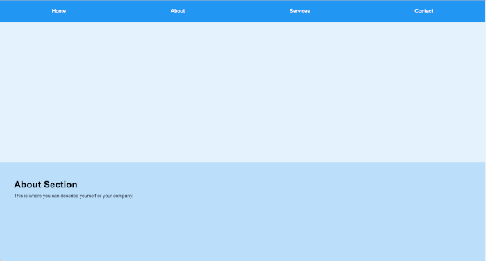
23. CSS Wave Animation
Create flowing animated waves.
<!DOCTYPE html>
<html lang="en">
  <head>
    <meta charset="UTF-8" />
    <meta name="viewport" content="width=device-width, initial-scale=1.0" />
    <title>Animated Waves</title>
    <style>
      * {
        margin: 0;
        padding: 0;
        box-sizing: border-box;
      }

      body {
        background: linear-gradient(to top, #2196f3 0%, #e3f2fd 100%);
        height: 100vh;
        overflow: hidden;
        position: relative;
        display: flex;
        justify-content: center;
        align-items: center;
        color: white;
        font-family: Arial, sans-serif;
      }

      h1 {
        position: relative;
        z-index: 10;
        font-size: 3em;
        text-shadow: 0 3px 10px rgba(0, 0, 0, 0.3);
      }

      .wave {
        position: absolute;
        bottom: 0;
        left: 0;
        width: 200%;
        height: 100px;
        background-repeat: repeat no-repeat;
        background-position: 0 bottom;
        transform: translate3d(0, 0, 0);
        opacity: 0.6;
        animation: wave 10s linear infinite;
      }

      .wave1 {
        background-image: url("https://svgshare.com/i/ubv.svg");
        animation-delay: 0s;
        animation-duration: 10s;
        z-index: 3;
        opacity: 0.5;
      }

      .wave2 {
        background-image: url("https://svgshare.com/i/ubv.svg");
        animation-delay: -5s;
        animation-duration: 15s;
        z-index: 2;
        opacity: 0.3;
      }

      .wave3 {
        background-image: url("https://svgshare.com/i/ubv.svg");
        animation-delay: -2s;
        animation-duration: 20s;
        z-index: 1;
        opacity: 0.2;
      }

      @keyframes wave {
        0% {
          transform: translateX(0);
        }
        100% {
          transform: translateX(-50%);
        }
      }
    </style>
  </head>
  <body>
    <h1>Flowing Animated Waves 🌊</h1>
    <div class="wave wave1"></div>
    <div class="wave wave2"></div>
    <div class="wave wave3"></div>
  </body>
</html>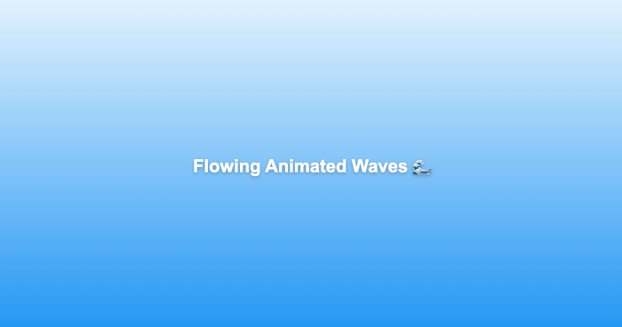
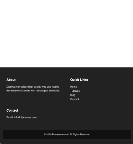
24. Responsive Footer Design
Design a clean footer with columns.
<!DOCTYPE html>
<html lang="en">
<head>
<meta charset="UTF-8" />
<meta name="viewport" content="width=device-width, initial-scale=1.0" />
<title>Responsive Footer</title>
<style>
* {
margin: 0;
padding: 0;
box-sizing: border-box;
}
body {
font-family: "Poppins", sans-serif;
line-height: 1.6;
min-height: 100vh;
display: flex;
flex-direction: column;
justify-content: space-between;
}
footer {
background-color: #222;
color: #ddd;
padding: 40px 20px;
}
.footer-container {
display: flex;
justify-content: space-between;
flex-wrap: wrap;
max-width: 1200px;
margin: auto;
}
.footer-section {
flex: 1 1 250px;
margin: 20px;
}
.footer-section h3 {
color: #fff;
margin-bottom: 15px;
font-size: 1.2rem;
}
.footer-section p,
.footer-section a {
color: #bbb;
font-size: 0.95rem;
text-decoration: none;
}
.footer-section a:hover {
color: #fff;
}
.social-links a {
display: inline-block;
margin-right: 10px;
font-size: 1.2rem;
color: #bbb;
transition: color 0.3s;
}
.social-links a:hover {
color: #fff;
}
.footer-bottom {
text-align: center;
padding: 15px 0;
background: #111;
color: #aaa;
font-size: 0.9rem;
margin-top: 20px;
}
@media (max-width: 768px) {
.footer-container {
flex-direction: column;
text-align: center;
}
.footer-section {
margin: 10px 0;
}
.social-links {
margin-top: 10px;
}
}
</style>
<!-- Optional: Font Awesome for icons -->
<script
src="https://kit.fontawesome.com/a076d05399.js"
crossorigin="anonymous"
></script>
</head>
<body>
<div style="flex: 1"></div>
<!-- For spacing -->
<footer>
<div class="footer-container">
<div class="footer-section about">
<h3>About</h3>
<p>
Djamware provides high-quality web and mobile development tutorials
with real project examples.
</p>
</div>
<div class="footer-section links">
<h3>Quick Links</h3>
<a href="#">Home</a><br />
<a href="#">Tutorials</a><br />
<a href="#">Blog</a><br />
<a href="#">Contact</a>
</div>
<div class="footer-section contact">
<h3>Contact</h3>
<p>Email: [email protected]</p>
<div class="social-links">
<a href="#"><i class="fab fa-facebook"></i></a>
<a href="#"><i class="fab fa-twitter"></i></a>
<a href="#"><i class="fab fa-linkedin"></i></a>
<a href="#"><i class="fab fa-github"></i></a>
</div>
</div>
</div>
<div class="footer-bottom">
© 2025 Djamware.com | All Rights Reserved
</div>
</footer>
</body>
</html>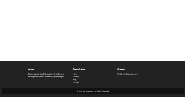

25. Animated CSS Loader Page
Create a loading screen animation.
<!DOCTYPE html>
<html lang="en">
  <head>
    <meta charset="UTF-8" />
    <meta name="viewport" content="width=device-width, initial-scale=1.0" />
    <title>Animated CSS Loader</title>
    <style>
      * {
        margin: 0;
        padding: 0;
        box-sizing: border-box;
      }

      body {
        height: 100vh;
        background: linear-gradient(135deg, #667eea, #764ba2);
        display: flex;
        align-items: center;
        justify-content: center;
        font-family: "Poppins", sans-serif;
        color: #fff;
        flex-direction: column;
      }

      .loader {
        display: flex;
        justify-content: center;
        align-items: center;
        gap: 10px;
      }

      .dot {
        width: 15px;
        height: 15px;
        background: white;
        border-radius: 50%;
        animation: bounce 1s infinite ease-in-out;
      }

      .dot:nth-child(2) {
        animation-delay: 0.2s;
      }

      .dot:nth-child(3) {
        animation-delay: 0.4s;
      }

      @keyframes bounce {
        0%,
        80%,
        100% {
          transform: scale(0);
        }
        40% {
          transform: scale(1);
        }
      }

      h2 {
        margin-top: 25px;
        font-weight: 400;
        letter-spacing: 1px;
      }

      /* Optional: fade-in effect for loader container */
      .loader-container {
        animation: fadeIn 1.2s ease forwards;
      }

      @keyframes fadeIn {
        from {
          opacity: 0;
          transform: translateY(10px);
        }
        to {
          opacity: 1;
          transform: translateY(0);
        }
      }

      /* Responsive adjustments */
      @media (max-width: 600px) {
        h2 {
          font-size: 1rem;
        }
        .dot {
          width: 12px;
          height: 12px;
        }
      }
    </style>
  </head>
  <body>
    <div class="loader-container">
      <div class="loader">
        <div class="dot"></div>
        <div class="dot"></div>
        <div class="dot"></div>
      </div>
      <h2>Loading, please wait...</h2>
    </div>
  </body>
</html>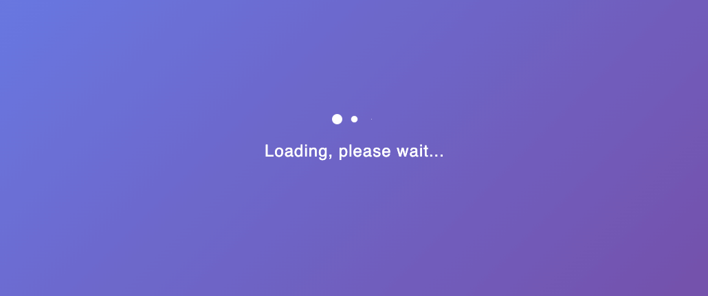
Conclusion
These 25 CSS projects will help you master real-world techniques like layouts, animations, and responsive design.
Experiment with colors, effects, and typography — then combine multiple projects to create your own unique portfolio.
Looking for the next step? Try your hand at 25 HTML Projects for Beginners or 25 JavaScript Projects for Beginners
You can get the full source code on our GitHub.
That's just the basics. If you need more deep learning about CSS, SASS, SCSS, TailwindCSS, you can take the following cheap course:
- CSS - The Complete Guide 2025 (incl. Flexbox, Grid & Sass)
- Advanced CSS and Sass: Flexbox, Grid, Animations and More!
- Creative Advanced CSS & JavaScript Animations - 150 Projects
- CSS Layouts Masterclass: Build Responsive-Adaptive Websites
- The Complete Sass & SCSS Course: From Beginner to Advanced
- SASS - The Complete SASS Course (CSS Preprocessor)
- The Modern Flexbox, Grid, Sass & Animations Developer Course
- Tailwind CSS From Scratch | Learn By Building Projects
- Tailwind CSS v4 - Beginner to Pro
- Tailwind CSS – The Practical Bootcamp in 2025
Thanks!