
A datepicker is one of the most common UI components in mobile applications, allowing users to easily select a date (and optionally, a time) without manually typing it in. Whether it’s for scheduling appointments, setting reminders, or filling in birthdates, a datepicker improves the user experience and ensures consistent date formats.
In React Native, you have several options for implementing a datepicker, but one of the most reliable and native-feeling solutions is the @react-native-community/datetimepicker library. It uses the platform’s built-in date and time pickers for a seamless, consistent experience on both Android and iOS.
In this tutorial, we will create a simple React Native application with a working datepicker using the latest React Native 0.80.x and the React Native CLI. You will learn how to:
-
Set up a new React Native project
-
Install and configure the DateTime Picker component
-
Display and style the datepicker
-
Handle user-selected dates and format them for display
By the end, you will have a fully functional datepicker ready to integrate into your own mobile projects.
Setup
Before we begin, make sure you have the following installed on your machine:
-
Node.js (v18 or higher recommended)
-
npm or yarn
-
React Native CLI (
npm install -g react-native-cli) -
Android Studio and/or Xcode for running the app on emulators
1. Create a New React Native Project
Open your terminal and run:
npx @react-native-community/cli init RnDatepickerApp
cd RnDatepickerApp
This command creates a new React Native project named RnDatepickerApp and navigates into the project folder.
2. Install the Datepicker Library
We’ll use the @react-native-community/datetimepicker package:
npm install @react-native-community/datetimepickeror
yarn add @react-native-community/datetimepicker3. Install iOS Pods (for macOS users)
If you’re developing for iOS, you’ll need to install CocoaPods dependencies:
npx pod-install
Creating the Datepicker Component
Now that the project is set up and the datepicker library is installed, we can start building the component that will display and handle the date selection.
We will:
-
Store the selected date in a state variable using
useState. -
Display a button that opens the datepicker.
-
Handle the
onChangeevent to update the date when the user selects one. -
Format the selected date for display.
Create a new file called DatePickerExample.js in your project’s root folder (or inside a components directory if you prefer):
import React, { useState } from 'react';
import { View, Text, Button, Platform, StyleSheet } from 'react-native';
import DateTimePicker from '@react-native-community/datetimepicker';

const DatePickerExample = () => {
  const [date, setDate] = useState(new Date());
  const [show, setShow] = useState(false);

  const onChange = (event, selectedDate) => {
    setShow(false); // Hide picker after selection
    if (selectedDate) {
      setDate(selectedDate);
    }
  };

  const showDatepicker = () => {
    setShow(true);
  };

  return (
    <View style={styles.container}>
      <Text style={styles.label}>Selected Date:</Text>
      <Text style={styles.dateText}>{date.toDateString()}</Text>

      <Button title="Pick a Date" onPress={showDatepicker} />

      {show && (
        <DateTimePicker
          value={date}
          mode="date"
          display={Platform.OS === 'ios' ? 'spinner' : 'default'}
          onChange={onChange}
        />
      )}
    </View>
  );
};

const styles = StyleSheet.create({
  container: {
    flex: 1,
    justifyContent: 'center',
    alignItems: 'center',
    backgroundColor: '#fff',
  },
  label: {
    fontSize: 18,
    marginBottom: 8,
  },
  dateText: {
    fontSize: 20,
    marginBottom: 20,
    color: '#333',
  },
});

export default DatePickerExample;
How it Works
-
useStatemanages both the current date and whether the picker is visible. -
showDatepickersetsshowtotrue, making the picker appear. -
onChangeupdates the selected date and hides the picker. -
We use
Platform.OSto adjust the display style depending on iOS or Android. -
toDateString()formats the date into a human-readable format.
Using the Component in App.js
Open your App.js file and replace its contents with:
import React from 'react';
import DatePickerExample from './DatePickerExample';

const App = () => {
  return <DatePickerExample />;
};

export default App;
Now run the app:
# For Android
npx react-native run-android

# For iOS
npx react-native run-ios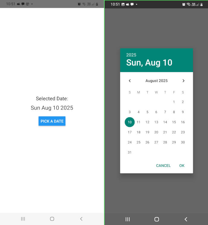
Styling Improvements + Adding Time Picker Mode
Currently, our datepicker functions, but the UI is quite basic. Let’s make it more visually appealing and add an option to select a time in addition to the date.
We will:
-
Improve the layout and colors.
-
Add a time picker button that allows the user to select a time.
-
Display the full date + time in a clean, readable format.
Updated DatePickerExample.js
import React, { useState } from 'react';
import { View, Text, TouchableOpacity, Platform, StyleSheet } from 'react-native';
import DateTimePicker from '@react-native-community/datetimepicker';
const DatePickerExample = () => {
const [date, setDate] = useState(new Date());
const [showPicker, setShowPicker] = useState(false);
const [mode, setMode] = useState('date');
const onChange = (event, selectedDate) => {
setShowPicker(false);
if (selectedDate) {
setDate(selectedDate);
}
};
const showMode = (currentMode) => {
setMode(currentMode);
setShowPicker(true);
};
return (
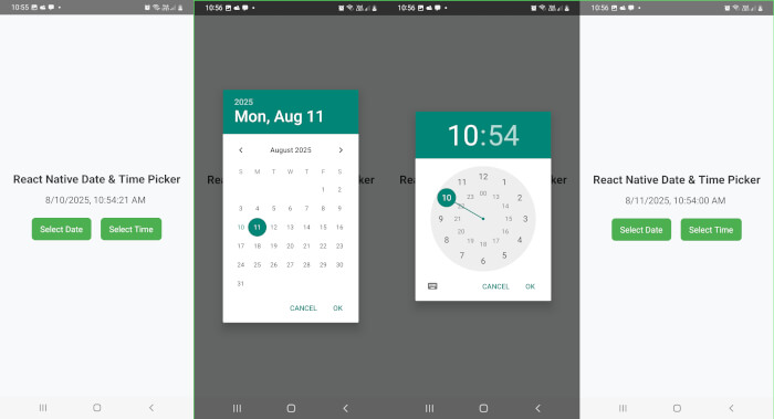
<View style={styles.container}>
<Text style={styles.title}>React Native Date & Time Picker</Text>
<Text style={styles.selectedText}>
{date.toLocaleString()} {/* Shows both date & time */}
</Text>
<View style={styles.buttonContainer}>
<TouchableOpacity style={styles.button} onPress={() => showMode('date')}>
<Text style={styles.buttonText}>Select Date</Text>
</TouchableOpacity>
<TouchableOpacity style={styles.button} onPress={() => showMode('time')}>
<Text style={styles.buttonText}>Select Time</Text>
</TouchableOpacity>
</View>
{showPicker && (
<DateTimePicker
value={date}
mode={mode}
display={Platform.OS === 'ios' ? 'spinner' : 'default'}
onChange={onChange}
/>
)}
</View>
);
};
const styles = StyleSheet.create({
container: {
flex: 1,
justifyContent: 'center',
alignItems: 'center',
backgroundColor: '#f8f9fa',
padding: 20,
},
title: {
fontSize: 22,
fontWeight: 'bold',
marginBottom: 15,
color: '#333',
},
selectedText: {
fontSize: 18,
marginBottom: 25,
color: '#555',
},
buttonContainer: {
flexDirection: 'row',
gap: 10,
},
button: {
backgroundColor: '#4CAF50',
paddingVertical: 12,
paddingHorizontal: 18,
borderRadius: 8,
marginHorizontal: 5,
},
buttonText: {
color: '#fff',
fontSize: 16,
},
});
export default DatePickerExample;What’s New Here
-
modestate — lets us switch between'date'and'time'mode dynamically. -
Two buttons — one for selecting a date, one for selecting a time.
-
Improved styling — softer background, modern button styles, and readable text.
-
toLocaleString()— shows both the selected date and time in a local-friendly format.
Running the Updated App
Once you save the file, run:
npx react-native run-android
# or
npx react-native run-ios
You should now be able to pick both a date and a time, and see them nicely formatted on the screen.
Conclusion
In this tutorial, we built a simple yet functional React Native Datepicker using the @react-native-community/datetimepicker package. You learned how to:
-
Set up a new React Native project with the CLI.
-
Install and configure the native date and time picker library.
-
Use React hooks (
useState) to manage the selected date and time. -
Switch between date mode and time mode dynamically.
-
Style the datepicker UI for a better user experience.
This datepicker leverages the platform’s native UI, ensuring it feels natural on both Android and iOS. The code is easy to extend, so you can quickly integrate it into your own applications.
Extra Tips for Customization
Here are some quick ideas to make your datepicker even more powerful:
-
Restrict Date Range
Use theminimumDateandmaximumDateprops to limit selection. -
24-Hour Time Format
On Android, you can enable 24-hour mode by adding: -
Custom Date Formatting
For more control, use a library likedate-fnsormoment: -
Modal-Based Datepicker
If you want a more customized look, tryreact-native-date-pickerfor a modal experience.
Final Words:
Date and time inputs are an essential part of many mobile apps, and React Native makes them easy to implement. With the @react-native-community/datetimepicker, you can provide users with a smooth, native experience without sacrificing flexibility.
Now that you’ve got this set up, you can integrate it into forms, event planners, booking apps, or any feature where time matters.
You can get the full source code on our GitHub.
That's just the basics. If you need more deep learning about React Native, you can take the following cheap course:
- React Native - The Practical Guide [2025]
- The Complete React Native + Hooks Course
- The Best React Native Course 2025 (From Beginner To Expert)
- React Native: Mobile App Development (CLI) [2025]
- React - The Complete Guide 2025 (incl. Next.js, Redux)
- React Native Development Simplified [2025]
- React Native by Projects: From Basics to Pro [2025]
- Full Stack Ecommerce Mobile App: React Native & Node.js 2025
- Learning Management System Mobile App using React Native
- React Native: Advanced Concepts
Thanks!