
Data is everywhere — from sales records and website analytics to social media interactions and IoT devices. To make sense of it all, you need the right tools. Python has become one of the most popular programming languages for data analysis, thanks to its powerful libraries, such as Pandas for data manipulation and Matplotlib for visualization.
In this beginner-friendly tutorial, you’ll learn how to:
-
Load, clean, and explore tabular datasets with pandas
-
Create derived columns, handle missing values, and aggregate results
-
Visualize patterns and insights with Matplotlib charts
-
Work through a small hands-on project using a sample sales dataset
By the end, you’ll have the foundational skills to analyze real-world data and present your findings with clear visualizations.
What you'll learn
-
How to set up a Python environment for data analysis (pandas + matplotlib)
-
How to load, inspect, clean, and transform tabular data with pandas
-
How to perform common aggregations and grouping operations
-
How to plot and visualize data with Matplotlib (basic charts)
-
A short mini-project: exploratory analysis of a small sales dataset
Prerequisites
-
Basic familiarity with Python (variables, lists, functions)
-
Python 3.8+ installed
-
A code editor (VS Code, PyCharm) or Jupyter / JupyterLab
Setup: Create a Virtual Environment and Install Packages
Before we start analyzing data, let’s set up a clean Python environment with the required packages.
1. Create and activate a virtual environment
On macOS/Linux:
python3 -m venv venv
source venv/bin/activate
On Windows (PowerShell):
python -m venv venv
.\venv\Scripts\Activate.ps1
2. Upgrade pip and install dependencies
pip install --upgrade pip
pip install pandas matplotlib jupyterlab openpyxl
3. Launch JupyterLab (optional, recommended for beginners)
jupyter labJupyterLab gives you an interactive notebook interface where you can run Python code cell by cell and see immediate results — perfect for data analysis.
Sample Dataset (copy into data/sales_data.csv)
Create a folder named data/ and paste the following CSV into data/sales_data.csv.
OrderID,Date,Region,SalesPerson,Product,Units,UnitPrice,Discount
1001,2024-01-03,North,Alice,Widget,10,9.99,0.00
1002,2024-01-05,South,Bob,Gadget,5,19.95,5.00
1003,2024-02-10,East,Charlie,Widget,2,9.99,0.00
1004,2024-02-20,West,Denise,Thingamajig,12,4.50,2.00
1005,2024-03-01,North,Alice,Gadget,1,19.95,0.00
1006,2024-03-15,South,Bob,Widget,7,9.99,0.00
1007,2024-03-20,East,Charlie,Thingamajig,3,4.50,0.00
1008,2024-04-02,West,Denise,Gadget,6,19.95,0.00
1009,2024-04-10,North,Alice,Widget,4,9.99,0.00
1010,2024-04-18,South,Bob,Thingamajig,20,4.50,10.00
Loading Data with Pandas
Once the dataset is saved into data/sales_data.csv, let’s load it into Pandas and start exploring.
import pandas as pd


# read CSV and parse the Date column as datetime
df = pd.read_csv('data/sales_data.csv', parse_dates=['Date'])


# quick look at the first rows
print(df.head())


# shape of the dataframe
print(df.shape)


# column types
print(df.dtypes)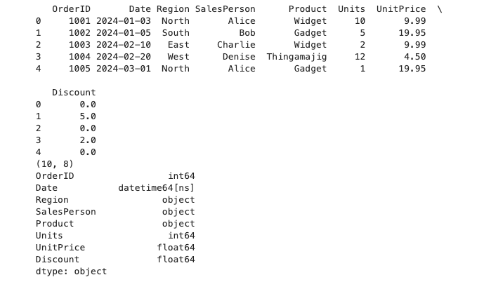
Key functions explained
-
pd.read_csv()— loads CSV files into a DataFrame. Theparse_dates=['Date']argument automatically converts theDatecolumn into proper datetime objects. -
df.head(n)/df.tail(n)— previews the first/last n rows of the dataset. -
df.shape— shows the number of rows and columns. -
df.info()— displays column types, non-null counts, and memory usage. -
df.describe()— generates summary statistics for numeric columns (count, mean, std, min, max, percentiles).
Example usage
# get more dataset insights
print(df.info())
print(df.describe())
These commands are the foundation of any data analysis workflow — they help you quickly understand what kind of data you are working with before you start cleaning or analyzing it.
Inspecting & Selecting Data with Pandas
After loading your dataset, the next step is to inspect its structure and select the parts you need for analysis.
Viewing columns and data
# list all column names
print(df.columns.tolist())


# view the first 5 rows
print(df.head())


# view the last 5 rows
print(df.tail())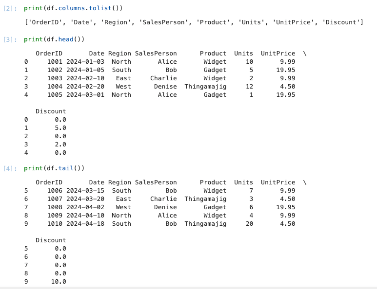
Selecting columns
-
Single column (returns a Series):
sales_person = df['SalesPerson']
print(sales_person.head())- Multiple columns (returns a DataFrame):
subset = df[['Date', 'Region', 'Product', 'Units']]
print(subset.head())
Filtering rows
-
By condition:
north_sales = df[df['Region'] == 'North']
print(north_sales)- Multiple conditions (use
&for AND,|for OR):
# All sales in the South region with Units greater than 5
south_high_units = df[(df['Region'] == 'South') & (df['Units'] > 5)]
print(south_high_units)
Using .loc and .iloc
-
.locis label-based (rows and columns by name):
# select rows 0–3, and only 'Date' and 'Revenue' columns
df.loc[0:3, ['Date', 'Revenue']].ilocis integer-based (rows and columns by position):
# select first 5 rows and first 3 columns
df.iloc[0:5, 0:3]
Best practices
-
Use
.locfor clarity when selecting by column/row labels. -
Avoid chained assignment (e.g.
df[df['A'] > 0]['B'] = x), which can lead to confusing bugs. Instead, use.locdirectly:
df.loc[df['A'] > 0, 'B'] = x
Derived Columns & Vectorized Operations
Often, you’ll need to create new columns from existing ones or apply operations to entire columns. Pandas makes this easy and efficient through vectorized operations — applying a function to a whole column without writing explicit loops.
Creating a new column
For example, let’s calculate the total revenue from each sale:
df['Revenue'] = df['Units'] * df['Price']
print(df.head())
Now the DataFrame includes a new column Revenue.
Using built-in functions
We can also apply mathematical functions directly:
# profit margin (as a percentage)
df['ProfitMargin'] = (df['Revenue'] * 0.2) / df['Revenue'] * 100
Here, we assume a constant 20% profit rate just as an example.
String operations
Vectorized operations aren’t limited to numbers. You can apply them to text columns too:
# make all product names uppercase
df['ProductUpper'] = df['Product'].str.upper()
Conditional columns
Create a new column based on a condition:
# mark high-value sales (Revenue > 100)
df['HighValue'] = df['Revenue'] > 100
This results in a boolean column (True or False).
Summary
-
Use
df['NewColumn'] = ...to derive new features. -
Operations on entire columns are vectorized (fast and concise).
-
Works for numeric, string, and boolean logic.
Grouping & Aggregating Data with Pandas
When analyzing datasets, it’s common to group rows by categories and calculate aggregated statistics (sum, average, count, etc.). Pandas provides the groupby method for this.
Basic grouping
Let’s find the total revenue per region:
grouped = df.groupby('Region')['Revenue'].sum()
print(grouped)
Multiple aggregations
You can calculate more than one metric at a time:
# total units and total revenue per product
summary = df.groupby('Product').agg({
'Units': 'sum',
'Revenue': 'sum'
})
print(summary)
Grouping by multiple columns
You can group by more than one category:
# revenue by region and product
multi_group = df.groupby(['Region', 'Product'])['Revenue'].sum()
print(multi_group)
Resetting the index
By default, groupby results often use the grouped column(s) as an index. To convert them back into normal columns:
summary = df.groupby('Region')['Revenue'].sum().reset_index()
print(summary)
Using .mean(), .count(), etc.
Other common aggregation functions:
# average revenue per salesperson
avg_revenue = df.groupby('SalesPerson')['Revenue'].mean()
print(avg_revenue)


# number of transactions per region
transactions = df.groupby('Region')['Revenue'].count()
print(transactions)
Summary
-
Use
groupbyto segment data by categories. -
Combine with
.sum(),.mean(),.count(), or.agg()for flexible summaries. -
Reset index when you need a tidy DataFrame.
Data Visualization with Matplotlib
Once you’ve cleaned and summarized your data, it’s time to visualize it. Matplotlib is a powerful plotting library in Python that integrates well with pandas.
Line plot
Visualize revenue over time:
import matplotlib.pyplot as plt


# aggregate revenue per date
revenue_per_date = df.groupby('Date')['Revenue'].sum().reset_index()


plt.figure(figsize=(8,5))
plt.plot(revenue_per_date['Date'], revenue_per_date['Revenue'], marker='o')
plt.title('Revenue Over Time')
plt.xlabel('Date')
plt.ylabel('Revenue')
plt.xticks(rotation=45)
plt.tight_layout()
plt.show()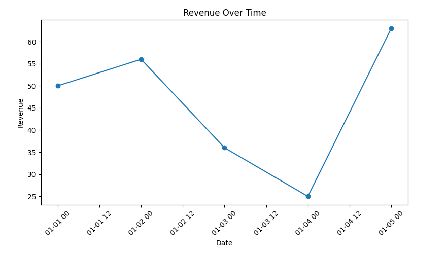
Bar chart
Compare revenue across regions:
revenue_by_region = df.groupby('Region')['Revenue'].sum().reset_index()


plt.figure(figsize=(6,4))
plt.bar(revenue_by_region['Region'], revenue_by_region['Revenue'], color='skyblue')
plt.title('Total Revenue by Region')
plt.xlabel('Region')
plt.ylabel('Revenue')
plt.show()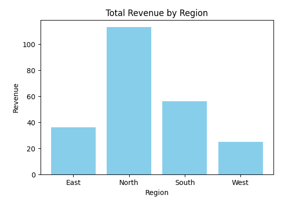
Pie chart
Show revenue distribution by product:
revenue_by_product = df.groupby('Product')['Revenue'].sum()


plt.figure(figsize=(6,6))
plt.pie(revenue_by_product, labels=revenue_by_product.index, autopct='%1.1f%%', startangle=140)
plt.title('Revenue Share by Product')
plt.show()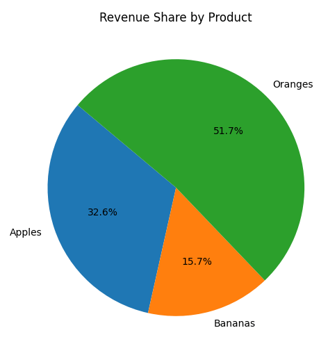
Histogram
Check distribution of units sold:
plt.figure(figsize=(6,4))
plt.hist(df['Units'], bins=10, color='orange', edgecolor='black')
plt.title('Distribution of Units Sold')
plt.xlabel('Units')
plt.ylabel('Frequency')
plt.show()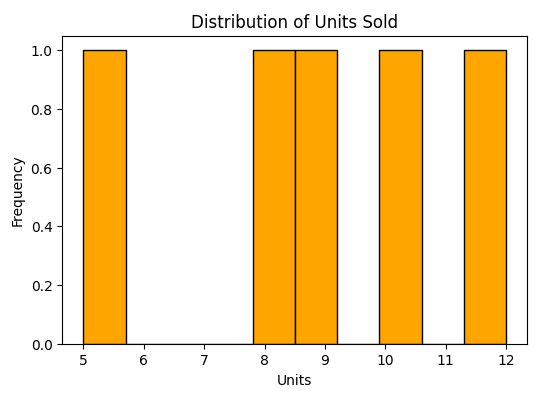
Best practices
-
Always label axes and add a title for clarity.
-
Rotate x-axis labels when dealing with dates.
-
Use colors consistently across charts.
-
Keep visualizations simple and avoid clutter.
Conclusion & Best Practices
Congratulations! 🎉 You’ve just completed a beginner-friendly walkthrough of data analysis with Python, using pandas for data wrangling and Matplotlib for visualization.
What we covered
-
Setup → Installed pandas and Matplotlib, prepared a dataset.
-
Loading Data → Read CSV files into pandas DataFrames.
-
Inspecting & Selecting → Explored columns, filtered rows, and selected subsets.
-
Derived Columns → Created new columns with vectorized operations.
-
Grouping & Aggregating → Summarized data with
groupby. -
Visualization → Built line plots, bar charts, pie charts, and histograms with Matplotlib.
Best practices for beginners
-
Start small → Always begin with a small dataset (like our sales example) before moving on to larger, real-world datasets.
-
Validate your data → Use
df.head(),df.info(), anddf.describe()to ensure your data is clean before analysis. -
Use vectorized operations → They’re faster and cleaner than loops.
-
Label everything in plots → Titles, axis labels, and legends make your visualizations clear.
-
Document your steps → Keep your analysis in Jupyter notebooks or scripts so you can reproduce results later.
-
Experiment → Try different aggregations and plots to find the most meaningful insights.
Next steps
-
Explore seaborn, a higher-level visualization library built on top of Matplotlib, for more polished charts.
-
Learn NumPy for advanced numerical operations.
-
Practice with real-world datasets from sources like Kaggle or data.gov.
By following these steps, you now have a solid foundation to explore the world of data analysis with Python 🚀.
You can get the full source code on our GitHub.
That's just the basics. If you need more deep learning about Python, Django, FastAPI, Flask, and related, you can take the following cheap course:
- 100 Days of Code: The Complete Python Pro Bootcamp
- Python Mega Course: Build 20 Real-World Apps and AI Agents
- Python for Data Science and Machine Learning Bootcamp
- Python for Absolute Beginners
- Complete Python With DSA Bootcamp + LEETCODE Exercises
- Python Django - The Practical Guide
- Django Masterclass : Build 9 Real World Django Projects
- Full Stack Web Development with Django 5, TailwindCSS, HTMX
- Django - The Complete Course 2025 (Beginner + Advance + AI)
- Ultimate Guide to FastAPI and Backend Development
- Complete FastAPI masterclass from scratch
- Mastering REST APIs with FastAPI
- REST APIs with Flask and Python in 2025
- Python and Flask Bootcamp: Create Websites using Flask!
- The Ultimate Flask Course
Thanks!