
Flutter’s promise of building apps for multiple platforms from a single codebase is more powerful than ever, especially with its solid support for web, mobile, and even desktop. But responsive UI design remains a key challenge when targeting diverse screen sizes.
In this tutorial, you’ll learn how to build a Flutter app that adapts seamlessly across web and mobile. We'll explore layout techniques, media queries, breakpoints, responsive widgets, and real-world examples to help you master building responsive UIs in Flutter.
Prerequisites
-
Basic knowledge of Dart and Flutter
-
Flutter SDK installed
-
Code editor (VS Code or Android Studio)
-
Emulator or browser for testing
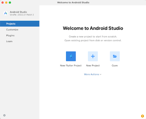
1. Create a New Flutter Project
Start Android Studio.
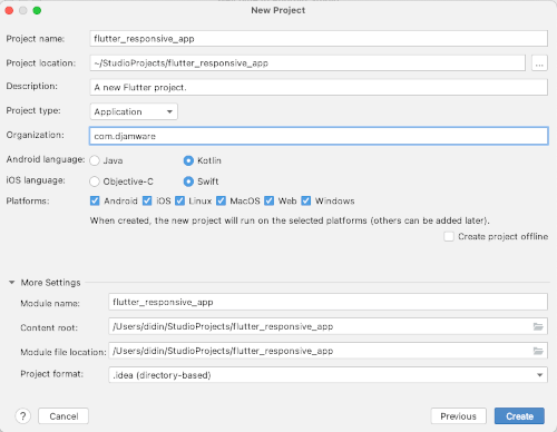
Create a New Flutter Project. Point the Flutter SDK path to the downloaded Flutter SDK folder, then click the Next button.
- Fill the project name (flutter_responsive_app)
- Fill the organization name (com.djamware)
- Click the Create button
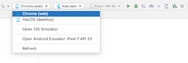
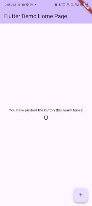
To run it on Mobile (devices/simulator) or Web (Chrome), choose Chrome (web) or connected devices, then click the Play button.
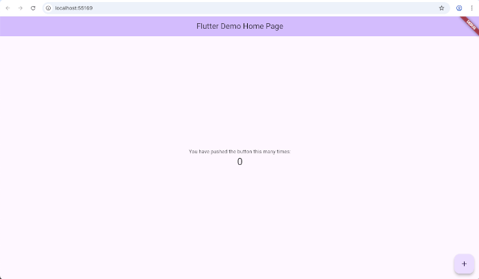
On Chrome (web).
On an Android device.
File structure for this tutorial:
lib/
├── main.dart
├── utils/
│   └── responsive.dart
├── pages/
│   └── responsive_home_page.dart
├── layouts/
│   ├── mobile_layout.dart
│   ├── tablet_layout.dart
│   └── desktop_layout.dart
├── widgets/
│   ├── app_scaffold.dart
2. Define Screen Types and Breakpoints
Create a utility to handle screen sizes.
📁 lib/utils/responsive.dart
enum ScreenType { mobile, tablet, desktop }

class Responsive {
  static ScreenType getScreenType(double width) {
    if (width >= 1024) return ScreenType.desktop;
    if (width >= 600) return ScreenType.tablet;
    return ScreenType.mobile;
  }
}
💡 This logic helps you cleanly switch UI layouts based on screen width.
3. Create the Adaptive Scaffold (Drawer vs Sidebar)
This widget shows a Drawer for mobile/tablet and a NavigationRail (sidebar) for desktop.
📄 lib/widgets/app_scaffold.dart
import 'package:flutter/material.dart';
import '../utils/responsive.dart';

class AppScaffold extends StatelessWidget {
  final Widget body;
  final ScreenType screenType;
  final String title;

  const AppScaffold({
    super.key,
    required this.body,
    required this.screenType,
    this.title = 'Responsive App',
  });

  @override
  Widget build(BuildContext context) {
    if (screenType == ScreenType.desktop) {
      return Scaffold(
        body: Row(
          children: [
            NavigationRail(
              selectedIndex: 0,
              labelType: NavigationRailLabelType.all,
              onDestinationSelected: (index) {},
              destinations: const [
                NavigationRailDestination(
                  icon: Icon(Icons.home),
                  label: Text('Home'),
                ),
                NavigationRailDestination(
                  icon: Icon(Icons.settings),
                  label: Text('Settings'),
                ),
              ],
            ),
            const VerticalDivider(thickness: 1, width: 1),
            Expanded(child: body),
          ],
        ),
      );
    } else {
      return Scaffold(
        appBar: AppBar(title: Text(title)),
        drawer: Drawer(
          child: ListView(
            children: const [
              DrawerHeader(child: Text('Menu')),
              ListTile(leading: Icon(Icons.home), title: Text('Home')),
              ListTile(leading: Icon(Icons.settings), title: Text('Settings')),
            ],
          ),
        ),
        body: body,
      );
    }
  }
}
4. Create Layouts for Each Screen Type
We'll create three layout files using the AppScaffold.
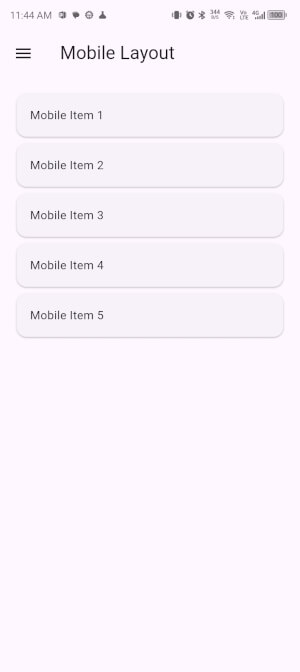
📁 lib/layouts/mobile_layout.dart
import 'package:flutter/material.dart';
import '../utils/responsive.dart';
import '../widgets/app_scaffold.dart';
class MobileLayout extends StatelessWidget {
const MobileLayout({super.key});
@override
Widget build(BuildContext context) {
return AppScaffold(
screenType: ScreenType.mobile,
body: ListView(
padding: const EdgeInsets.all(16),
children: List.generate(
5,
(index) => Card(
child: Padding(
padding: const EdgeInsets.all(16),
child: Text('Mobile Item ${index + 1}'),
),
),
),
),
);
}
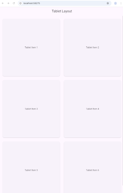
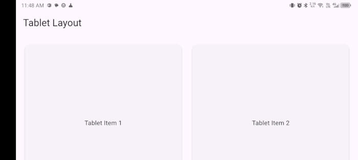
}📁 lib/layouts/tablet_layout.dart
import 'package:flutter/material.dart';
import '../utils/responsive.dart';
import '../widgets/app_scaffold.dart';
class TabletLayout extends StatelessWidget {
const TabletLayout({super.key});
@override
Widget build(BuildContext context) {
return AppScaffold(
screenType: ScreenType.tablet,
body: GridView.count(
crossAxisCount: 2,
padding: const EdgeInsets.all(16),
crossAxisSpacing: 16,
mainAxisSpacing: 16,
children: List.generate(
6,
(index) => Card(
child: Center(
child: Padding(
padding: const EdgeInsets.all(16),
child: Text('Tablet Item ${index + 1}'),
),
),
),
),
),
);
}
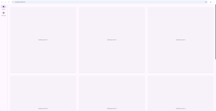
}📁 lib/layouts/desktop_layout.dart
import 'package:flutter/material.dart';
import '../utils/responsive.dart';
import '../widgets/app_scaffold.dart';

class DesktopLayout extends StatelessWidget {
  const DesktopLayout({super.key});

  @override
  Widget build(BuildContext context) {
    return AppScaffold(
      screenType: ScreenType.desktop,
      body: GridView.count(
        crossAxisCount: 3,
        padding: const EdgeInsets.all(24),
        crossAxisSpacing: 24,
        mainAxisSpacing: 24,
        children: List.generate(
          9,
              (index) => Card(
            child: Center(
              child: Padding(
                padding: const EdgeInsets.all(24),
                child: Text('Desktop Item ${index + 1}'),
              ),
            ),
          ),
        ),
      ),
    );
  }
}
5. Build the Main Responsive Page
This page chooses which layout to render using LayoutBuilder.
📄 lib/pages/responsive_home_page.dart
import 'package:flutter/material.dart';
import '../utils/responsive.dart';
import '../layouts/mobile_layout.dart';
import '../layouts/tablet_layout.dart';
import '../layouts/desktop_layout.dart';

class ResponsiveHomePage extends StatelessWidget {
  const ResponsiveHomePage({super.key});

  @override
  Widget build(BuildContext context) {
    return LayoutBuilder(
      builder: (context, constraints) {
        final screenType = Responsive.getScreenType(constraints.maxWidth);

        switch (screenType) {
          case ScreenType.mobile:
            return MobileLayout();
          case ScreenType.tablet:
            return TabletLayout();
          case ScreenType.desktop:
            return DesktopLayout();
        }
      },
    );
  }
}
6. Initialize App in main.dart
📄 lib/main.dart
import 'package:flutter/material.dart';
import 'pages/responsive_home_page.dart';

void main() {
  runApp(MyApp());
}

class MyApp extends StatelessWidget {
  @override
  Widget build(BuildContext context) {
    return MaterialApp(
      title: 'Responsive Flutter App',
      debugShowCheckedModeBanner: false,
      theme: ThemeData(primarySwatch: Colors.blue),
      home: ResponsiveHomePage(),
    );
  }
}
7. Optional: Use flutter_screenutil for Scaled Sizes
Add dependency to pubspec.yaml:
dependencies:
  flutter:
    sdk: flutter

  flutter_screenutil: ^5.8.4
Initialize in main.dart:
import 'package:flutter/material.dart';
import 'package:flutter_screenutil/flutter_screenutil.dart';
import 'pages/responsive_home_page.dart';

void main() {
  runApp(MyApp());
}

class MyApp extends StatelessWidget {
  @override
  Widget build(BuildContext context) {
    return ScreenUtilInit(
      designSize: Size(375, 812), // Base size used for scaling (e.g., iPhone 11)
      minTextAdapt: true,
      splitScreenMode: true,
      builder: (context, child) {
        return MaterialApp(
          title: 'Responsive Flutter App',
          debugShowCheckedModeBanner: false,
          theme: ThemeData(primarySwatch: Colors.blue),
          home: child,
        );
      },
      child: ResponsiveHomePage(),
    );
  }
}
8. Testing Responsiveness
-
Chrome DevTools (mobile view simulation)
-
Resize the browser window
-
Test with emulators (Android, iOS)
-
Use breakpoints to debug layout logic
Chrome landscape desktop:
Chrome portrait desktop:
Android portrait:
Android landscape:
9. Performance Tips
-
Use
constconstructors where possible -
Avoid deep widget trees with
Flexible,Expanded -
Use image/network caching
-
Defer non-critical widgets
Bonus Tips for Scaling Responsiveness
-
Use
flutter_screenutilorMediaQueryto scale padding/sizing -
Consider
OrientationBuilderfor portrait vs landscape -
Modularize widgets and use
Expanded,Flexible,Wrap, etc.
Conclusion
Flutter gives you the power to deliver responsive apps across platforms from a single codebase. With LayoutBuilder, custom breakpoints, and utility classes like Responsive, you can tailor the UI to any screen with minimal effort.
Start modular, think in screen types, and embrace a responsive-first design mindset to create modern, adaptive Flutter apps.
You can get the full source code on our GitHub.
That's just the basics. If you need more deep learning about Flutter and Dart, you can take the following cheap course:
- Flutter & Dart - The Complete Guide [2025 Edition]
- The Complete Flutter Development Bootcamp with Dart
- Complete Flutter Guide 2025: Build Android, iOS and Web apps
- Advanced Flutter: Build Enterprise-Ready Apps.
- Flutter , Nodejs, Express , MongoDB: Build Multi-Store App
- Flutter & Dart Essentials-Build Mobile Apps like a Pro
- Master Flutter with ML: Object Detection, OCR & Beyond
- Full-Stack Mobile Development: Flutter, Figma, and Firebase
- Dart & Flutter - Zero to Mastery [2025] + Clean Architecture
- Master Flame Game Engine with Flutter: Build 2D Mobile Games
Thanks!