
In this Angular Material series, we will show you how to use the Angular Material Form Controls select component with working examples. An Angular Material Form control is an essential component, especially when working with data. There are some Angular Material Form Controls like autocomplete, checkbox, date picker, form field, input, radio button, select, slider, and slide toggle. This time, we will show you examples of Angular Material Form Controls Select <mat-select>.
The following tools, frameworks, and libraries or modules are required for this tutorial.
- Node.js
- Angular
- Angular Material
- Terminal (Linux/Mac) or Node Command Line (Windows)
- Text Editor or IDE (We use VSCode)
Also, you can watch this tutorial on our YouTube channel. Please like, share, comment, and subscribe to our Channel.
Preparation
We will bundle all of these Angular Material Form Controls Select examples in one application. For that, we will prepare all required Angular applications and Angular Material. Now, we are creating an Angular app using Angular CLI, which needs Node.js and NPM to install or update it. Make sure you have installed Node.js and NPM before installing or updating Angular CLI. To install or update the Angular CLI, type this command.
sudo npm install -g @angular/cliNext, create a new Angular app using Angular CLI by typing this command.
ng new material-selectThat command will create a new Angular app with the name `material-select` and pass all questions as 'Y', then the Angular CLI will automatically install the required NPM modules. After finishing, go to the newly created Angular folder, then run the Angular app for the first time.
cd ./material-select
ng serve --open
Using those "--open" parameters will automatically open Angular in your default web browser. Here's what the Angular default page looks like.

Next, type this command to install Angular Material using Angular CLI's install schematics.
ng add @angular/materialLeave all questions as default to finish the installation.
? Choose a prebuilt theme name, or "custom" for a custom theme: Indigo/Pink        [ Preview: https://mate
rial.angular.io?theme=indigo-pink ]
? Set up HammerJS for gesture recognition? Yes
? Set up browser animations for Angular Material? Yes
Next, open the Angular application project with your text editor or IDE. Open and edit `src/app/app.module.ts`, then add these required imports of @angular/forms FormsModule, ReactiveFormsModule, @angular/material MatSelectModule, and MatFormFieldModule.
import { FormsModule, ReactiveFormsModule } from '@angular/forms';
import { MatSelectModule } from '@angular/material/select';
import { MatFormFieldModule } from '@angular/material/form-field';
Register the above modules to `@NgModule` imports.
imports: [
  BrowserModule,
  AppRoutingModule,
  BrowserAnimationsModule,
  FormsModule,
  ReactiveFormsModule,
  MatSelectModule,
  MatFormFieldModule
],
Now, the Angular Material Form Controls Components and Angular Reactive Form modules are ready to use in Angular Components.
Basic Select Example
For basic Angular Material Form Controls Select <mat-select> example, we need to create an Angular component first. Type this command in the Terminal or VSCode terminal to create a new Angular component.
ng g component basicNext, open and edit "src/app/app-routing.module.ts" and then add this import.
import { BasicComponent } from './basic/basic.component';Add that BasicComponent to the routes constant.
const routes: Routes = [
  {
    path: 'basic',
    component: BasicComponent,
    data: { title: 'Basic Select Example' }
  },
];
Next, open and edit "src/app/app.component.html", then replace all HTML/Angular templates with these.
<div class="container">
  <ul>
    <li><a [routerLink]="['/basic']">Basic Select Example</a></li>
  </ul>

  <router-outlet></router-outlet>
</div>
Give it a little style by opening and editing "src/app/app.component.scss", then add these lines of SCSS code.
.container {
  width: 500px;
  margin: 20px;
  padding: 20px;
}
Next, open and edit "src/app/basic/basic.component.html", then add these lines of <mat-select> example thatis wrapped by <mat-form-field>.
<h2>Basic mat-select Example</h2>
<mat-form-field>
  <mat-label>Your Team</mat-label>
  <mat-select>
    <mat-option *ngFor="let team of teams" [value]="team.name">
      {{team.name}}
    </mat-option>
  </mat-select>
</mat-form-field>
This basic mat-select option (mat-option) loops through the "teams" array. So, we need to add an array to the TypeScript file. Open and edit "src/app/basic/basic.component.ts", then add this array variable before the constructor.
teams: any[] = [
    { name: 'Liverpool' },
    { name: 'Manchester City' },
    { name: 'Manchester United' },
    { name: 'Arsenal' },
    { name: 'Leicester City' },
    { name: 'Chelsea' },
    { name: 'Tottenham Hotspur' },
];
Now, the basic <mat-select> with <mat-option> will be like this.

The next example is to get the selected value to the console or display it in the text. Still, on basic.component.ts, add this variable before the list variable.
selectedItem: string;Next, add ([ngModel]) to "src/app/basic/basic.component.html" that points to a previously created variable. Also, add a <h3> to display the result of the selected option.
<h2>Basic mat-select Example</h2>
<mat-form-field>
  <mat-label>Your Team</mat-label>
  <mat-select [(ngModel)]="selectedItem">
    <mat-option *ngFor="let team of teams" [value]="team.name">
      {{team.name}}
    </mat-option>
  </mat-select>
</mat-form-field>

<h3>Your Team is: {{selectedItem}}</h3>
Select in Reactive Form Example
This example is the most useful in almost every Angular application that uses a Form to input some data. Including a show error message on every invalid selection using ErrorStateMatcher components. First, we will create an Angular Reactive Form to add new data. Generate a new Angular component for this example.
ng g component reactiveAdd that generated component to the "src/app/app-routing.module.ts" and add a link to "src/app/app.component.html" as in the previous example. Also, add the additional Angular Material components (MatIconModule, MatCardModule) to the "src/app/app.module.ts" as in the previous Angular Material configuration. Open and edit "src/app/reactive/reactive.component.ts", then add this import.
import { FormControl, FormGroupDirective, FormBuilder, FormGroup, NgForm, Validators } from '@angular/forms';
import { ErrorStateMatcher } from '@angular/material/core';
Add MyErrorStateMatcher class that implements ErrorStateMatcher before the ReactiveComponent class.
/** Error when invalid control is dirty, touched, or submitted. */
export class MyErrorStateMatcher implements ErrorStateMatcher {
  isErrorState(control: FormControl | null, form: FormGroupDirective | NgForm | null): boolean {
    const isSubmitted = form && form.submitted;
    return !!(control && control.invalid && (control.dirty || control.touched || isSubmitted));
  }
}
Add these variables before the constructor.
  questionerForm: FormGroup;
  position = '';
  industry = '';
  experience = 0;
  matcher = new MyErrorStateMatcher();
  positions: any[] = ['Programmer', 'Businness Analyst', 'Designer', 'DBA'];
  industries: any[] = ['Software', 'Marketplace', 'Education', 'Mining'];
  experiences: any[] = [1, 2, 3, 4, 5, 6, 7, 8, 9, 10];
Initialize FormGroup and FormControls using FormBuilder inside the NgOnInit function.
  ngOnInit() {
    this.questionerForm = this.formBuilder.group({
      position: ['', Validators.required],
      industry: ['', Validators.required],
      experience: [null, Validators.required]
    });
  }
Add a form submit function to check the selected items to the console.
  onFormSubmit() {
    if (this.questionerForm.valid) {
      console.log(this.questionerForm.value);
    } else {
      return;
    }
  }
Next, implement the HTML or Angular template by opening and editing "src/app/reactive/reactive.component.html", then replace all tags with these.
<mat-card>
  <form class="example-form" [formGroup]="questionerForm" (ngSubmit)="onFormSubmit()">
    <mat-form-field class="example-full-width">
      <mat-label>Position</mat-label>
      <mat-select formControlName="position" [errorStateMatcher]="matcher">
        <mat-option *ngFor="let pos of positions" [value]="pos">
          {{pos}}
        </mat-option>
      </mat-select>
      <mat-error *ngIf="questionerForm.get('position').hasError('required')">
        You must make a selection
      </mat-error>
    </mat-form-field>
    <mat-form-field class="example-full-width">
        <mat-label>Your Position</mat-label>
      <mat-select formControlName="industry" [errorStateMatcher]="matcher">
        <mat-option *ngFor="let ind of industries" [value]="ind">
          {{ind}}
        </mat-option>
      </mat-select>
      <mat-error *ngIf="questionerForm.get('industry').hasError('required')">
          You must make a selection
      </mat-error>
    </mat-form-field>
    <mat-form-field class="example-full-width">
      <mat-label>Experience</mat-label>
      <mat-select formControlName="experience" [errorStateMatcher]="matcher">
        <mat-option *ngFor="let exp of experiences" [value]="exp">
          {{exp}}
        </mat-option>
      </mat-select>
      <mat-error *ngIf="questionerForm.get('experience').hasError('required')">
          You must make a selection
      </mat-error>
    </mat-form-field>
    <div class="button-row">
      <button type="submit" mat-flat-button color="primary"><mat-icon>save</mat-icon></button>
    </div>
  </form>
</mat-card>
To set the initial value in the Edit form. Add this function.
  setValues() {
    this.questionerForm.setValue({
      position: 'Designer',
      industry: 'Mining',
      experience: 6
    });
  }
Then call that function in the NgOnInit function.
  ngOnInit() {
    ...
    this.setValues();
  }
So, this example will look like this.

Grouping Option Example
For this example, first, we have to create a new component. Do exactly like the previous example with the component name "grouping". So, this mat-select contains mat-optgroup where the group name is disabled (can't choose), and each mat-optgroup has its mat-option. Open and edit "src/app/grouping/grouping.component.ts," then add this nested array variable.
  groups: any[] = [
    {
      groupName: 'Group A',
      teams: [
        { teamName: 'Real Madrid' },
        { teamName: 'Bayern Muenchen' },
        { teamName: 'Juventus' },
        { teamName: 'Manchester City' },
      ]
    },
    {
      groupName: 'Group B',
      teams: [
        { teamName: 'Inter Milan' },
        { teamName: 'Ajax Amsterdam' },
        { teamName: 'Barcelona' },
        { teamName: 'Tottenham Hotspur' },
      ]
    },
    {
      groupName: 'Group C',
      teams: [
        { teamName: 'Liverpool' },
        { teamName: 'AC Milan' },
        { teamName: 'PSG' },
        { teamName: 'Borussia Dortmun' },
      ]
    },
  ];
Next, open and edit "src/app/grouping/grouping.component.html", then replace all HTML tags or Angular templates with these.
<mat-form-field>
  <mat-label>UEFA Champions Team</mat-label>
  <mat-select>
    <mat-optgroup *ngFor="let group of groups" [label]="group.groupName"
                  [disabled]="group.disabled">
      <mat-option *ngFor="let team of group.teams" [value]="team.teamName">
        {{team.teamName}}
      </mat-option>
    </mat-optgroup>
  </mat-select>
</mat-form-field>
So, this example will look like this.

Multiple Select Example
Using only mat-select is the single selection mode by default. To make multiple selections, just add a "multiple" attribute to the <mat-select>. Before implementing this example, create a new Angular component with the name "multiple". Do as in the previous component to register this new component to the routing and main component.
Next, open and edit "src/app/multiple/multiple.component.ts" then add this array os string variables.
skills: any[] = [ 'Java', 'Javascript', 'Angular', 'React', 'Vue', 'MySQL', 'MongoDB', 'Python' ];Next, open and edit "src/app/multiple/multiple.component.html", then replace all HTML tags with these.
<mat-form-field>
  <mat-label>Choose Your Skills</mat-label>
  <mat-select multiple>
    <mat-option *ngFor="let skill of skills" [value]="skill">{{skill}}</mat-option>
  </mat-select>
</mat-form-field>
And this example will look like this.

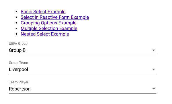
Nested Select Example
Nested select in this example is two or more <mat-select>, depending on the first <mat-select>. On first <mat-select> selection, it sends the value to the second <mat-select> options, and so on. Before implementing this example, create a new Angular component with the name "nested". Do as in the previous component to register this new component with the routing and main component.
Next, open and edit "src/app/nested/nested.component.ts", then add this nested array of objects and empty array variables.
  groups: any[] = [
    {
      groupName: 'Group A',
      teams: [
        {
          teamName: 'Real Madrid',
          players: [
            { playerName: 'Karim Benzema' },
            { playerName: 'Luca Modric' },
            { playerName: 'Eden Hazard' },
          ]
        },
        {
          teamName: 'Bayern Munich',
          players: [
            { playerName: 'Phillipe Coutinho' },
            { playerName: 'Benjamin Pavard' },
            { playerName: 'Thomas Muller' },
          ]
        },
        {
          teamName: 'Juventus',
          players: [
            { playerName: 'Christiano Ronaldo' },
            { playerName: 'Aaron Ramsey' },
            { playerName: 'Emre Can' },
          ]
        },
        {
          teamName: 'Manchester City',
          players: [
            { playerName: 'David Silva' },
            { playerName: 'Leroy Sane' },
            { playerName: 'Riyad Mahrez' },
          ]
        },
      ]
    },
    {
      groupName: 'Group B',
      teams: [
        {
          teamName: 'Liverpool',
          players: [
            { playerName: 'Sadio Mane' },
            { playerName: 'Robertson' },
            { playerName: 'Fabinho' },
          ]
        },
        {
          teamName: 'AC Milan',
          players: [
            { playerName: 'Ibrahimovic' },
            { playerName: 'Andrea Conti' },
            { playerName: 'Fabio Borini' },
          ]
        },
        {
          teamName: 'PSG',
          players: [
            { playerName: 'Kylian Mbappe' },
            { playerName: 'Edison Cavani' },
            { playerName: 'Thiago Silva' },
          ]
        },
        {
          teamName: 'Borussia Dortmund',
          players: [
            { playerName: 'Axel Witsel' },
            { playerName: 'Mats Hummels' },
            { playerName: 'Marco Reus' },
          ]
        },
      ]
    },
  ];
  teams: any[] = [];
  players: any[] = [];
Next, open and edit "src/app/nested/nested.component.html", then replace all HTML tags with these.
<mat-form-field class="field-full-width">
  <mat-label>UEFA Group</mat-label>
  <mat-select (selectionChange)="showTeams($event)">
    <mat-option *ngFor="let group of groups" [value]="group">
      {{group.groupName}}
    </mat-option>
  </mat-select>
</mat-form-field>
<mat-form-field class="field-full-width">
  <mat-label>Group Team</mat-label>
  <mat-select (selectionChange)="showPlayers($event)">
    <mat-option *ngFor="let team of teams" [value]="team">
      {{team.teamName}}
    </mat-option>
  </mat-select>
</mat-form-field>
<mat-form-field class="field-full-width">
  <mat-label>Team Player</mat-label>
  <mat-select>
    <mat-option *ngFor="let player of players" [value]="player.playerName">
      {{player.playerName}}
    </mat-option>
  </mat-select>
</mat-form-field>
And this example will look like this.
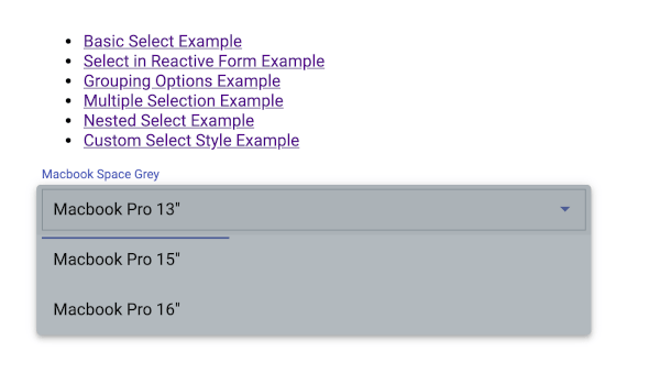
Custom Style Example
As usual, we will put a custom style for mat-select in a new Angular component. For that, do as in the previous example to add and register this new component. Give it the name "custom" when generating a new component.
Next, open and edit "src/app/custom/custom.component.ts", then modify and add these imports.
import { Component, OnInit, ViewEncapsulation } from '@angular/core';
import { FormControl } from '@angular/forms';
To make a custom style applied to mat-select-panel, add this line to @Component.
@Component({
  selector: 'app-custom',
  templateUrl: './custom.component.html',
  styleUrls: ['./custom.component.scss'],
  encapsulation: ViewEncapsulation.None,
})
Open and edit "src/app/custom/custom.component.html", then replace all HTML tags with these.
<mat-form-field>
  <mat-label>Macbook Space Grey</mat-label>
  <mat-select panelClass="space-grey">
    <mat-option value="small">Macbook Pro 13"</mat-option>
    <mat-option value="mid">Macbook Pro 15"</mat-option>
    <mat-option value="large">Macbook Pro 16"</mat-option>
  </mat-select>
</mat-form-field>
Next, add a style class to "src/app/custom/custom.component.scss".
.space-grey.mat-select-panel {
  background: rgba(101,115,126, 0.5);
}
To customize the select box, add this style.
.mat-select {
  width: 500px !important;
  border: solid 1px rgba(101,115,126, 0.5);
  padding: 10px;
}
And here this example looks like.
That's an example of Angular Material Form Controls Select <mat-select>. As usual, you can get the full source code on our GitHub.
If you don’t want to waste your time designing your front-end or your budget to spend by hiring a web designer, then Angular Templates is the best place to go. So, speed up your front-end web development with premium Angular templates. Choose your template for your front-end project here.
That's just the basics. If you need more deep learning about Angular, you can take the following cheap course:
- Angular - The Complete Guide (2025 Edition)
- Complete Angular Course 2025 - Master Angular in only 6 days
- Angular Deep Dive - Beginner to Advanced (Angular 20)
- Modern Angular 20 with Signals - The missing guide
- The Modern Angular Bootcamp
- Angular (Full App) with Angular Material, Angularfire & NgRx
- Angular Front End Development Beginner to Master 2025
- 30 Days of Angular: Build 30 Projects with Angular
- Angular 20 Full Course - Complete Zero to Hero Angular 20
- Angular Material In Depth (Angular 20)
Thanks!